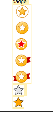
Most times when I see questions about icons I think: What if you reversed it? Seeing a gold and silver star and not knowing the context. What does it mean? I wouldn't come up with 'passed' and 'mastered'. My thought would be 'favorite' (on/yellow) and 'not favorite' (off/white). But others may associate it differently. Some associations will be quite far from what you intended. Did you know a star is a religious symbol?

I think with stars you're on the right track. But I think stars are earned like in the army, restaurants, hotels. You get more stars if you're better.
Creatives are the best in associative thinking and overestimate the ability of our audience to do the same. The receiver will do minimal required to understand the message and the receivers perception is their truth... the only truth. This is also why it's hard to design icons and why there are many questions about it. It's also the reason why to use icons in context. An icon alone will be interpretable. If you want no mistakes at the receiving end you might have to apply text, label or legend. Also a single icon is harder to understand than multiple.
Lesson 1 *
Little or no context, this could mean anything: footnote; required; hard; etc.
Lesson 1 Your score: *--
With a label (proving context) and 'no stars' the meaning becomes clear.
          Your scores:
Lesson 1: ***
Lesson 2: **-
Lesson 3: *--
Lesson 4: --- try again
And even more clear if you have multiple occurrences. Great, good, average and fail.
Since this question is about educational software. I guess you want to use the same icon in different situations. To make it work, always provide enough context. This way the meaning of the icon is less in the shape of the icon itself. It can be stars, checkmarks, dots, coins, a progress bar, color range. Even something in a theme: Monkeys if your lessons are about wildlife.
Tips: If you have a 'passed' and 'mastered' status you might want to think about 'fail' and 'not defined'. Also I would use simpler words: 'bad', 'poor', 'average', 'good', 'great'.


