1

This is an opinion question that I go back and forth on every time I start a new project. In most cases, I am designing a website that has some sort of "article" element, whether it be a blog post, event listing, etc. Something that uses a template for multiple bits of the same type of content. I'm sure this is not unfamiliar.

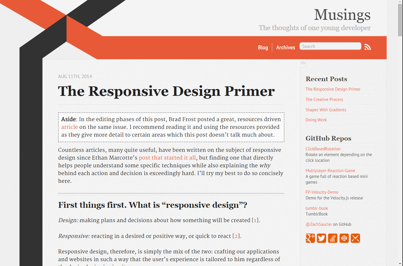
When laying out these templates, I am usually working with a variation on the classic two-column layout (as seen on this page) with content on the left in a large area and a smaller-width sidebar to the right.

The issue is, I struggle with whether or not to make the sidebar, or at least the top few sections of the sidebar, "part" of the content of that article (or post, or event listing) or whether the sidebar should remain a constant part of the site itself and the only part that should be specific to that article is the content frame itself.

On one hand, I feel like the sidebar should be separate to focus the attention all to one frame (the content) which also makes sense considering I assume many people tune out the sidebar because it's almost always used for ads on many sites.

On the other hand, I think it also makes sense to use the sidebar for info/links pertaining to the current article (like this page, with the "similar questions" sidebar). For a functional site like stackexchange, this makes perfect sense. In other contexts, it could get muddy.

Now, I know there is not a right or wrong answer to this, but I'm very interested to see what others think about this little design tidbit. So where do you all stand: Dynamic content all within the content column or content + a customized sidebar as well?

2
  • Screenshots would help!
    – Yisela
    Commented Jun 27, 2014 at 12:14
  • That's a good point. I feel like I could fit all the content in one area just fine without a sidebar, but I always run into the my text areas being to wide to be easily readable and can only think of a sidebar to fill the extra space. I will upload some screenshots in the next couple days to help illustrate. Thanks for your thoughts so far!
    – Eckstein
    Commented Jun 27, 2014 at 17:50

3 Answers 3

1

This decision should be made on a site to site basis, depending on the situation. However, by using a mobile-first (that is, in order, not in importance) design, this decision can be made more easily.

The easiest way to get the best results is to start with the essentials. By beginning with the smallest screen size that we plan to support, we know we’re giving attention to the most vital aspects of our site or app, and the rest is gravy.

Here's a standard HTML structure of a page with a main content section and sidebar for reference:

<div class="main">
    <div class="content">
         <!-- All of your body's content, the bulk of the page -->
    </div>
    <aside class="sidebar"> <!-- I use an aside here, but it could be something else -->
         <!-- Sidebar menu's content-->
    </aside>
</div>

So the question is: "What do I do with the sidebar when the screen is too small to fit it?"

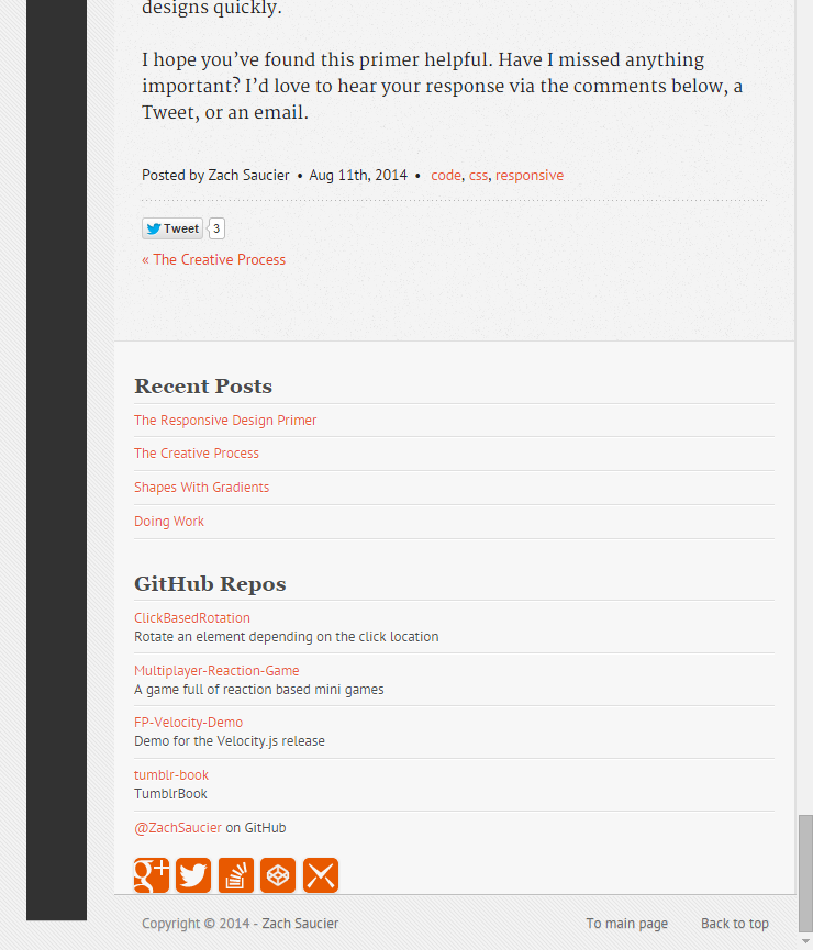
On my personal blog, I decided that, while I want people to see the sidebar menu content still, it's not as important as the main content. As such, I started with it positioned below my main content. When there is adequate room, it'll shoot back up next to the main content to be visible while reading. This is also the most common technique I see when the sidebar is important enough to have on mobile at all.

The "sidebar" content goes below the main content on mobile (left) and acts as a sidebar when it can fit well (right).

This approach also works great for something like citations, commentary, and helpful hint type sidebars. The only difference would be that a link may be inserted for mobile users to auto scroll to the citation or comment.

At times the sidebar content might act more as a navigation, in which case placing it above the main content on mobile is likely a better decision, if not just placing it in an off-canvas menu instead. In this case, I may switch the order of .content and .sidebar to put the sidebar above the main content.

Using an off-canvas menu is also a valid technique for some sites, depending on the sidebar's contents. Navigation, as mentioned, is great for this, but if done right it can be used for some content types as well. When using off-canvas menus, it's important to take into account that less people, generally speaking, will see the content as opposed to something on the main page. Of course, styling and positioning it in a user friendly way is important as always.

In summary, I almost always use an HTML structure similar to the one above, but the behavior of the sidebar menu for mobile varies depending on the sidebar's content. Using a mobile-first approach can help make this decision an easier one to make.

Some of this was taken from my blog post on responsive design, which provides more information on related issues.

0

I usually use the sidebar to display links like if it was a menu. Usually I make the sidebar like on iOS, separated, you have to click it to see the content. I put the links that, or me, are important to the user, for example: Home, About, Contact, Profile, Settings,... or similiar. I like to make sure user will find it but I also like to not place it like a two-column structure, I like to focus on the content.

Hope you understand :)

0

I think this depends on the content, context and aims of the site.

The clearer the differentiation between modules that serve different purposes the better.

Remember that proximity in design plays a role in how we relate things. If two things are close, we perceive them as related. If they are apart/separated, they must be separate.

Your Answer

By clicking “Post Your Answer”, you agree to our terms of service and acknowledge you have read our privacy policy.

Not the answer you're looking for? Browse other questions tagged or ask your own question.