6

enter image description here

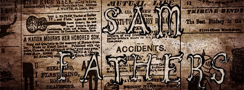
I made this image a few years ago and no longer have the computer I made it on. Now I can't for the life of me figure out what I used for "SAM FATHERS".

Although it looks hand-drawn, it's definitely a font; the differences between the A's and S's is probably due to upper- and lower-case letters producing the variations.

1
  • Hi user30157, welcome to GDSE and thanks for your question. We have a collection of font identification resources right here, and it is a good idea to try those first. Please let us know what you have tried without luck. Always good to show a little effort, and chances of getting a good answer increase. Please don't be discouraged, we know that using this site can be a learning curve. We are happy to have you!
    – Vincent
    Commented Sep 19, 2014 at 7:30

2 Answers 2

8

I think this may be your font... enter image description here

http://www.ffonts.net/Szorakatenusz.font

Process I used to find it...

  • Isolated the individual letterforms in Photoshop using Quick Selection Tool
  • Save as high quality JPG
  • Upload JPG to www.WhatFontIs.com
  • Combine all the individual elements identified by dragging and dropping

Tried also on www.myfonts.com/WhatTheFont without luck. Typically, one or both of these sites will be successful.

And, yes, some fonts will have stylistic or contextual alternatives or ligatures that help to keep text from looking repetitious :)

6
  • 1
    Incredible match. +1 up
    – Ilan
    Commented Sep 20, 2014 at 21:01
  • 1
    Nice find. I bet you could have just searched for "top ugly fonts" and found it though :)
    – Scott
    Commented Sep 20, 2014 at 21:04
  • What do you mean by dragging and dropping?
    – Rosenthal
    Commented Sep 20, 2014 at 21:06
  • Ha! Good thinking Scott xD
    – Tom
    Commented Sep 20, 2014 at 21:11
  • Neo, several of the semi automatic font finding sites (like whatfontis.com) will scan the file and ask you to identify the letters. Sometimes the software picks up bits and pieces, so you drag and drop them right on the page to join the pieces.
    – Tom
    Commented Sep 20, 2014 at 21:13
-2

I looks very similar to Extravaganza but I'm thinking you would have had to convert to outlines and tweak it with some line/stroke attributes?

Check dafont.com or Identifont.com for some faster results to find any font you are looking for. You may find some fonts that have multiple letter shapes. I've seen a few fonts that have multiple designs for characters and switch them based on the order used.

1
  • Hi there, and welcome to GD! This does not really answer the question, and are better suited for the comments-field. Your post will most likely be removed for that reason, but you can edit it to address the question if you like. Do not let that stop you from participating; we know that using this site is a learning curve.
    – benteh
    Commented Sep 20, 2014 at 21:49

Your Answer

By clicking “Post Your Answer”, you agree to our terms of service and acknowledge you have read our privacy policy.

Not the answer you're looking for? Browse other questions tagged or ask your own question.