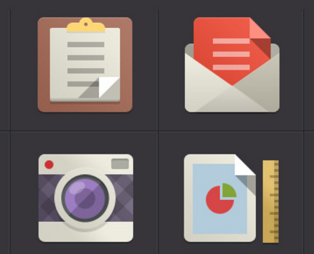
4

When I am using Color Picker in Photoshop or Illustrator I am unable to get a Flat color. What are the things or basic points that I should keep in mind so that I am able to judge a color whether it is flat or not. Although flat color can be picked form websites such as

  1. http://flatuicolors.com/
  2. http://www.flatuicolorpicker.com/all
    e.t.c.

Picking a flat color is not my problem. I want to learn the skill needed to judge and differentiate a flat color from other.
Do all flat colors values follow a pattern ?(like specific hue and saturation).

1
  • 13
    There is no particular definition of a 'flat color' in the context you are using. It's merely just a particular color pallet that those web sites picked. There is no definition of what makes them flat or not other than the person that picked them said so.
    – DA01
    Commented Dec 13, 2015 at 18:35

3 Answers 3

7

This appears to be a misconception about 'flat' design.

The 'Flat UI Colors' from http://flatuicolors.com/ are simply colors that featured in the Flat UI Bootstrap theme, so named because it eschewed popular pseudo-depth effects created by gradients, drop shadows and bevels.

Flat design gets its name from the shapes used. Flat design employs a distinct two-dimensional style that is simply flat.

The concept works without embellishment – drop shadows, bevels, embossing, gradients or other tools that add depth. Every element or box, from image frames to buttons to navigational tools, is crisp and lacks feathered edges or shadows.

...

Color palettes for flat design projects often contain many more hues as well. While most color palettes focus on two or three colors at most, flat design palettes may use six to eight colors equally.

The hues tend to be vibrant – think about the purest colors from the color wheel – without tints or tones. Primary and secondary colors are popular. In addition certain types of colors are also used frequently; in this iteration of the flat design trend, retro colors – including salmon, purple, green and blue – are especially popular.

http://designmodo.com/flat-design-principles/

6

Colours aren't 'flat', designs are. 'Flat' designs use very little to no gradients, and thus restrict themselves to a limited palette—one of the hallmarks of the style.

You can choose any colour, combine it with a few others in the right ways, and the design will still be 'flat'.

1

I agree with @Jackson-Hyde that there are a lot of misconceptions about flat design. It seems generally that "flat" design seems to generally avoid the three pure primary colours (cyan, magenta and yellow). This is not a rule; just a general observation, that does not mean that you cannot use these colours.

Secondly. "Flat" design is quite often NOT flat. A lot of them do have some shading going on. The major difference is that it is subtle and usually a shade of darker of the same colour, as opposed to adding black. This, I think is crucial. So. Flat is not flat.

This owl is a good example: it is kinda shaded, but by geometric shapes opposites in slightly darker:

enter image description here

here are some other examples:

enter image description here

enter image description here

enter image description here

Your Answer

By clicking “Post Your Answer”, you agree to our terms of service and acknowledge you have read our privacy policy.

Not the answer you're looking for? Browse other questions tagged or ask your own question.