I'll try to answer with some generalities first, because the background info seems like it would help in this case.
PANTONE matching ink colors can't be converted perfectly to RGB or CMYK, but there's more than one reason why that is.
RGB as you probably know, applies only to light, and making colors from the three light primaries: Red, Green and Blue. The RGB gamut (full range of possible colors) is wider than for printed ink colors.
Commercial Process color printing uses CMYK inks, and the gamut is narrower than for RGB. Some RGB colors really can't be reproduced in CMYK. Some Pantone inks really can't be reproduced exactly with CMYK process inks either.
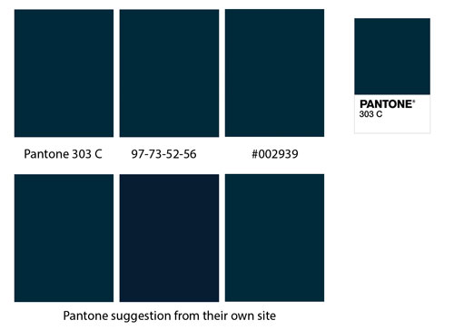
In general, I would use Pantone's own specs for RGB or CMYK conversion, but keeping the gamut mismatches in mind.
Matching printed colors is an art and science. The only way to get somewhat consistent results is to use a color guide printed on the same stock, with the same process (web offset, for example), and same screen frequency. The bright red you get from 100M 100Y is going to look very different on newsprint versus glossy coated brilliant white stock.
Also, using CMYK values in software for a color that is only going to be displayed in RGB (in case that happens) doesn't make any sense -- the on screen display is an approximation of an approximation.
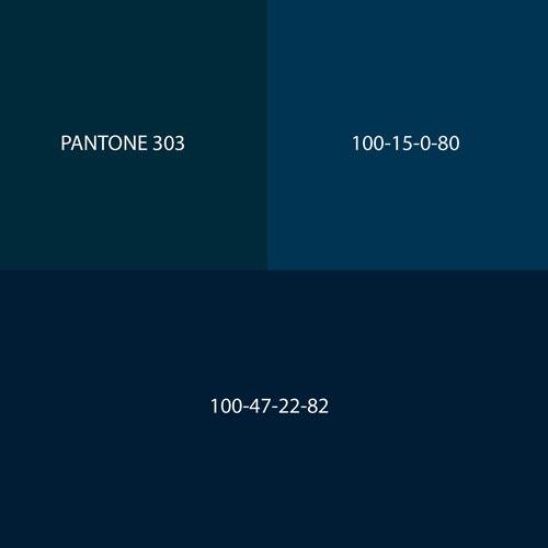
About your specific color: The 100-15-0-80 in CMYK looks lighter and more teal on my screen, but might be right for printing. But there would be no way to know without a matchprint (a calibrated proof made with CMYK colors). The 100-47-22-82 mix looks darker on screen, closer to the RGB 0-49-69, but again, the only way to tell is with a matchprint.
The second RGB spec -- 0-42-58 -- seems greener and yellower.
So, finally, keep in mind that there are many algorithms that are used in software to try to convert from one color system to another. None are exact, and different algorithms can produce different results. But the real thing to keep in mind is that, when going from an onscreen color to a printed color, (almost) all bets are off without actual, calibrated testing on the exact paper stock to be used.
BTW, that is a dark, subtle color you're working with, and it's probably going to look more greenish or blueish from one monitor to another, just using the same RGB values. The only way to get accurate printed results for a Pantone color swatch is to use actual PANTONE ink formulations, and to print them as spot (not process) colors.


