I have just run a test and the only difference appears to be on mobile browsers.
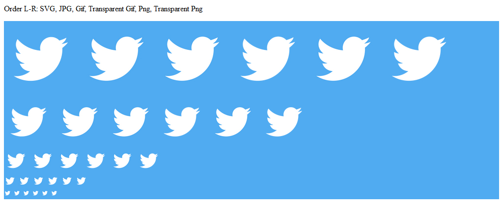
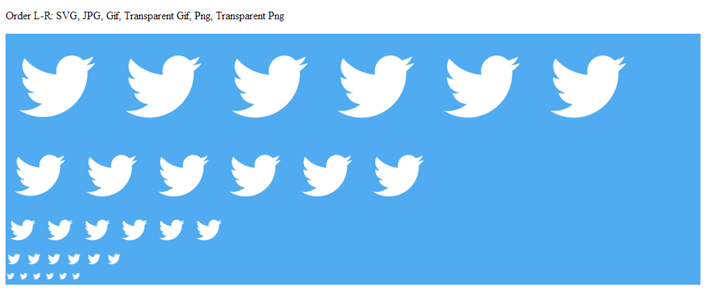
I created a 990 x 900px image of the Twitter icon (that icon seems far too detailed a design for good scaling, so good for this test). I saved this as SVG, JPG, GIF, Transparent GIF (just the bird shape, no background colour, instead adding this with CSS), PNG, transparent PNG.
I then shrunk these down to 15px, 25px, 50px, 100px and 150px.
Here's the results in Firefox:

Here's the results in Chrome:

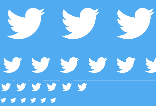
If we zoom into a screengrab of the smallest results so that we can see what pixels are being generated, then Firefox (top) is slightly darkening the edges on the non-transparent versions, but all other results are very similar.

However, on an IPod Touch Safari browser, the SVG version seems quite blurred, and the others quite pixelated:

A similar result is also seen on Android Chrome. I have not taken a screenshot of this.
I wonder if the reason for this could be something to do with pixel density, which is the main difference in display, though that would make more sense to me if all images were handled differently on mobile, rather than just the SVG one.
If someone can explain why this is the case, then I'll transfer the accepted answer tick. Otherwise, I gues the TL;DR answer is that it depends if you prefer blurred or pixelated icons (or to make lots of icons at pixel perfect sizes for your responsive breakpoints).
edit: I've since observed that svgs are usually far clearer on apple devices - the twitter bird may have been too detailed for this to show up in my tests above, so feel that they are the right format to use for icons.

