Designing infographics is a large portion of what I do. Here's a rough breakdown of what I use.
Probably 95% of the work on infographics I do is in Illustrator. You'll want to keep everything in vector format as much as possible because accurate scaling, aligning, grouping, tweaking and changing are so important. If it's a good presentation of good information, then there may be call for differently laid out versions: web, print, poster, interactive, small shareable images for social media, thumbnails... and maybe even an updated version with next year's data. If you keep everything flexible, you'll thank yourself later. A few specific Illustrator features:
- Its chart tools, which are rusty and frustrating but accurate and worth using (a few tips: remember to use
s and r to scale and rotate, normal methods don't work, and when you need to break and ungroup the charts, always keep a grouped copy) and beat the workarounds needed in Corel Draw. That said, I gather that Inkscape has some plugins and is improving in this regard while Adobe neglect their frankly antiquated graph tools. As much as I like Illustrator, I'd drop in an instant if a rival had good, modern, reliable charting tools. Don't be tempted to copy, ungroup and edit charts from Excel - it works, they paste as vectors, but somewhere along the line they get slightly distorted and lose accuracy.
- Its features to apply effects to accurately drawn shapes in an adjustable way, like art brushes, pattern brushes and transform effects. Other vector programs have features like these, but not to the same extent. Anything that makes elements re-usable, tweakable and reconfigurable helps.
- There are loads of scripts for when you need to do things in a precise numerical way. When you need to do something unusual and precise, there's often a script for it. Also, the Align palette is great, and has non-obvious handy tricks like stacking things accurately.
I rarely use InDesign unless a graphic is to be part of a multi-page document (though some people use it for the whole text side of a graphic, placing every element from Illustrator). Two exceptions where I use it:
- Anything built around a table format (even then, it's a good idea to keep wholly graphical elements as illustrator files and place them as needed - particularly for anything adjustable based on data like sparklines - InDesign is fine for placing data but can't do anything with it)
- If it's very text-heavy, being more like a magazine layout with various graphics than a graphic with snippets of text
Photoshop is occasionally very handy for the times when using raster graphics is unavoidable, and Fireworks can be handy for preparing complex things for web or for a suite of variants with the same basic structure. I use both quite rarely for infographics, although there are some people who design one-off simple infographics for web mainly using Photoshop or Fireworks.
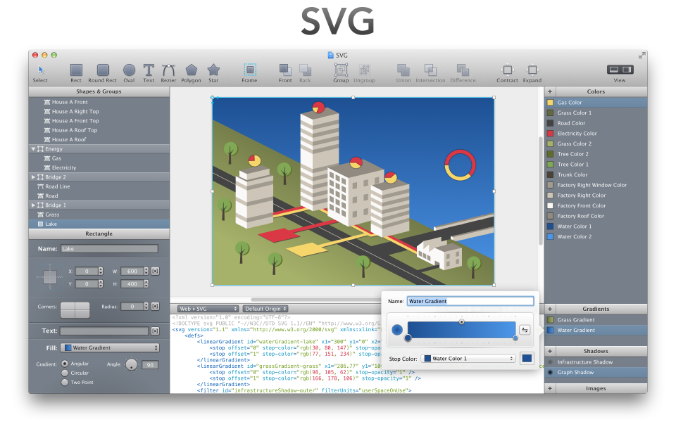
If you're interested at all in interactive infographics, and if you or a colleague know any javascript, another advantage of Illustrator (also true of Inkscape and CorelDraw) is that it can export SVG which can be used as interactive vector elements in a browser.
People sometimes use more simple programs like omnigraffle for simple diagrams, and the idea of low-barrier-to-entry infographics creation tools sometimes gets floated around, but those I've seen have been either just a bunch of pre-made infographics in disguise (e.g. visual.ly create) or ludicrously shallow (e.g. easel.ly).
Edit--
There are now a couple of low-barrier-to-entry tools that don't 100% suck and that add something worth mentioning to the standard infographic format (Vennage and infogr.am). They're early stages and a bit crude, and since they are essentially toy apps they're unlikely to ever be much use to designers except for in-house people avoiding mind-numbingly trival work ("Text and a couple of charts? That's really simple, you can actually do that yourself, here's how...") - but there's something worth noting about them: they export as HTML and SVG (infogr.am uses Raphael, Venngage uses HTML, CSS and D3).
Why does this matter? Because if you design infographics for publishing on web pages, and if you just whack up a png or gif and say job done without using methods like this to output the text as actual, real, live, semantic text in the web page's markup, this will mean that cheesey automated toys like these sites are going to be producing output that has an advantage over your work... I always use Raphael for things like this because it's the only thing that works in old IE and iOS.
Edit 2 ---
Influential information designer / data journalism pioneer Alberto Cairo recently blogged about tools of the trade, and has published some video tutorials on infographics in Illustrator aimed at beginners (I've not tried them so can't vouch for them). The popular dataviz blog Flowing Data also periodically has tutorials which are sometimes code, sometimes stats, sometimes design. These are usually aimed at statisticians looking to boost their design and visualization skills than the other way round, but might be useful.

