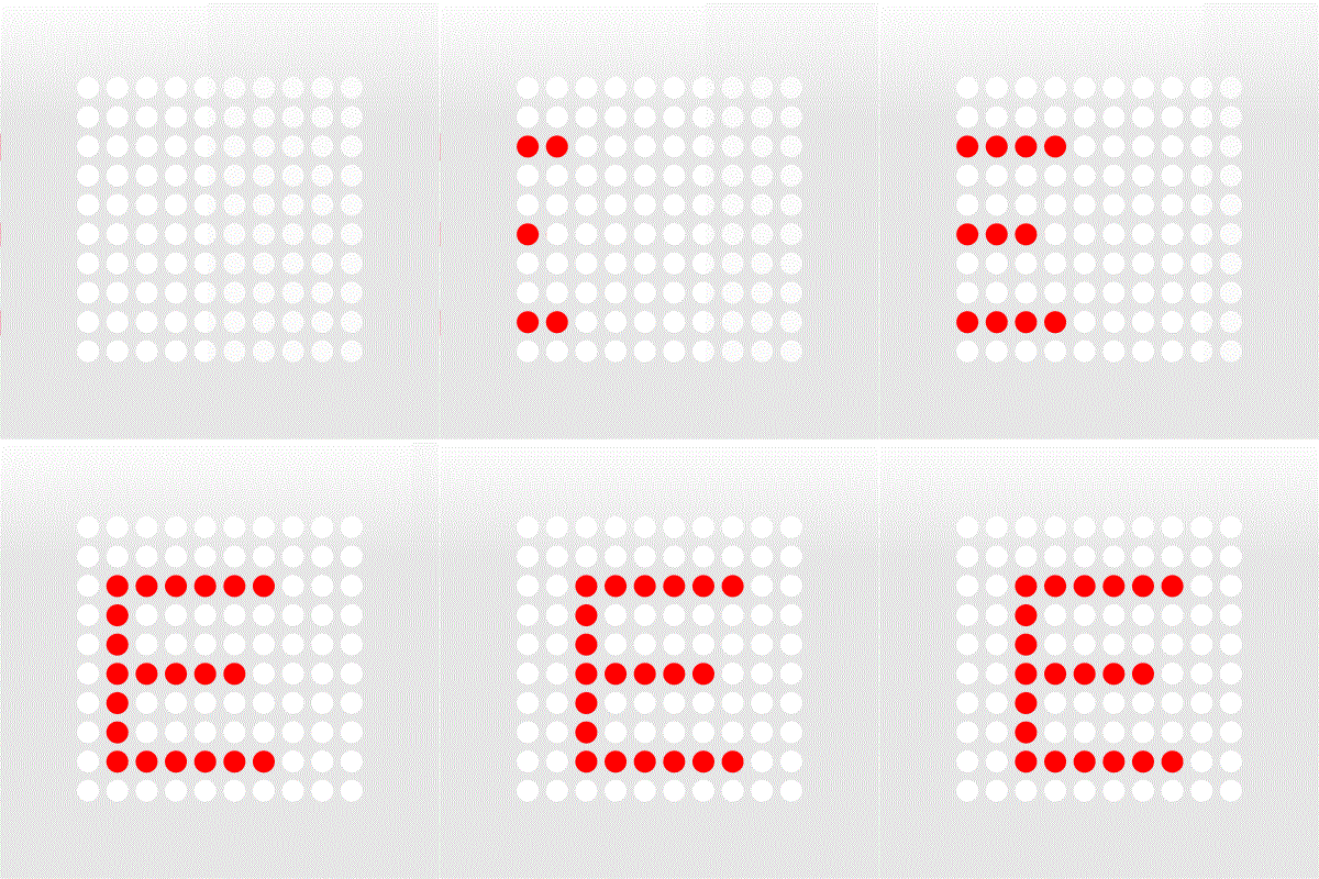
You could just use your image and using a position transition using CSS.
But You probably are refering that the dots should stay fixed in space and start iluminating as the letters pass along.
That is probably easier to animate in After effects or other aplication (inclusive Photoshop) using a dotted pattern mask and moving a layer below the pattern, and exporting it as an animated gif. (You can slightly see that the E is on a square below the pattern)

But using the same logic, you could use a transparent PNG as a mask, and animating a div below the image, again using CSS.
<style>
img {
  background-image: url(E.png);
  background-position:-1000px;
  background-repeat: no-repeat;
  transition: all linear 1s;}
img:hover {
  background-position: 0px;}
</style>

<img src="Mask.png" />
Open this and mouse over the grid.
http://otake.com.mx/Foros/MaskTest/Test1.html
You need to synchronize the speed of the animation, so you do not have half circles. But this was just a simple test.
In this examples I left the grid gray so you can see it, but the efect would be better of course using white.


