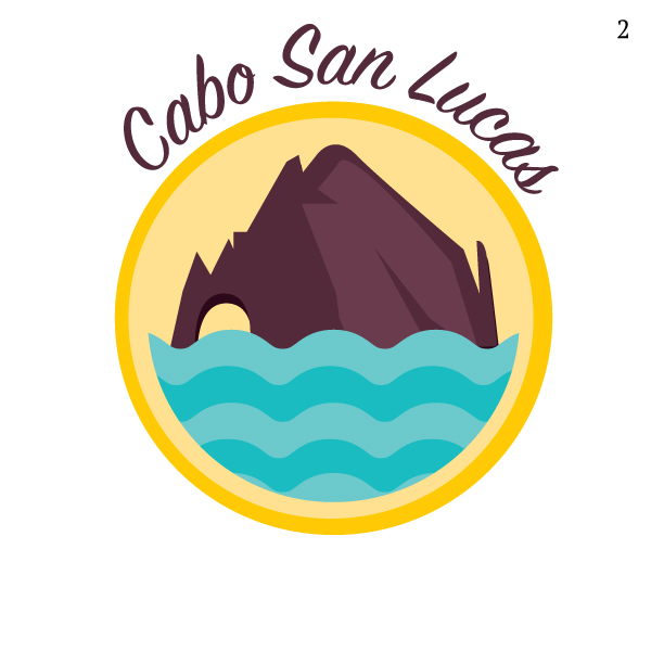
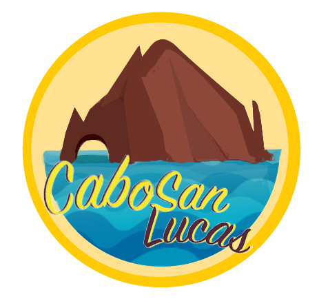
I am creating a logo with the arch from Cabo San Lucas. Any suggestions on how to make it look like it has more depth?
3 Answers
You mean simply: More 3D image look, no need to increase the hidden message content or the visual balance of the set-up - OK?
3D look needs a little bit more perspective. The waves should be smaller at further and maybe to have little flatter contrast, too. The horizon line should exist. The rocky island is too dark. You have no room to make the shadows visible enough. Anything small seen as big in the front and something big or same size in the background seen as small helps.
Try to search how others have illustrated the sea and got it to continue to the horizon.
Addendum: This is maybe an overkill because it destroys the simplicity. But it also tells how I think. The name has been thrown onto the water because there is some free space. Now all can be bigger. Contrast has been increased quite much, more in the front. Sorry for maybe trashing your work. Send a comment if you want this off. If something is ok, the original creator can use it as will.
The illusion of depth is created with highlights and lowlights. Light areas are perceived as being closer to you and darker farther away.
If your main shape is dark you have a challenge. It should be the lighter than its background. Make the sky a gradient from dark blue to medium blue (darker at the horizon) adjust until it looks like daylight sky. The darker you can keep it.
Make the island a gradient side to side - dark brown, light brown, light brown. Or make it light brown with dark brown shadows.
Make the ocean waves closer together as they get farther away. The other important aspect of creating 3D look is perspective, so those top waves should look like they're at the horizon or behind the island.
Based on your original, I feel like you should go the vintage travel poster route. https://goo.gl/images/lR9iGn You can refine the simple shapes you have and use lighting to help get a more "realistic/3d" look. This just adds a little depth without being overly rendered. Another way to think about it is "cell shading" like in animation.
To do this, google pics of El Arco and pick one with clearly defined light and shadow on the rock. https://goo.gl/images/ZJ04dO Design your logo similar to as you have but adjust to have one color for light, one for shadow.
As for the ocean, I think it works better as a flat under El Arco with minimal wave detail or as the stylized waves like you have. But make your waves larger as they get closer to the bottom of the icon to imply some depth.


