5

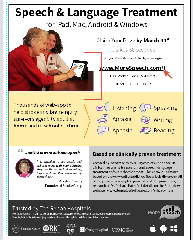
I often run into the problem of having a photo that has an akward edge/framing like the one below. Especially the second one. I like to have a photo with no background to simplify things.

Having part of the abrupt edge or the right edge of the desk in the photo (outlined in red) seems jarring to me.

enter image description here

Some options I've considered:

  1. Border around the photo. Or even better, a nice "polaroid style" photo border. I think that looks good on the web, not so sure how it looks on a printed document. I don't like those options because it adds extra lines/boxes (clutter)

  2. Faded/feathered edge (this isn't too bad, see below))

enter image description here

2
  • 1
    the claim your prize section could be in a box that is another colour. You could use photoshop to extend the table across as long as you want, this maybe tedious and unnatural looking at first, but with some patience and perseverance you could make it look right.
    – Aasim Azam
    Commented Feb 18, 2017 at 5:24
  • Very inteligent question. Congratulations.
    – Rafael
    Commented Mar 20, 2017 at 17:21

3 Answers 3

7

I would...

  • Extend the table the width of the ad (easy to do in this instance, just copy a section, paste, then transform it to stretch the width. Not a lot of clean up is needed).... crop closer to the elbow and rethink the type layout a great deal.
  • Flip the photo - English is read left to right, so if you have an opportunity to push the eye back to the left, use it. (A note about flipping photos check anything in the image for text such as the doctor's name badge. You may need to extract that and flip it back, just as you may need to flip the iPad display back to right reading - I can't actually read any of it in the low res image).
  • Utilize the red in the woman's top to create a visual "circle". This way the eye is pulled to red elements. This keeps the viewer actually looking at the ad longer. They see the URL, then the claim box, then the red in the woman pulls they eye up and to the right, not only leading the viewer back to the URl, but also upward right movements tend to convey "happiness" or "joy".
  • Added the yellow at the top to create some continuity with what is below the photo.
  • Enlarged the photo purposefully to break the yellow backing at the top creating more visual interest than a photo on a white background. In addition, if photos have faces, using larger images helps convey more "friendliness". If I had a higher resolution image, I may have tried breaking the woman's elbow out and overlapping the yellow below it. With the low res image posted here, that proved to be difficult.
  • Minor levels adjustment to the photo to reduce the dark red overtone it contains (may have just been due to low res photo here).

Quick and dirty.....

enter image description here

If possible I'd change all the purple in the ad to red as well.

I'd also transpose the positions of the testimonial and the study, placing the testimonial on the right, and enlarging the photo associated with it. The testimonial is just naturally more compelling to people than a clinical study and the grey box on the right makes things feel off balance to me. I'd also try and make them fit 50% of the space. The study is currently wider than 50%, which may also lead me to that "off balance" feeling. The grey box on the left would balance against the larger photo on the right at the top.

0

I agree the image clips should not end abruptly in your art.

You listed 1 good option, having the image fade into background color.

Framing the image is less desirable. Including frames just to resolve a ragged clip is unnecessary and may adversely affect your design.

What I recommend is using another graphic element in front of the edge of your clip.

Your link and contact text can be in a colored shape that overlaps the desk edge. This will hide the clipped edge of the desk and give a layered effect, making the text shape appear in front of the people.

Another option is to use additional photo clips, make a collage of elements. mask the edge with another photo that adds to the message, a photo that may contain large blank areas where you can put that text.

0

There's nothing wrong with your feathered edge version.

You could also frame the whole "Claim you prize" copy (instead of the photo) and let the frame of the text sit above and abut sharp edge of the photo so the photo appears to lie under the text block to its right.

The "Claim your prize" would then align with the "Based on clinical evidence" block at the bottom of the cut. You would also push the photo slightly left but the hunched back of the elder wouldn't be missed if cropped, IMO.

Your Answer

By clicking “Post Your Answer”, you agree to our terms of service and acknowledge you have read our privacy policy.

Not the answer you're looking for? Browse other questions tagged or ask your own question.