1

I've had this issue for a while on all my files that I created and then exported from Illustrator.


[here's the scenario]

I create an image in Illustrator using CMYK.

(I prefer to work in CMYK mode since I understand the way those colors interact with each-other much better than RGB or HEX)

I go to File > Export > JPEG > Color Mode = CMYK

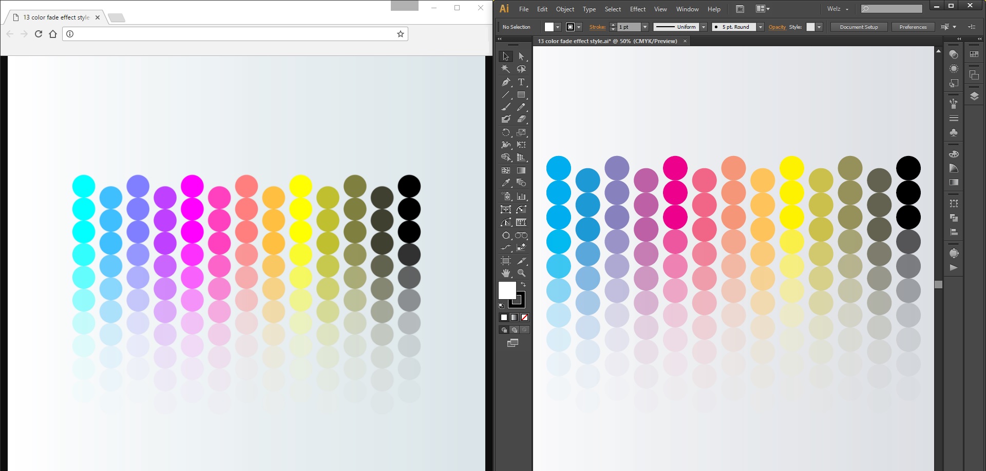
I then open the file (I've tried in many different Photo Viewers, including other devices and phones) but the color is just completely way off from the way I had created it in Illustrator.


How It looks in Illustrator vs. How it looks when Exported (viewed in Chrome)


I've figured out a solution to the problem - I can either use the Save For Web option or use RGB Color Mode and I would get the correct colors displayed.

However, I'm wondering Why does it happen?

8
  • I voted to close this as too broad, but really it's a duplicate of many questions here. Here is one such question: graphicdesign.stackexchange.com/questions/7815/… - The long and short if it is that RGB and CMYK are different* color spectrums.
    – Scott
    Commented Apr 20, 2017 at 1:15
  • @Metis when I export as CMYK, (which it was created in) why then does it not display the colors correctly?
    – Welz
    Commented Apr 20, 2017 at 1:19
  • Please read the question I liked to, don't ask me to repeat it all here. "Other devices and phones" use RGB displays.
    – Scott
    Commented Apr 20, 2017 at 1:27
  • 1
    The viewer is not aware of your color profiling settings, and is atleast by default really badly configured to preview color. Note 99% of all imaging software are unable to use profiles correctly. Because thats just more work than the entire rest of the software.
    – joojaa
    Commented Apr 20, 2017 at 4:27
  • 1
    But in the end all of this is mostly irrelevant if you havent calibrated/profiled your monitor.
    – joojaa
    Commented Apr 20, 2017 at 4:33

3 Answers 3

1

Color is much more complicated than people give credit for. In fact it is a insanely complex subject. Not only that but its not even clear what we mean when we say color. Physics and cognitive psychology have different meanings for the word, and they are not compatible. For graphic design and printing only the cognitive psychologists meaning of color has any meaning.

In essence, making a extremely long story short, RGB and CMYK values only have a meaning when paired with a physical device or a defined space (sort of a virtual reference device). So conversion between CMYK and RGB is meaningless without knowing what specific color space they were defined in. We call these spaces device profiles.

Now CMY is the dual of RGB, and the order of the names are not a mistake. Cyan is the inverse of red that is cyan paint removes red color from the spectrum. But the fact that the other is subtractive and the other is additive is just a red herring. The reason why you can not make a perfect conversion from RGB to CMY(K) is that basically you are spanning your color space in the form of a triangle if you turn that triangle 180 degrees there is no longer any way for the triangle to fill the same area as the other.

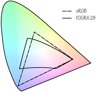
Graphing the a CMYK and RGB space looks like image 1. The chromatically chart just takes a sudden turn due to way its been mapped so the 4th corner of FOGRA 28 (a CMYK space) is just because of the way the data has been measured. In reality, the values on the magenta side don't exist, just in our brain, so they can not be directly measures.

Also worth noting that the chormaticity chart is 3 dimensional and what you see is just one slice.


enter image description here

Image 1: Chromaticty chart of a RGB and a CMYK space

Now you can see that both the RGB and CMYK have colors that they can produce and the other can not. There is no way you can do this as two triangles with vertices pointing in different directions simply can not fill the same space.

Also the overall size of the spaces differ simply because each manufacturer tries to be as big as possible. So there will allays be more colors in the spaces that you can never see in the other.

Now To see color across spaces means that the system has to emulate the other space. Now not all applications can even begin to do that, they simply have no notion of color spaces, this would also be a bit overkill as most machines are not calibrated for it to be meaningful. Also quite commonly systems do not allow for CMYK conversion.

1

So after reading up and looking into this more (from here amongst other places), I've found out that...

  • RGB starts at black and you then remove color till it gets to white.

  • CMYK starts at white and you then add color till you get to black.

Before I had found this out I had thought, "gee, CMYK is so much better (IMO, feel free to comment yours), why don't they just make screens like that?"

Now, after a considerable amount of research, I think I know why it wouldn't work, (but I'd love to get feedback from you guys). Reason below


Think of a LCD monitor (which displays RGB) and a piece of paper (which displays CMYK)

  • The monitor: when displaying no color - shows black

  • The paper: when displaying no color - shows white

The Answer: The screen, cannot display something which is meant to be displayed on the paper and vice-versa.


The reason my idea probably wouldn't work:

(I may be understanding this completely wrong)

It would mean that the monitor would be like a piece of paper, you add color, not remove it. Now a piece of paper... is pretty much a one time use - (have you ever seen the color of recycled paper? it's never even close to white!) so after each use (every frame the screen wants to change the pixels colors) it would be like re-using that piece of paper, within minutes, your screen would be nasty looking.

Whereas if the screen is all black, you remove color to get to white, the reason that you'r screen isn't getting lighter every time you use it, is because it's much easier to add back the color, than it is to remove it.


Now of course, the screen isn't made of paper, and the color isn't pigment from actual dyes/inks. it's using little tiny flashlights with color filters overlaying it etc.

(I don't really know exactly how it works, please correct me where I'm wrong)

If the screen were all white (if this were possible at all) it would require having stronger (more, and darker) light filters on top of those led's in order to have the ability to produce darker objects, whereas the regular monitor (defaulting at black) just has to add in the bright lights.

0

CMYK is for printing, it display the artwork as if it is printed because of printing inks limitations. If you want want to create a work that is for display you have to choose RGB.

Your Answer

By clicking “Post Your Answer”, you agree to our terms of service and acknowledge you have read our privacy policy.

Not the answer you're looking for? Browse other questions tagged or ask your own question.