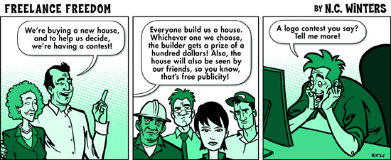
On the point of contests in general, on top of what Farray's said I'll just add, do the maths: $490 prize for one person out of 1,109 entrants? Assuming all designs took just two hours on average and people keep at it as long as it takes until they finally win something, that'd give the designers participating in this system an average wage of 22 cents an hour. I imagine you probably spent longer on yours, so it's probably even lower for you. That's exploitation. Your time is worth more than that, and that's clearly no way to pay the bills.

(from http://freelanceswitch.com/freelance-freedom/freelance-freedom-158/)
There's an actual campaign, No Spec, against spec work (including exploitative contests) like this.
There are better ways to gain practical experience early in your design career. Anything that doesn't involve real direct feedback from a real human with a real mutual understanding of your real shared goal is like practising archery blindfolded.
Edit: Since writing this, I did actually meet one guy who had not bad experiences of these kind of contests (first ever) - but not in the way most people who enter them are hoping.
He works in interior design, and occasionally enters logo / web design contests because it's a no-risk, no-commitment way to keep his unused graphics skills slightly fresher. He prefers it to pro-bono work as there's no risk or commitment, and he prefers it to self-initiated work as, after a tiring day on his regular job, he's more likely to actually knuckle down if there's a convenient list of near-random briefs to idly choose from and actual deadlines to make it happen.
He's an exception that proves the rule. Like him, never enter competitions like these expecting to make any money, and never expect any meaningful or useful feedback. Use them only if you want an easy, lazy, no risk way to keep certain skills in practice, and if you're not realistically going to get around to doing higher-effort but more rewarding things like pro-bono and self-initiated projects.
As for the question of why your design didn't go down well, here's one concrete issue with why your actual submitted design probably didn't go down well:
I personally quite like it, it's got some character, it's fairly memorable, original and intriguing (a few critiques below). This is probably a big part of the reason why it didn't work out: it very effectively communicates a personality, but when the "client" is someone you've never met who's disinterested in the logo design process to the point of using a contest instead of actually working with someone, what's the chances of it by luck matching the specific personality of this company/guy you've never met?
If they wanted something challenging, innovative or high quality, they'd have chosen a designer and worked with them in a proper process. They went with a contest because they probably don't care very much and just want something (anything) that looks professionally produced, so they probably went with something very ordinary.
The following are more passing comments than part of an answer, but I'll throw them in anyway:
- Minor tip: the moustache looks a little bit high relative to its size and the size of the hat
- There's no real stylistic relationship between the "ecilipse" backdrop and the chef image. At first I didn't even realise the eclipse thing was part of the logo, I thought it was a separate presentational device and only realised it was part of the logo when I realised it was an eclipse. There should be some correspondence that ties them together as being part of one unit - for example, the stark white with non-perfectly-circular edges style that exists in the logo could work for an eclipse.
- There's also not much correspondence between the text and the central image (the fact it seems you weren't satisfied with any one of the placements of the text, and the fact it seems to work as well as part of the image as it does as something wholly separate floating outside it, is always a good warning flag that something needs re-thinking). The typography doesn't feel like it's adding much to the image, and the earnest serious sci-fi/space character of the type feels like a clash with the slightly cool cheeky understated character of the cartoon
- Book recommendation: Really good logos explained, it's a panel of designers giving good quality critiques and comments on a bunch of decent, realistic quality logos. Full of valuable practical insights.

