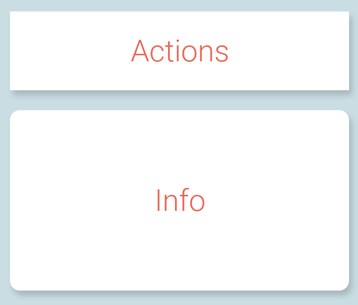
In graphic design (specifically for web and mobile) is it acceptable to combine elements that have rounded corners with elements that have sharp corners on one screen?
The purpose from of this from a UX perspective is to visualize that the rounded is for displaying information and the sharp is for actionable elements.
Is it acceptable from a graphic design perspective in to combine both rounded and sharp cornered elements on one page?

