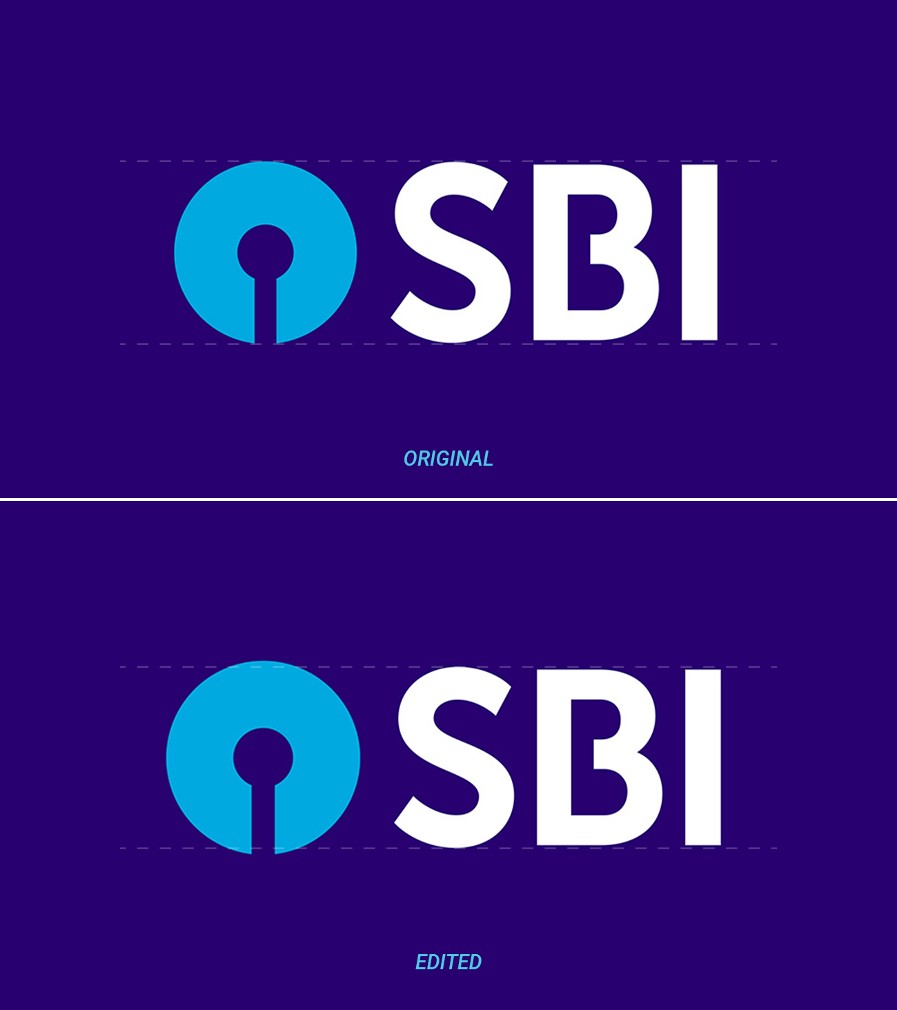
The design in question here is an official variation of the SBI logo:
Now, I've always felt that the main circular icon feels a bit smaller, and must be corrected by enlarging it a bit to make it look more aesthetic and balanced from both sides.
Does it really make it look better? Or the original one is still better?
PS: I know there will be people here who will mark this question as opinion based. But I've seen many many famous designs that do things like this, just to make it look better. So, so I guess there must be some reason behind it, rather than opinion.

