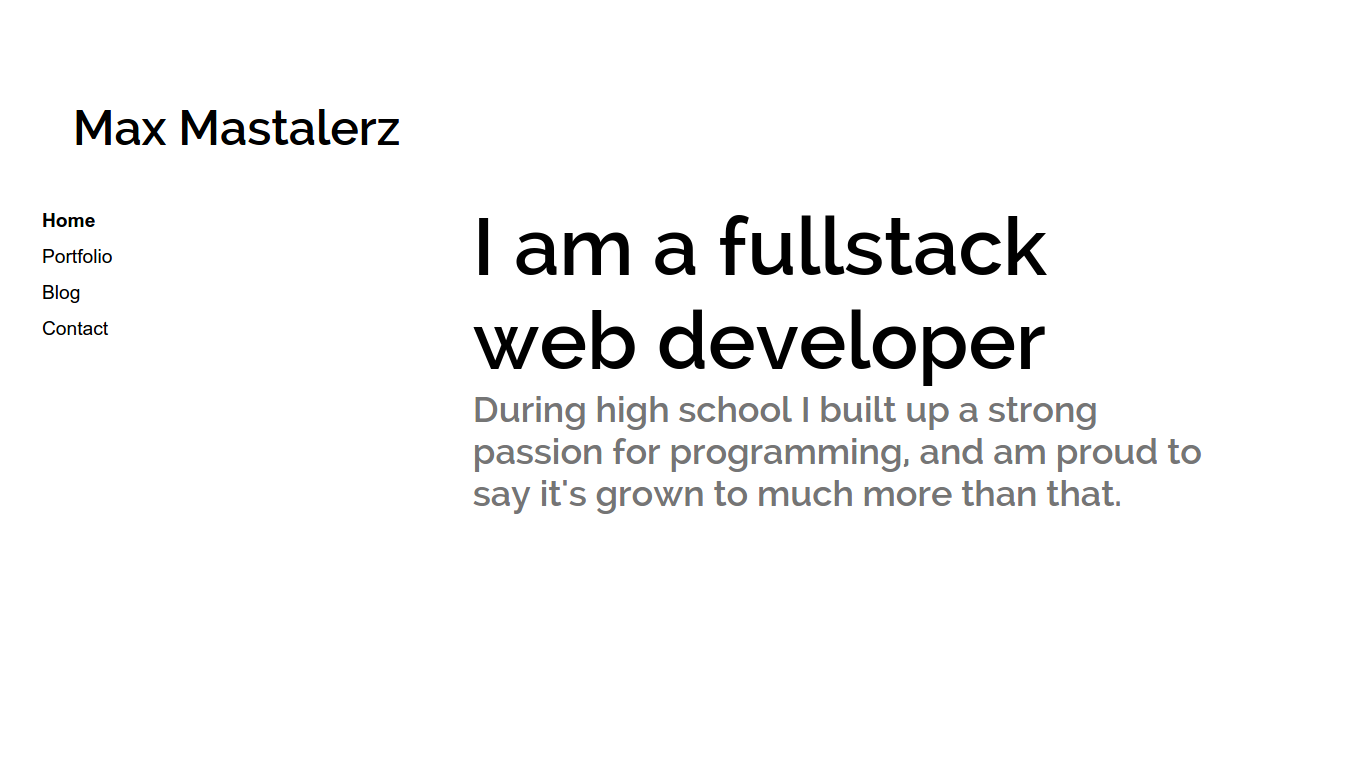
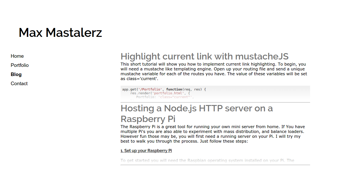
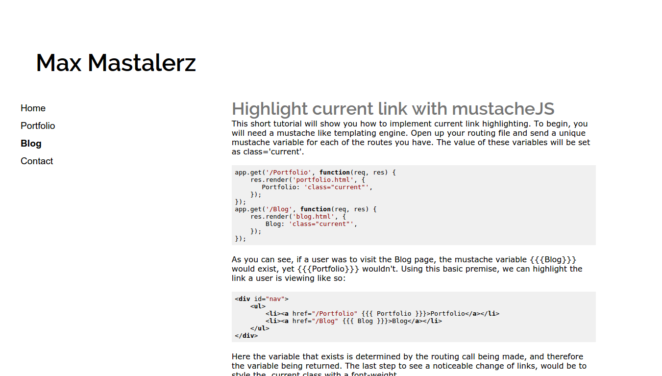
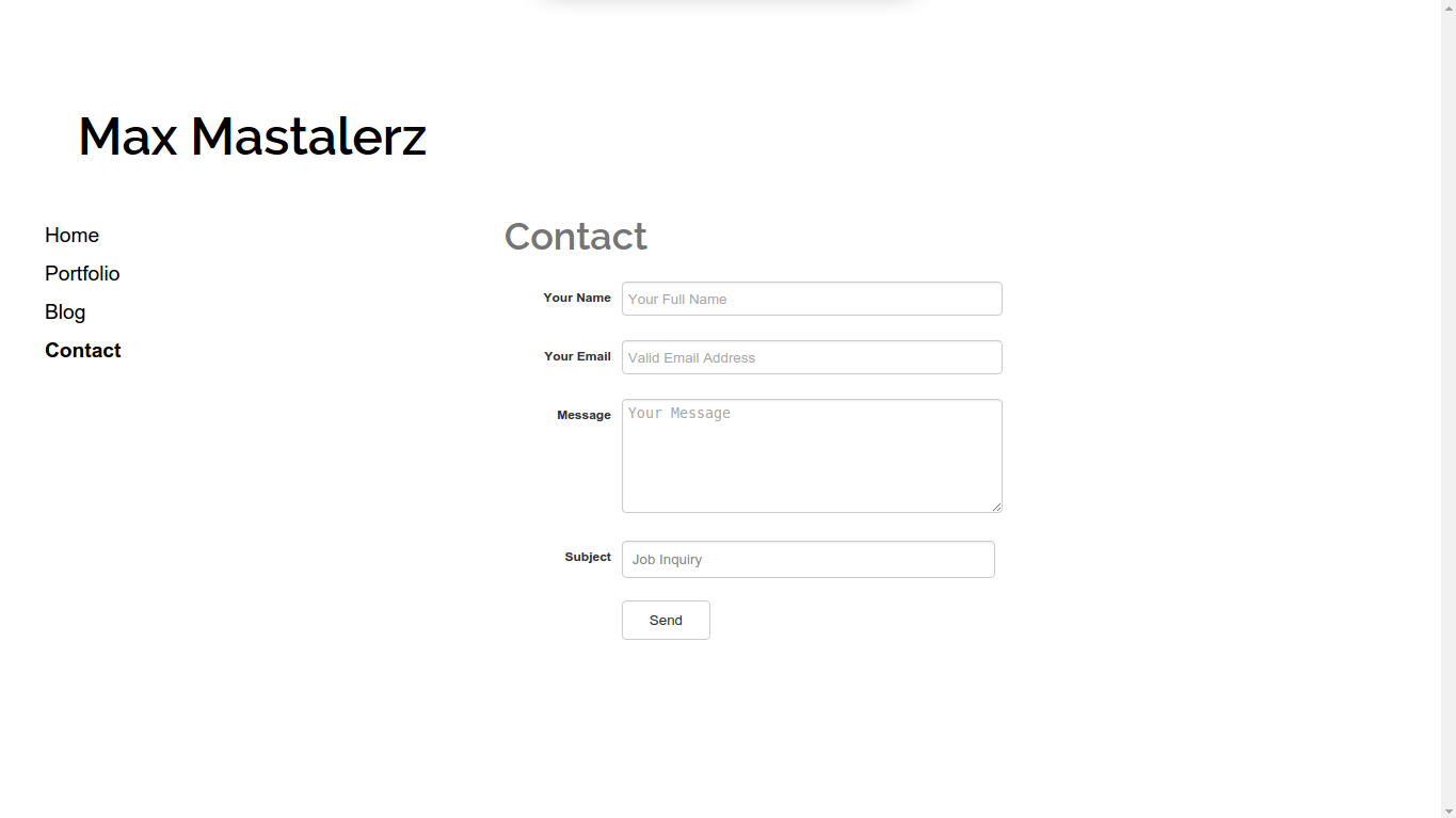
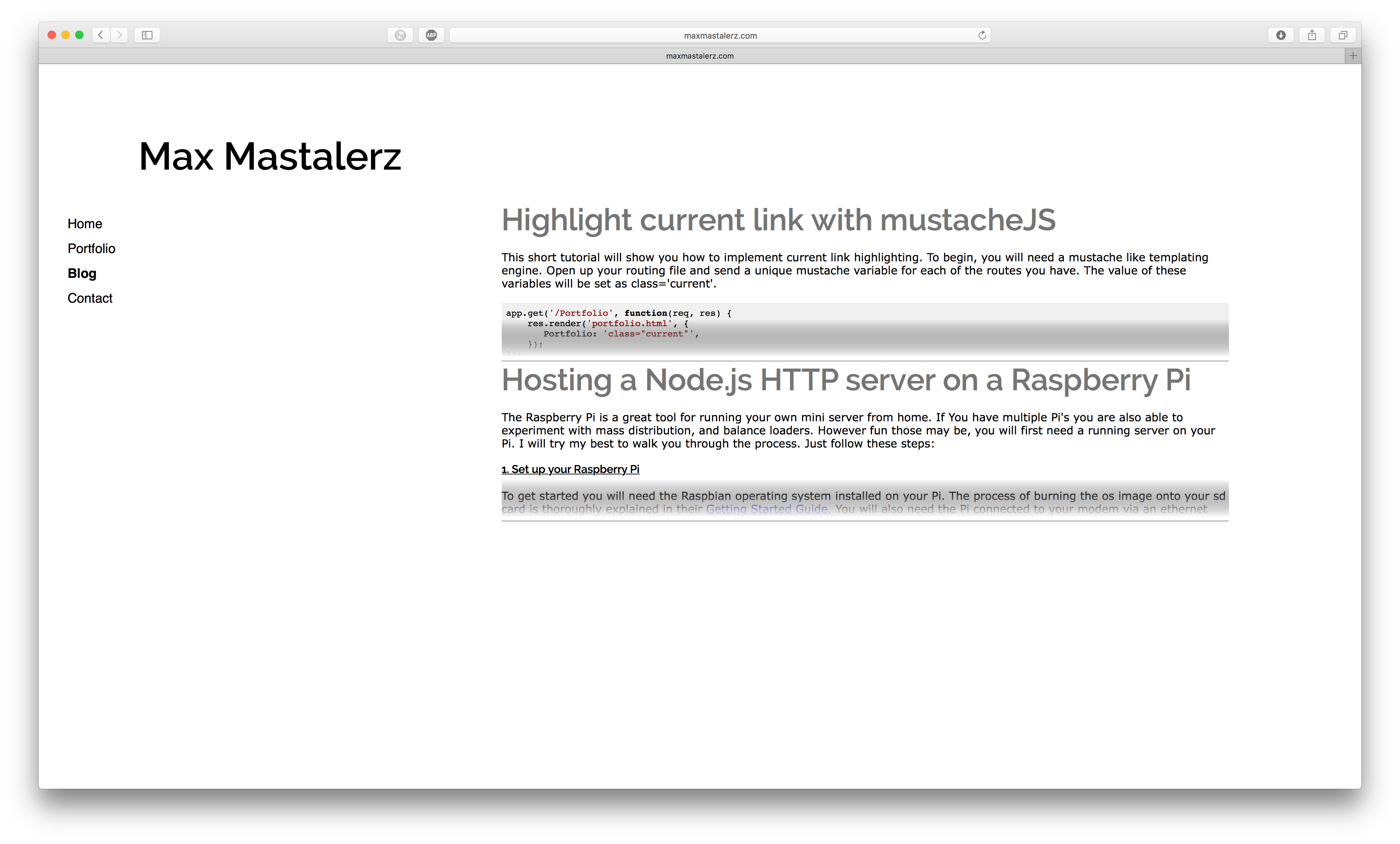
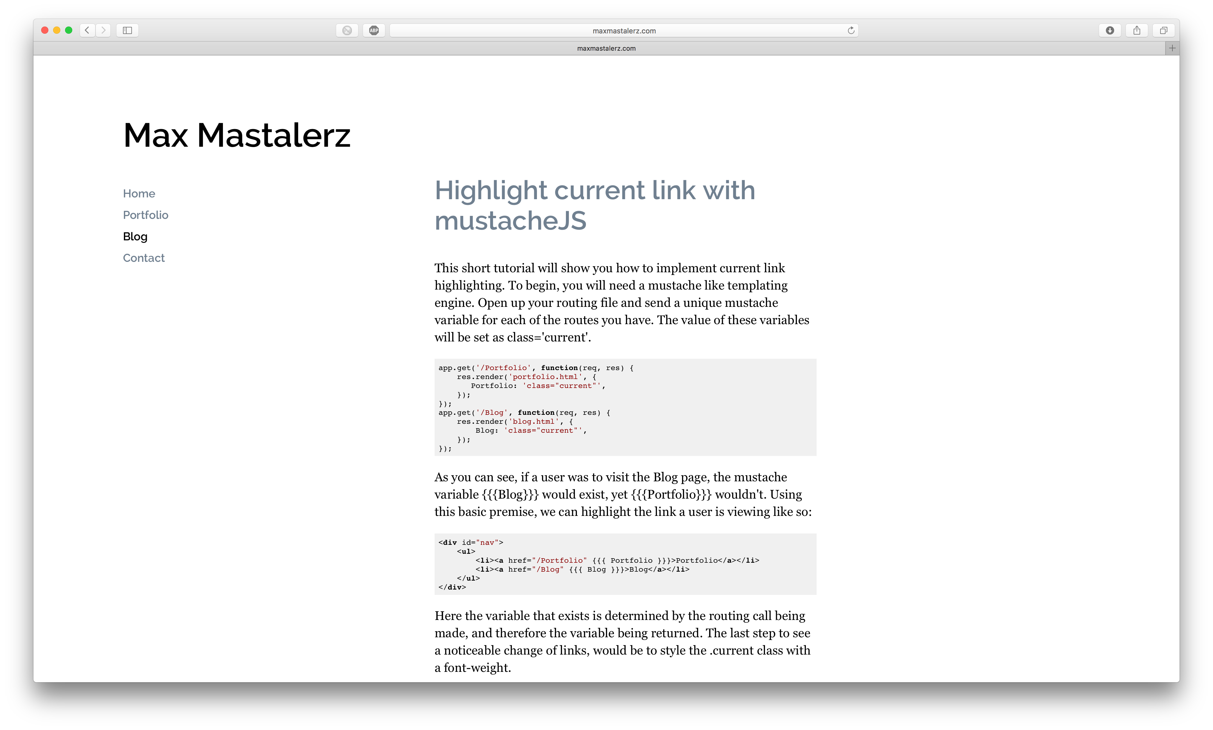
I would like to start off with: 'I am not a designer'. I am a programmer. I was hoping some of you design guru's could comment on the design I have made for my portfolio site.
I tried to make the design responsive and seem to like the result, yet there is always room for improvement. The site follows a google white space style, and is meant to be look cleanly.
Some things to ignore for the time being:
- I am yet to fix the fact that blog content centers in mobile view.
- I am yet to fix the width of the facebook comment box overflowing in mobile view.
One more thing I am wondering about is whether or not the font choice is readable? I have a feeling something else could improve the user experience.
Here are some pictures:

