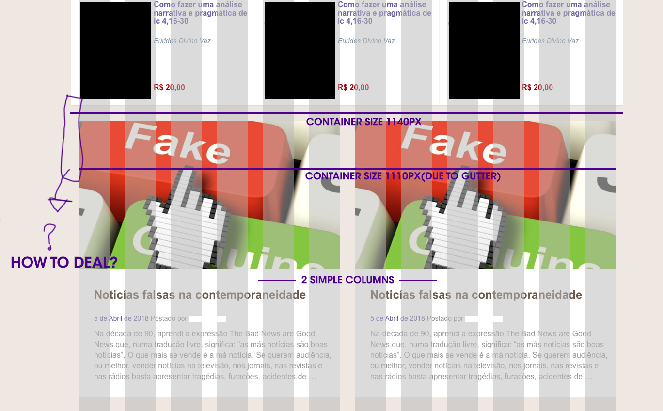
Bootstrap is a simple 12 column grid.
How you configure that in design software depends entirely on the width you want to design at. Essentially create a new document and set up 12 column guides.
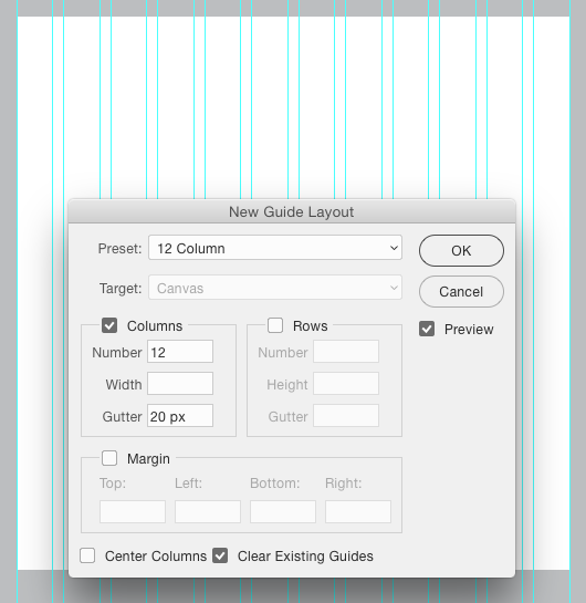
For Photoshop, you can use View > New Guide Layout and merely choose the default "12 Column" from the drop down menu:

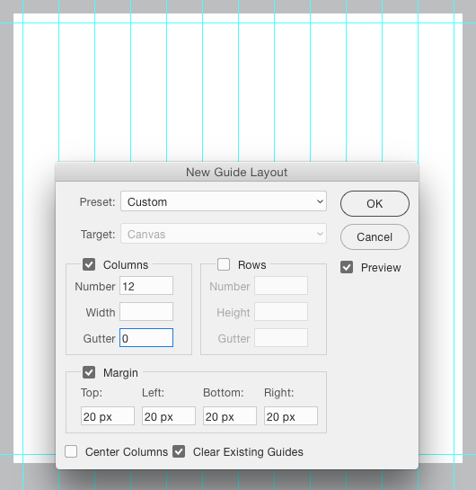
I, personally prefer to remove the padding for the columns and add a page margin:

This, for me, gives me a decent indication of the break points.
(I don't use Sketch, can't comment there)
Disclosure: I don't create full page designs in graphic software to directly export to markup. I use graphic software to explore via mockups or wireframes, but I'm never seeking any sort of pixel-perfect representation of HTML. I learned long ago, that can be more trouble than its worth. These sort of setups, for me, are more along the lines of "sketches" as opposed to "comprehensives".
I build "comps" in browser with a text editor.
This tends to be more true due to responsiveness and any design at 1000px wide isn't going to be the same design at 1200px or 700px wide. So, spending a lot of time fleshing out one width in graphics software can be wasted overall.
I'd also point out that Bootstrap, in itself, is a great tool. However, it really does a lot of "designing" for you. If you are more interested in the responsiveness without the design aspects, you might look into Zurb Foundation - All the responsiveness benefits without having to scour CSS files to override a button color or something along those lines.
