7

I have never made a font so bare with me if this is a beginner question. I am wondering what the dimensions are of a monospaced font. I understand that since it is monospaced every glyph has the same width, but that's all I understand.

I'm wondering about the other dimensions.

enter image description here

Specifically, #1, #2, #3, #5, #19, #20.

Basically, what the midpoint of the glyph is (where the lines cross on the x, or the line on the e), what the baseline is (how high from the bottom of the g), or alternatively how far below the baseline the long letters go like the g. Also, how far above the lowercase letters the tall letters go (like the l).

If it is different for every monospace font, then that's good to know. Maybe there is a standard range though, so it's not a super tall and narrow font. Wondering if it needs to be a perfect square (width == height), or if not, yeah then what the dimensions typically are.

2 Answers 2

5

Monospaced does not define any of the other attributes. A monospaced fonts aspect ratio is rarely a square, unless it is used for Japanese or Chinese*. This is simply because the characters in the Latin alphabets need vertical space more than they need width. And since the font is monospaced you need to come to some compromise as to how much the ratio is.

Now for practical reasons you don't want the x-height be too small as monospaced fonts are more often than not used on screen. And a very small x-height would necessitate very large fonts. But ultimately all the other variables are for the font designer to decide.

*even many of the monospaced fonts that do include monospaced Kanji and Latin alphabets tend to have a different width for them than for Latin letters.

4

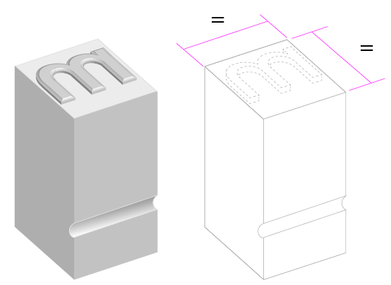
Taking the m-space as a modular basis, there is a coordinate system for measurements.

In the typographic printing system, a type without printing relief was used for spaces, whose width is equal to the height of the volume's face, that is,

  • width = type size

It used to correspond to the width of the lowercase character m, that's why it's called m-space. Its half is the n-space. (Wikipedia)

quad

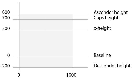
Taking as an example the m-space divided into 1000 units and placing the baseline, it divides the m-space into two parts: a superior or ascending one that occupies 80% and a lower or descending one that occupies the remaining 20%. The baseline works as an origin and therefore the superior units are positive and the inferior units are negative:

formula

The Caps height represents the 70% of the type size. The lowercase height, x-height, represents the 70% of the height of the capitals or half of the type size, which would place the x-height line more or less towards 500 units. The descender height may coincide with the base of the m-space. The ascenders height may or may not match the height of the capitals.

Source: http://www.dicecomunicacion.com/blog/cuadratin-y-diseno-de-tipografia/

In the case of a monospace font, the measure with the greatest variability with respect to the example shown is the vertical quad width. But horizontal measures are a good reference to start a font design.

Your Answer

By clicking “Post Your Answer”, you agree to our terms of service and acknowledge you have read our privacy policy.

Not the answer you're looking for? Browse other questions tagged or ask your own question.