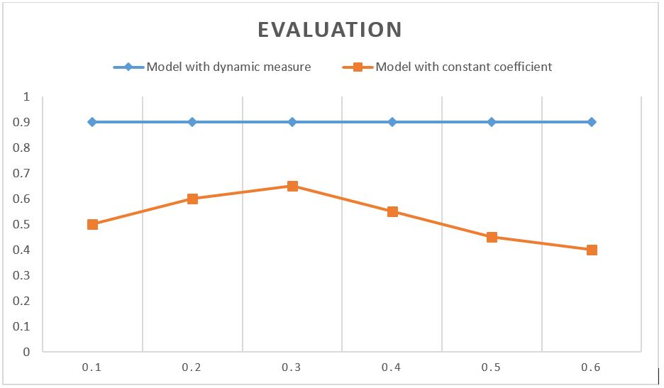
I proposed a measure which estimates the coefficient of each sample dynamically, So the coefficient of two sample s1 and s2 can be different. To show the effectiveness of this measure, I want to compare it with different constant coefficients. The constant coefficients are in the range of 0.1 to 0.6. When the constant coefficient Y is for example 0.2, it is equal for all samples. There are 1000 samples in the dataset.
I want to represent the effectiveness in a chart.
The scores are as follows:
The score of dynamic measure: 0.9
The score of constant coefficients Y:
- Y=0.1 ⇒ score=0.5
- Y=0.2 ⇒ score=0.6
- Y=0.3 ⇒ score=0.65
- Y=0.4 ⇒ score=0.55
- Y=0.5 ⇒ score=0.45
- Y=0.6 ⇒ score=0.40
How can I show the differences between the effectiveness of dynamic measures in a chart that clearer than what I already have?
I used the following chart, but it is not clear for some of the readers. So, I would like to make some changes to make it more readable.
Any help is appreciated.


:):)