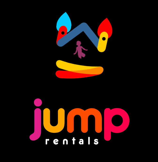
Ok i need help. I am currently making a logo for a company called “Jump Jump Rentals” specializing in Bounce Houses. How can I add the kinetic element of jumping to the 1st word “jump” over 2nd part “jump rentals? (But still maintain a clean look)
-
If the company is called "Jump Jump rentals" and you already have a bouncy house with a kid jumping in there, are you sure you need more jumping elements in the logo? Simple is usually better. You should think about choosing one over the other.– LucianoCommented Apr 23, 2019 at 14:16
4 Answers
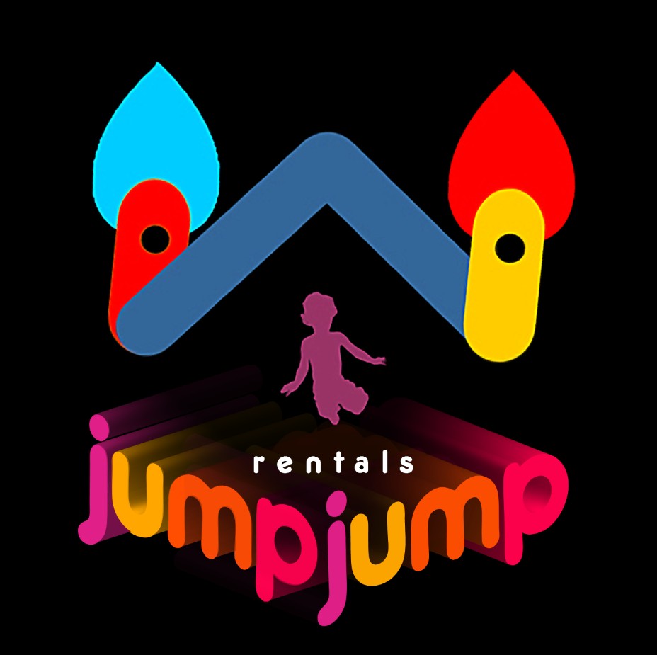
You could simply repeat / complement the effect in the bouncy house's floor, something similar to my example below:
Probably you need to work the colors and perhaps the positioning of the letters, I just repeated and rotated the existing word.
Assuming you can use more colors, use company name as your jumping platform. You can get much bigger boy and house. There's no need to make the name look out bouncing, the boy and the top part already do it, thanks to jump jump.
I rotated the top part to make its bouncing more subtle.
The bounce surface in your image presents a motion aspect with the doubling and rotation from one end.
Add a second Jump, pivot it at the right end and change the bounce surface to rotate at the opposite side.
The tilt of the roof also gives motion feel to the image.
-
"but Jump appears only once"... Yes, he's asking where and how to put the other "jump".– user120647Commented Apr 21, 2019 at 22:16


