0

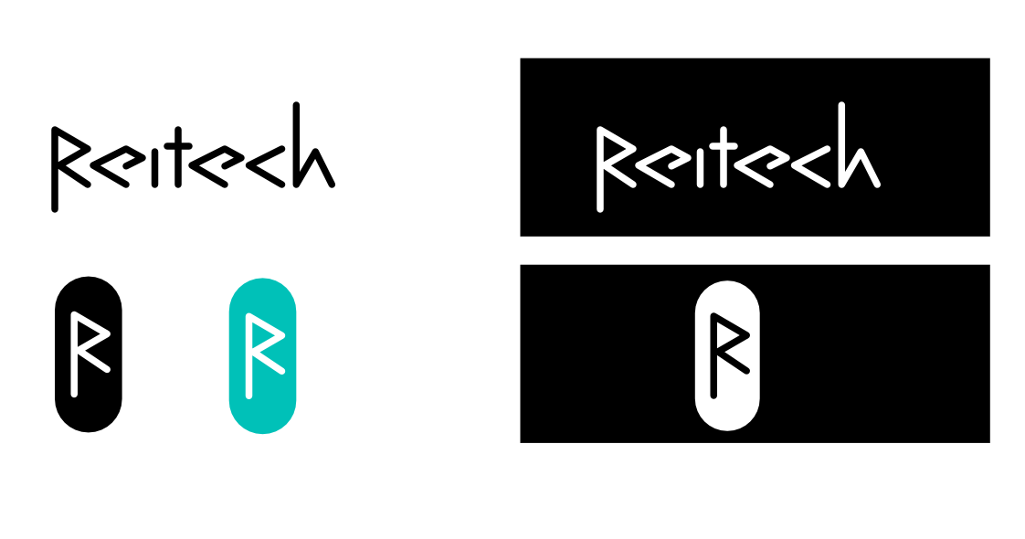
I am creating a logo for a tech company, Reitech. The company creates software, tools, and plugins. The company is also doing programming consulting.

I am not a designer, but I like working with design and improve my skills, so I would love some feedback on the first draft I made. I created a wordmark/logotype design, and an abstract logo (at least that is what I think the terms are called).

Background

I tried to incorporate the symbols, <,> as the underlying theme. I got inspired to combine these symbols creating the, , from the Futhark runic alphabet as the capital letter. (I thought about using </> as a theme as well, but weren't able to incorporate the /).

Logo design

I have a few questions:

  1. Is the logo readable? Does it read "Reitech"? Maybe the "e"s in the logo are difficult to recognize?
  2. Does the spacing (kerning) between the letters need some adjustment?
  3. Did I go overboard on trying to force the theme? Maybe a subtle change is better, like only using < in the "c"?
  4. Is the logo (inside the capsule) too similar to the Bluetooth logo?

Any other type of feedback is welcome.

3
  • 2
    I disagree that it’s particularly hard to read. I saw the logo before reading the text, and my immediate thought was, “Reitech? The hell is that?” – or rather, that was my second thought. My first thought was, “Ooh, botched Bluetooth logo!”, so a definite yes to #4. Commented Mar 30, 2021 at 7:38
  • But as a technical item it could be good for a blacksmith who makes iron and copper stuff based on 1000...1300 years old Scandinavian models.
    – user82991
    Commented Mar 30, 2021 at 12:15
  • I also disagree that it's hard to read. But it seems strange to me to see Futhark inspired letters in lowercase.
    – Wolff
    Commented Mar 30, 2021 at 15:32

2 Answers 2

2

It's unreadable in my opinion.... well.... it can be read, but requires way too much effort from the viewer to figure it out. It's simply too stylized if the goal is easy readability.

At no point would I ever, in a million years, know the intention was to represent brackets (<, >). Especially since seemingly the only right bracket is in the R. I can't count those horrible es.... :) To me, it just looks like horribly hard to read type.

The R alone, honestly... merely feels like a bluetooth rip off (which it kind of is from your explanation).

3
  • Thanks for the feedback. I kind of thought it would be too difficult to read. Maybe it's better to get back to the drawing board, and consider using a font instead.
    – John
    Commented Mar 30, 2021 at 2:23
  • 1
    @John I'm all for not relying on a font. In fact, I really prefer logos that don't simply use a font they found (so their third cousin, twice removed, can recreate the logo merely by buying/downloading the font). But you should still keep readability/legibility in mind. -- of course... there's no law which states a logo must be readable :) The Death Metal genre of music is infamous for impossible to read logos. ;)
    – Scott
    Commented Mar 30, 2021 at 2:24
  • Agreed on all points with Scott here. Commented Mar 30, 2021 at 15:16
1

Too close to the Bluetooth symbol and almost unreadable. Honestly if you just type the name in Arial Black it can already look better than this. I think you need to reconsider the design.

Your Answer

By clicking “Post Your Answer”, you agree to our terms of service and acknowledge you have read our privacy policy.

Not the answer you're looking for? Browse other questions tagged or ask your own question.