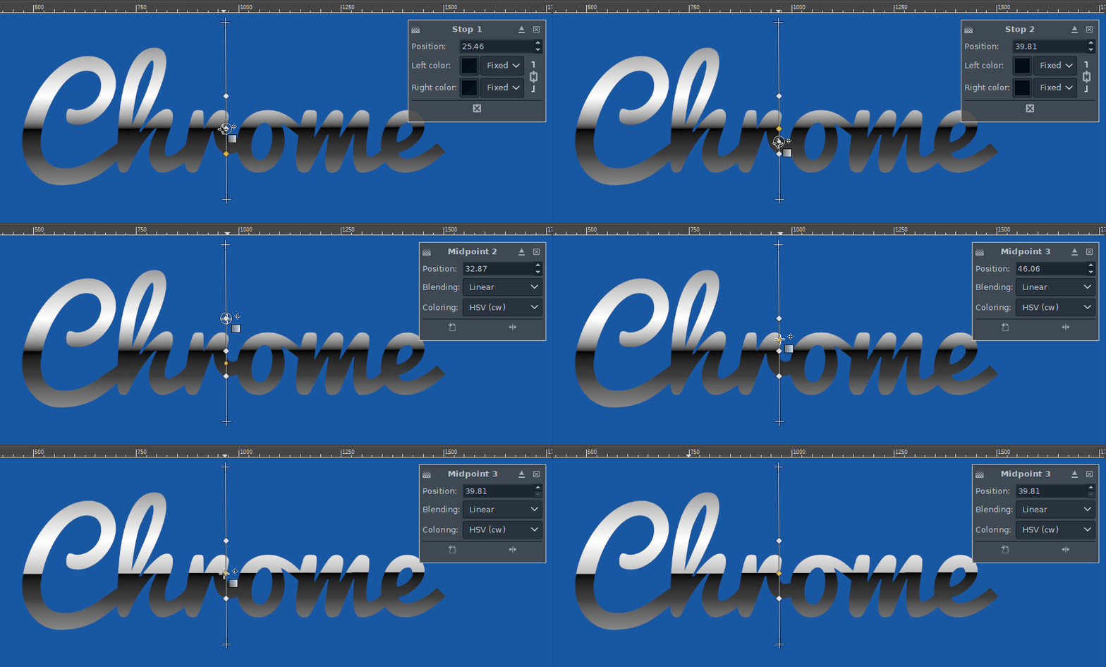
I hope you're having a nice day.
(This tutorial is out-of-date, and very vague, so I'm struggling with it since I'm a noob. I'm open to an alternate 80s chrome text Gimp tutorial as long as it looks as good as this one.)
I'm trying to create my own interpretation of this tutorial:
How to make retro 80's chrome text in GIMP?
but I'm stuck on the Text Shading section, which says:
- Create a bilinear, black-to-transparent gradient on each layer using the Blend tool from the toolbar (icon looks like a gradient; set mode to bilinear, gradient to FG to Transparent, click and drag from the middle of the text to the edge while holding ctrl for vertical snap).
I've followed what he says, and dragged the gradient from the middle of the text to the edge (of the text, or the edge of something else?), but his black line in the center is much thicker than what I'm getting as you can see: https://i.imgur.com/fWdx9UF.png
- Create 2 new transparent value layers for the highlights. Change the layer mode from "Normal" to "Value" for each.
- Create white bilinear gradients like before. Hit "x" to swap foreground/background colors, and then draw the gradients using the blend tool.
I'm not getting the effect he's getting. Whenever I do this step, it just effectively changes the text to white, covering up the previous gradient. It's still technically a gradient if you look closely.
- Mask the highlight. Use the Rectangle Select tool to select the top part of each gradient, right click on the corresponding highlight layer and choose Add Layer Mask>From Selection.
I have no idea what he means here, can anyone help?
- Rough up the masks. Click on each layer mask in the list (not the layer itself) to select it. Use Filters>Noise>Spread 16px, Filters>Blur>Gaussian Blur 8px, Colors>Brightness-Contrast 100 to go from a sharp border to a wavy one.
I did this, and it didn't seem to do anything?


