1

CoverScan

Here is a scan of an album cover. The scanner creates bands of colour streaking at regular intervals horizontally across the image.

Is it possible to eliminate these artifacts using Photoshop, so that the colour of the card stock is even, all without affecting the textures? Use of the clone tool, patch tool, etc are not permissible.

Edit: The colour streaking is likely a hardware issue, as I have cleaned every inch of the glass multiple times (both sides), and cleaned the calibration target as well. I can't replace the scanner anytime soon.

Edit: Upon further investigation, I've noticed that this phenomenon hasn't occurred on every album cover that I have scanned. I scanned the other three sleeves from this album, one bright orange, one yellow, and one green. Curiously, the banding only occurs on the pink and the orange sleeves. I tried scanning them in grayscale, but banding still resulted.


9
  • Hi. Welcome to GDSE. Why is the use of the clone tool or patch tool not permissible? What have you tried? What has failed?
    – Billy Kerr
    Commented Aug 7, 2023 at 14:50
  • 1
    Also why not mask black and use solid colors?
    – joojaa
    Commented Aug 7, 2023 at 14:54
  • 1
    I would scan to get the black... eliminating the pink.. then add a solid pink once I have a good scan of the black.
    – Scott
    Commented Aug 7, 2023 at 18:22
  • 1
    You have 2 conflicting targets you want to preserve the scan and eliminate the halftones. Which is it? Which do you want to do have as much of a reproducible artwork or preserve as much out of the scan as possible. If later then you need a higher quality scan.
    – joojaa
    Commented Aug 8, 2023 at 5:53
  • 1
    By the way if you did masking way you'd get this in a minute: i.sstatic.net/4JzBF.png ive added the texture back a little, you can offcourse add as miuch as you want. Results would be superior if i didn't have a very compressed low res jpeg to work with.
    – joojaa
    Commented Aug 8, 2023 at 6:00

2 Answers 2

3

The issue is there are real world limitations in play that you may be unaware of. It's not as simple as "tweaking" a setting anywhere. Because of these limitations, it is going to most likely take more work than simply scanning and being done.

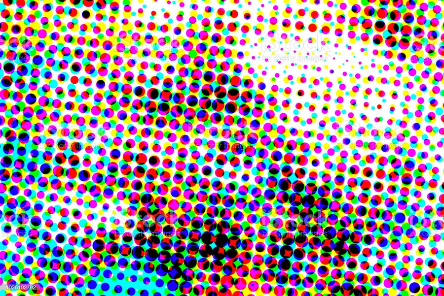
What you see as a solid pink.. is most likely not actually a solid pink. Printed items are created with a combination of cyan, magenta, yellow, and black dots like this:

enter image description here
https://www.istockphoto.com/photo/abstract-artistic-halftone-pattern-illustration-gm1026102792-275201376?phrase=cmyk+dots

The human eye then "blends" the dots to create an appearance of a solid color. You can use a loupe or magnifying glass on printed materials to see the actual dots.

Rarely is what looks like a solid color actually solid. It is possible to print a solid color via spot colors, but I think it's unlikely that album cover uses any spot colors (it would probably be cost prohibitive for a record label - cuz they generally want profits for themselves).

So, the scanner sees these dot patterns and creates what's called a moiré when scanning. This is what you are seeing as "streaks." There's little that can be done about a scanner's moiré - it is simply the result of scanning something that has been commercially printed. Moirés are most noticeable in fields of similar/solid colors.

Sometimes scanning at a 45° angle can help reduce any scanner moiré, but it may never vanish entirely.

The real solution is to scan for the black. Get a solid black scan eliminating the pink. Then, in image editing software add a solid pink background to match the original cover. And finally a "pattern overlay" to create the pseudo texture. At least, that's how I would handle a similar project.

3
  • It is hard to see on that image, but this particular sleeve is pink card stock and it looks like the text was laser printed, so there's no halftone present. I am not sure what you mean when you say "scan for black" and "eliminating the pink". Commented Aug 7, 2023 at 20:27
  • 1
    That "texture" could very well be a stock texture. In which case.. well.. all you can do is try and mimic it the nest you can. Get a quality scan of a small portion and create a seamless pattern tile from that. Either way.. I think separating the black from the pink is the best bet.
    – Scott
    Commented Aug 7, 2023 at 20:30
  • So the banding only occurs on the pink and orange sleeves. What I will have to do is scan the banded sleeves and the yellow sleeve in grayscale, do a C-A Fill on the text of the yellow sleeve, isolate the text from the pink/orange sleeve, as you mentioned, then transpose that onto the filled sleeve. Then after all of that, I can use a blending mode to change the colour back to pink/orange. Commented Aug 8, 2023 at 12:37
1

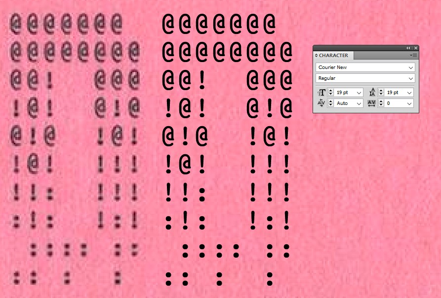
Just that black text on the pink looks like it can be recreated easily with a proper font. It's like something simple typewriter art. Try it. Then insert the background you like.

A monospace font should be used. Courier New is quite close, but not exact. Here's the scanned letter D and a retyped version of it in Illustrator.

enter image description here

A slight stroke is added to make the glyphs look heavy enough

3
  • I have actually done this on many occasions, but it is very tedious. Identifying the fonts, and then mapping the vectors onto the image with tracking and kerning is incredibly time-consuming, and a last resort. Commented Aug 8, 2023 at 12:16
  • 1
    Just this case is a simple one. I added an example. Commented Aug 8, 2023 at 22:11
  • I did give you upvotes because it is a possible solution, but because I wish to preserve the texture of the media, it's not a solution that I can use here. Commented Aug 24, 2023 at 22:45

Your Answer

By clicking “Post Your Answer”, you agree to our terms of service and acknowledge you have read our privacy policy.

Not the answer you're looking for? Browse other questions tagged or ask your own question.