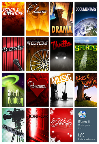
"Most attractive" is a pretty hard question to answer, but if you want to emulate a range of styles in a movie poster, you're in luck because movie posters tend to follow a range of clichés.
FontShop has a blog called the FontFeed, and they have a large archive of posts where they review movie posters. Read ten of 'em in succession and you'll start to see patterns, particularly in typography. There is a lot of discussion about fonts which is important to emulating whatever style you choose to emulate. (You'll see lots of Trajan in here!)
This site will be a bit quicker to scan and will give you some great overall trends in color and composition as well as how they tend to relate to movie themes.

