I need some graphic design advice on finding a quotable piece of information regarding the use of "highlighting" text on signage, which I hope you can help me with.
I'm in a dispute with my local council about a parking sign where they have put some vital information about the charging period which the have "highlighted" on a sign with a generally white background by using black text on a grey background. Common sense tells me that this low contrast combination of black text on a grey background is not a "highlighting" strategy, but rather obscures the text instead. Unfortunately my local council has no common sense, so I need to justify my "crackpot" theory with a reference to some respected source, such as a typographical text book or learned paper.
Can anyone point me in the direction of such a reference I could quote in my defence? Many thanks in anticipation of your support.
Folks,
Thanks for your answers and apologies to those of you who think my question is more legal than graphic. I'm new to the site and have no intention of offending anyone or breaking the rules.
I have posted a picture on iCloud of the sign:
https://www.icloud.com/photostream/#A3JtdOXmJK6Eto
The picture was taken at night, so the obscuring effect of the grey background is even worse in my opinion. Would you think that the "evening charges apply" text is readily visible?
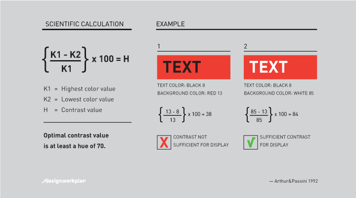
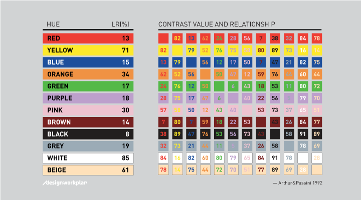
I will go take a picture in daylight and try to get an accurate idea of the grey level, to use the "Arthur and Passini" contrast calculation kindly referenced by Yisela.
Many thanks again for your input and help, it's very much appreciated by me.
Paul


