48

I have no experience regarding Graphic Design, so this is kind of a intro question.

If I have a font I'd like to identify, but cannot describe the details/semantics of it, how would I explain it? For example, some people here describe fonts as "x". What would it mean for a font to be "x"? Are there "categories" that fonts are typically organized in?

4
  • 1
    I can't find any websites that specifically go into detail about all the font styles but if you go on dafont.com you can check out the categories at the top and familiarize yourself with what certain styles look like.
    – SaturnsEye
    Commented Apr 8, 2014 at 16:27
  • There's always the Periodic Table of Typefaces too. squidspot.com/Periodic_Table_of_Typefaces/… Commented Apr 8, 2014 at 16:50
  • 1
    I didn't see the answers directly answer your query about "Gothic," but Gothic means, more or less, "German" and Sans-Serif (Grotesques) were popular in Germany int he 19th century as far as I can recall. Additionally, there was already a Gothic/Roman juxtaposition in art and cultural terms, so the American type foundries probably chose "Gothic" for its thematic resonance. Grotesque is a negative term in English. Probably in German too, since almost all art movements are named by wearing their critics comments as a badge of honor.
    – horatio
    Commented Apr 8, 2014 at 19:23
  • There are also numerous online font identification services. A few examples might be WhatTheFont and WhatFontIs; your favorite search engine should be able to uncover more. No affiliation with any of these.
    – user
    Commented Apr 9, 2014 at 11:03

6 Answers 6

54

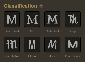
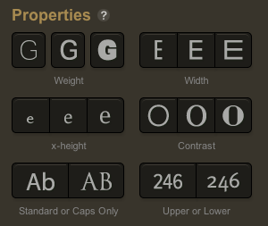
Great question! A good place to start is the faceted search tool on Typekit, which gives options for the main types of typeface and the main dimensions they can be measured against:
enter image description here

enter image description here

So you could look for Typekit options that seem to match, and try them out.

As you choose descriptions you can instantly see the sort of fonts that come up, so you can tell if you're on the right track. You might just get the font you're looking for simply by trying the buttons!

These are the categories and properties that Adobe's typography researchers decided were most useful for browsing fonts - so they're consistent, unambiguous labels that matter.


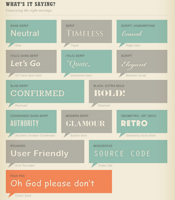
For another perspective on the basics, I browsed infographics on typography, and there's one that seemed useful, "A quick and comprehensive type guide" (I can't find any link to the original, just thousands of content farms, but apparently it's by someone called "Noodlor", either that or that's the first person who shared it...), here's the relevant segments:

enter image description here

Some people will disagree with some of this section (e.g. they chose an odd example for "art deco"), but it'll be useful for a beginner:
enter image description here

3
  • 1
    Good answer. I posted mine because the classifications follow the history and evolution of type, and that gives a good context into what makes a typeface look the way it does, even though fonts don't always fit neatly into them. It's a little bit like the difference between Grammy award categories and Pandora's classifications.
    – Brendan
    Commented Apr 8, 2014 at 16:51
  • What's the difference between Sans Serif and Mono?
    – Cole Tobin
    Commented Apr 22, 2015 at 5:57
  • Mono (short for "monospace") means every character has the same width - less readable, but the way text lines up makes it useful for things like coding, consoles and ASCII art (or, just looking like something was written on a typewriter).This is an example of monospace - see how normally-narrow characters like !, i, . and l have the same amount of space on the line as normally-wide characters like M, m and _ Commented Jun 14, 2018 at 16:14
11

There are different ways to classify typefaces. user568458 covers one way in their answer - big umbrellas like sans-serif and serif, and physical characteristics. This is a great start for someone, particularly if you're not all that interested in the nerdy details. But if you are interested in matching fonts, it helps to know some of the subgenres so you can match what you're looking for to different kinds of characteristics.

When you get into some of those big umbrellas, you'll find certain genres of typefaces:

Serif

  • Old Style
  • Transitional
  • Modern/Didone
  • Slab/Egyptian

Sans-Serif

  • Grotesque (I'll call these Gothic because of Franklin Gothic, News Gothic, Trade Gothic, etc., but plenty don't because of the association of that word with blackletter script)
  • Neo-Grotesque
  • Geometric
  • Humanist

Script

Lots of ways you can go here, but here's a taste:

And those "script" fonts are labeled as such because they remind us calligraphy, but there's a big difference between those typefaces that could be converted to metal type and more free-flowing handwritten-type lettering.

1
  • 1
    Could you give more descriptions or depictions in your answer. The answer should hold up on its own and I don't think it currently does.
    – Ryan
    Commented Apr 8, 2014 at 20:15
8

It's more art than science

Classifying fonts is a tricky business full of opinions of varying quality.
Here's a great quote from a Typophile thread on the topic:

It's gonna be tough to get a straight answer out of people about this one. Categorizing fonts is one of those things that seems to attract an inordinate amount of attention, for results of questionable utility, and everyone seems to think everyone else's scheme is bogus.

If you are not a typographer or designer, it's best to work with someone who is. Typically, you're looking for a typeface with a mood or personality. Those are vague things but, to a typophile they'll mean something. Use words that mean something to you and they'll guide your typographic selection.

But History does have something to say

Like any artistic pursuit, there are historical periods that can be used to generally categorize things. And like other arts, that categorization gets muddier as you get closer to present times.

Here are a few valuable resources to peruse.

The Elements of Typographic Style

Though not without it's controversial perspectives, Robert Bringhurst's book contains a thoroughly researched historical system for type classification.

ParaType's classification guide

A handy little interactive guide that's been around for years.

MyFonts tags

A more free-form approach can be seen in MyFonts' user-generated tag system. The categories are all over the board. However, given the sheer market presence of MyFonts, their tags naturally aggregate toward something that represents people's mindsets.

Typophile discussion: Typeface classification

My quote above came from this thread. There are more constructive responses (though, none more honest).

6

Take a look at the questions asked by Identifont to identify a font by appearance. They are specifically asked to narrow down the collection of font by excluding those that doesn't match a criterion.

5

If you have a font in an image that you are unable to identify, the "What The Font" tool can help you identify it.

It's not a perfect tool by any means, but if you're not a typography expert/savant, it can point you in the right direction.

0
4

To keep it brief, you should definitely know if the font you are looking for is Serif (with serifs) or Sans Serif (without serifs). Serifs are those little "tails" at the ends of certain lines. For example Times New Roman or Cambria is Serif font and Arial, Helvetica or Calibri is Sans Serif. If you are looking for something outside of that definition, it would probably resemble something that one can describe (handwriting, typewriter etc).

If you have pretty exact idea of font in your head and want to look for something like it, I would sugest to either find it in use somewhere (print, book, flyer...) or try to sketch it on the paper and share your idea with comunity to find something that is close enough. The letters you should sketch are probably h, o and p or q. The more the better of course, but you probably don't want to design entire font by yourself. If you wanted to sketch more, you should add some capital letters and numbers.

Your Answer

By clicking “Post Your Answer”, you agree to our terms of service and acknowledge you have read our privacy policy.

Not the answer you're looking for? Browse other questions tagged or ask your own question.