There are several things to keep in mind when serving images to viewers.
- Keep the image ratio the same as the original dimensions
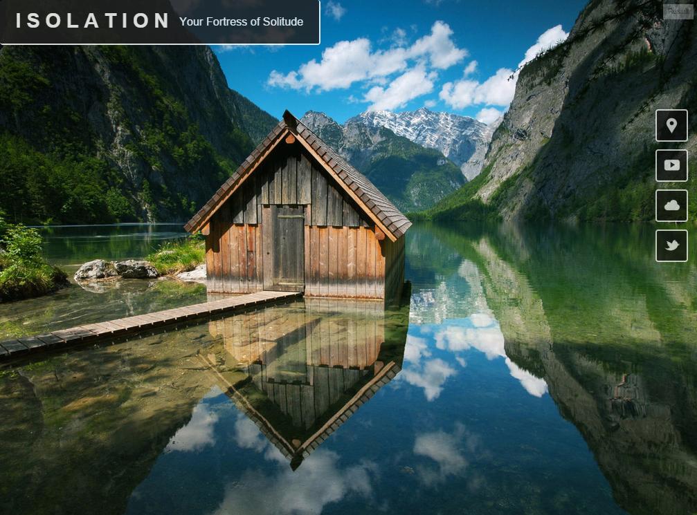
We do this to prevent the image from getting skewed and to prevent images from being blurry. We can either keep the dimension ratio the same or clip off parts that don't fit.
When using an <img> element or something similar, this is fairly straight forward, it just requires using a set width or height OR set max-width or max-height.
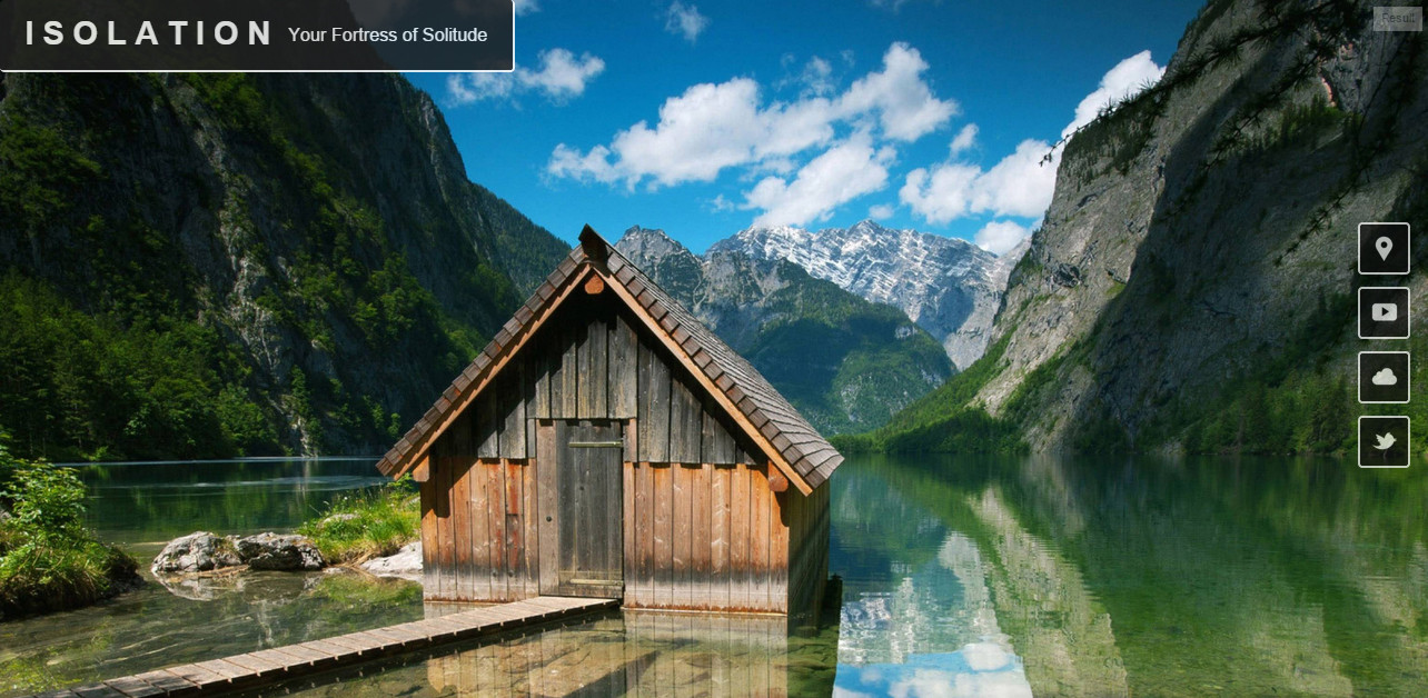
However in the case of a full viewport width image this is a little more complex. There are several CSS ways to do it, the best of which is background-size:cover like the first linked example in the article and Talkingrock' answer show.
In addition, we now have the ability to use the features found in the responsive images specification including srcset and the <picture> element, which are quite useful. I talk about this more later on in this answer.
- Give viewers only the image(s) they need
In order to have a quicker page load and prevent users from needing to transfer more data, it is vitally important to serve the end user only the image(s) that they need, when they need them. This means we serve them an image the same size or just a little larger than the one the viewport they're using and waiting to load images that will not be seen immediately until after the initial page load.
We can serve a more appropriately sized image using CSS by using @media queries when we're using background images. The images not in the media query being used are not loaded. I'd recommend using at least three photo sizes (which means at least 3 media queries), but having a couple more could be heplful performance wise. The following is an example, but it should usually coincide with some general breakpoints for your site's layout.
@media (max-width: 320px) { /* For phones (this breakpoint is the one I'm least sure about) */
    ... background-image(imageURLforPhones.png); ...
}
@media (min-width:501px) and (max-width: 1024px) { /* For tablets and such */
    ... background-image(imageURLforTablets.png); ...
}
@media (min-width: 1025px) { /* For large screens */
    ... background-image(imageURLforLargeScreens.png); ...
}
But, let's face it: we're not good at choosing breakpoints nor are we perfect at choosing image dimensions given a certain screen size. Wouldn't it be great if we could let the have something do this 'magically' for us?
The great news is that now we can!
With the responsive images specification, we can let the browser decide all of this for us, provided we help it out a little. The ever so useful srcset property can be used with an <img> or a <picture> element. For resolution switching like we're doing here, we should use an <img> element.
The following is an example of the HTML needed to allow srcset to do its job. For more, you can read Yoav Weiss' great article on the subject. The example is pulled from it.
<img src="cat_500px.jpg"
     srcset="cat_750px.jpg 1.5x, cat_1000px.jpg 2x"
     width="500" alt="lolcat">
Side note: If you need to serve the same image with different dimensions at certain viewport sizes, you can using the sizes attribute.
I'm not saying that using srcset is necessarily better than using a CSS background image, I haven't done enough work with it myself to say so for sure, but it is potentially a better way.
Also, to help with performance we can "lazy load" images that won't be visible initially. This means that we prevent them from loading initially but start loading them as soon as the initial page is done loading. That way we can get the viewer to see the page as soon as possible and fill in some details later. Here's a way to do that, I won't go into much detail right now.
- Make sure that the content in the image you want to show is shown
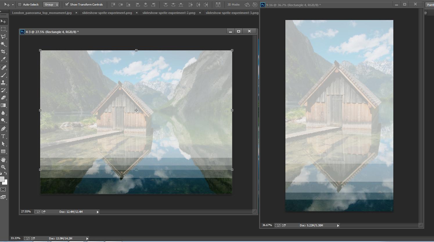
If we have the correct dimensions and great performance that's awesome, but if the viewer doesn't see what we want them to see there is no point. If we are showing the image completely all of the time this is not a problem, but if we have to crop the image this can be a problem.
We can crop background-images using CSS by using background-size and background-position (and sort of using clip, but that's usually used for more artsy, complex shapes). The exact details of this will vary from image to image depending on how it is being implemented.
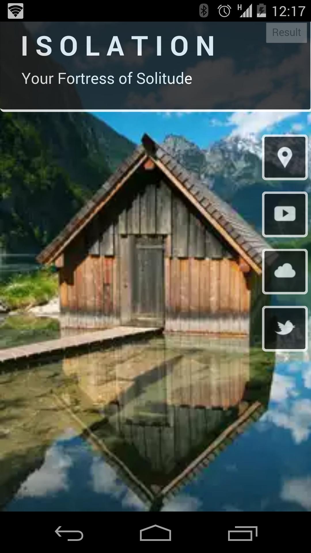
The second option is to use the <picture> element. We use this when we only want part of the image to show, as seen here, but here's a simple example of it in practice (pulled from Jason Grigsby's great article on this subject).
<picture>
    <source media="(min-width: 45em)" srcset="large.jpg">
    <source media="(min-width: 32em)" srcset="med.jpg">
    <img src="small.jpg" alt="The president giving an award.">
</picture>
I want to reiterate, if you only need to do resolution switching don't use the <picture> element, just use the <img> element with srcset. The only time we need the <picture> element is for this art direction, meaning clipping, etc.
There's also the possibility of doing some cropping server side, using an SVG mask, or doing some stuff with Canvas, but that's a bit outside of the scope of this answer.
Some other notes
Specific breakpoints are not that important. As with all responsive design, it's important to do the best as we can for all viewports, but there are no media queries that will be perfect for all sites.
Page load time is very important, and images can slow down the initial load time by a lot. Make sure you load images that will be immediately seen first, then others. Try to prevent images (like JPEGs) from showing part of the image while it loads the rest. Also optimize all of your images so that they are the smallest file size possible while still having the amount of quality you require.
It's important to remember that images, in most cases, should be an accessory, not a necessity. I recommend to always test how a webpage looks like without images to make sure it's usable.
Note: We can use a polyfill called Picturefill to serve older browsers that don't support the responsive images specification.


