2

I've tried multiple tutorials and even asked the designer — (his response: "If you want it perfect you will have to create it in adobe illustrator and import it into photoshop. In the case of the two examples of my work you sent I actually kept it in Photoshop but i retraced it using the pen tool. You might also be working in too low of resolution.") — but for the life of me I can't get the stroke to adhere tightly to the text like that.

Is there an easier or more elegant solution than manually retracing with pen? I appreciate any insight you can offer.

tight stroke around text

0

4 Answers 4

3

I think you're really over-thinking this.

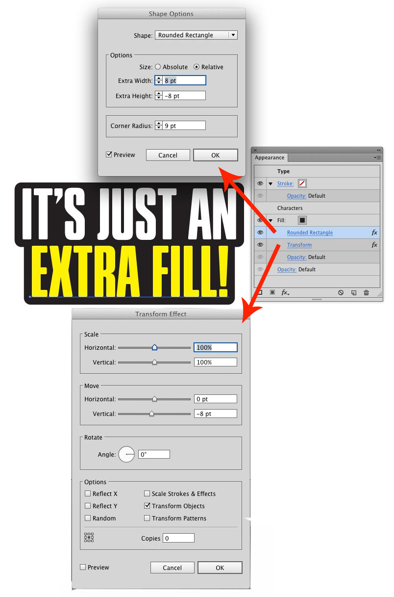
It is not a stroke. In most cases trying to use a stroke will not yield the straight top/bottom because a stroke will follow the type contours more.

It's merely a rounded rectangle behind the type. That's all. The right side may have been manually altered to align with the O at the end of the first line, but other than that.. it's just a rounded rectangle.

There are several ways of accomplishing this, including just drawing a rectangle. In Illustrator you can often use Effects to easily create a dynamic rounded rectangle behind text:

enter image description here

0
2

To create text with a tight stroke like that in Illustrator, I would first create the top text, what you see in colour with no stroke. I would then duplicate that layer, and lock the top layer. On the bottom layer, select the text, turn it into outlines (command-shift-o) and give it a stroke of your desired thickness and colour. The fill doesn't really matter, but you could make it the same colour as the stroke just to keep things even. Set the stroke to align on the outer edge of the letter shapes, and choose rounded corners. Fill in any gaps left between letters by manipulating anchor points or adding shapes with the pen tool.

1
  1. set your type
  2. duplicate it (so there's no a copy on top)
  3. on this new copy, set the stroke to whatever you want
  4. move this duplicated copy with stroke to the back
  5. done

Optional: As vincent points out, you may need to tweak the outline to remove gaps such as where the dash would be. To do that:

  1. with your black-stroked text still selected, STROKE TO PATH
  2. Select UNION to make it all one shape
  3. Delete extraneous node points to smooth out the outside border as needed.
3
  • That'd create a jagged outline, especially on the part where the dash is, needing manual adjustment. Sorry, DA, downvote. :)
    – Vincent
    Commented Nov 14, 2014 at 11:27
  • 1
    @Vincent all design requires manual adjustment if you want the details taken care of. :)
    – DA01
    Commented Nov 14, 2014 at 15:50
  • @Vincent added an update!
    – DA01
    Commented Nov 14, 2014 at 15:55
0

Not quite sure what you mean, but in such cases I usually add a standard stroke effect, outside one, and rather bold. And then manually fill the empty space using pen tool/lasso etc.

1
  • When I use that method, I don't get the neat uniformity this person is producing. And free-handing it doesn't produce such neatness either (at high-res levels, anyway).
    – trgritzman
    Commented Nov 14, 2014 at 7:04

Your Answer

By clicking “Post Your Answer”, you agree to our terms of service and acknowledge you have read our privacy policy.

Not the answer you're looking for? Browse other questions tagged or ask your own question.