35

I often struggle choosing proper color combinations. I'm self-ware enough to realize that I'm most comfortable with, and often settle on, colors which could be seen as more corporate or retro - blues, burgundies, browns, greys, etc.

I'm aware of things like Adobe Kuler, and Colorschemer.
I am not seeking additional, similar tools. I can build palettes without an issue. However.....

These don't seem to really solve my issue. I can gain a palette from these tools, yet applications of the colors often fails for me.

I have a lot of practice using my "retro corporate-like" colors and have learned what works well as a background, what works well as text, etc. But when I move to a brighter or more vibrant palette I tend to lose sight of color application and eventually start desaturating and wind up shifting things back to my comfort zone.

How can I go about expanding my range of "comfortable" color use?

What are some best practices to broadening my own sense of color in design?

Note, I work primarily in print, so "testing" isn't much of an option beyond on-screen testing. I rarely work on projects that allow me the luxury of using one palette today and trying another one next week. I customarily have to settle on one and use that for that project until the project is no longer needed. This means a poor color choice can really be detrimental to a piece and its lifetime.


Clarification: I am not seeking methods to build color palettes. As stated I can do that. It is the implementation of a palette that I'm asking about. Say, you build a palette of 7 colors.

  • How do you determine what colors work well for what objects? (i.e. "bright red on a canary yellow is too bright for good readability", etc.)
  • At what level does color contrast become an issue?
  • Is it preferable to use color discords (complimentary colors)?
  • When is a color too vibrant to use for text?
  • What makes a piece "pop" via color use?
  • What types of colors combinations convey "liveliness", "security", "respect", "youthful", "vibrant"?

Is is this sort of input I was hoping for, not the "here's how to pick a palette". Seems I may have done a poor job of explaining my intent previously.

3
  • 1
    Do you use moodboards? I don't often use them, but they can be really useful for forcing yourself out of your comfort zone (especially if you get someone else to contribute). Then extract colours (love cockypup's technique) and force yourself to experiment with whatever comes out. Commented Apr 8, 2015 at 17:16
  • You should expand a bit and add that as an answer @user568458 :)
    – Scott
    Commented Apr 8, 2015 at 21:49
  • I've worked in-house for several years... Choosing colour palettes for real projects is a distant memory! I'll leave it for someone with more recent relevant experience, I don't have much to add beyond that comment Commented Apr 9, 2015 at 7:14

9 Answers 9

32

This might not answer your question completely, but as part of my workflow, I use this technique sometimes.

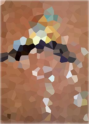
When trying to pick a colour palette (at the very beginning of the creative process), I try to recall from my memory an image or painting that fits the "mood" or "content" of the project. Then I take that image and, using Photoshop, I apply a Pixelate->Crystallize filter with quite a huge cell size. This simplifies the colours of the image to big flat swatches of colour.

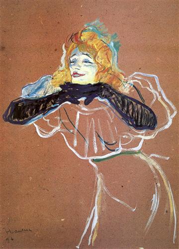
For example, I have on my plans to create a self-originated poster for a cabaret performer. She tends to sing vintage music but somehow makes it sound fresh, her performance is quite risque, humorous, human and interactive. For some reason that reminds of this Toulouse Lautrec's sketch, which, every time I see, communicates to me those values or mood.

enter image description here

I use the filter on the image and end up with this.

enter image description here

I then use the big cells of flat colours to build a colour scheme. I end up with choices that would have never come out from my own brain, such as baby blue and mid brown together. After I create the colour scheme I stick to it as if there were no more colours in the Universe. The only possible choices I give myself are swapping or adding a colour from/to the scheme with one of the colours from the cells.

It is just an aid that helps me think about the colour, to visualize it and to gauge their interactions and their contribution to a specific image. It also helps me break free from my well tried formulas.

Some might argue this is quite similar to using Adobe Kuler, but I find this approach more hands-on and personal. I get to pick the colours, not an app. I somehow find it disturbing to let a tool make creative decisions for me. One day androids will rule the Earth and do it all by themselves but until then I prefer adding my two cents of "me" to the creative process.

6
  • No.. separate answers are good.. they show different methods.
    – Scott
    Commented Apr 6, 2015 at 17:36
  • 2
    Almost like pixellating a mood board. Additionally, this an interior design technique: you find one item (painting, pillow) which you like, and pick out colors from that item to dress the room (wall paint, furnishings, rugs, curtains, etc.). Commented Apr 6, 2015 at 18:07
  • Pictaculous is a similar way to do this that is free online and generates the palette directly Commented Apr 8, 2015 at 21:27
  • 2
    A favorite technique, of mine, too, except I generally use Mosaic rather than Crystallize. Learned it from John McWade, years ago, and it's been a great tool. Commented Apr 9, 2015 at 0:31
  • 1
    The problem with this common technique is that it obscures the key colors of the original. In your masterful HTL example (a fave of mine) blending the colors into a simple 'mosaic' dulls the small areas that enliven the original. They aren't large enough to register properly in your filtered version, but they are more than strong enough in the original to change the mood of the artwork. Commented Apr 16, 2015 at 6:49
16
+400

This actually sounds like a question more about creativity and getting out of a comfort-zone than about technique but I will answer the technical side.

How do you determine what colors work well for what objects? (i.e. "bright red on a canary yellow is too bright for good readability", etc.)

This question is a little general, but to address your example: Text is generally more readable when it contrasts with the background in luminance, but not so much in hue. For example, if you took all the colour information away from text and background and left it black and white, the more they contrast the more readable the text will be.

On the other hand if the colour hues are very contrasty (complimentary) such as red and green, especially if they are close to the same luminance, they can ‘vibrate’ and make your eyes feel like they want to bug out of your head. People won’t even want to look at your text let alone read it.

At what level does color contrast become an issue?

See my last answer..

Generally, in my experience:

  • High luminance contrast with low hue contrast = easy to read
  • Low luminance contrast with high hue contrast (complimentary colours) = “vibration”; eyes bugging out of head feels

Use your judgement on when it becomes an issue when you're designing. It will be different in every project.

Is it preferable to use color discords (complimentary colors)?

See above

When is a color too vibrant to use for text?

See above

What makes a piece "pop" via color use?

The first rule I follow is to use high luminance contrast. Black pops on white more than grey pops on white.

The other rules I follow are to use warm, bright, pure, and saturated colours. I’ve done a lot of magazine covers where the main cover line needed to ‘pop’ next to all the other busy elements and one of my main go-to ways I used to accomplish this (besides making the line bigger) was making the colour the warmest brightest coloured text on the page. I used a lot of bright red, orange, golden yellow, and even bright yellow, but I also used cyan. I would usually pick which of these hues based on what went with the colours in the photo used.

But there’s one more extra rule that I use in print projects. Even though it’s a cooler colour I would often use cyan for a ‘poping’ colour because cyan is created with a single ink (rather than a mix of CMYK inks) so it looked more vibrant than some other colours of the same saturation level. Cyan, magenta and yellow when fully saturated tend to be brighter compared to mixed inks of the same saturation. Pantone colours work very well for this reason in print as well. Each Pantone colour is one ink rather than a mix of 4 CMYK inks like CMYK colours. I love using Pantone colours for their impact.

What types of colors combinations convey "liveliness", "security", "respect", "youthful", "vibrant”?

I don’t know if I can think of a way to answer this without it being an opinion so I will leave this up to you. It's probably better answered by yourself anyway.

Hope this helps.

2
  • 1
    It is a question more about creativity than technique. That was why I edited to add additional info. Thanks :) We do allow a bit more subjective questions here than can be found on other Stack sites. Opinion is not always a bad thing if it's backed with experience.
    – Scott
    Commented Apr 8, 2015 at 19:22
  • A point worth noting about complementaries in general is they "glare" when used against one another. Red/green is particularly vicious, because the eye can't focus on them simultaneously. (Ask your optometrist!) Commented Apr 9, 2015 at 1:28
10

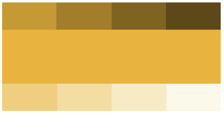
When I pick a color palette I narrow my selection to a max of 3-5 colors but I expand on those colors. For example, I usually run a script in Illustrator that will allow me to place each color in its own master palette and a variation of the color based from highlights and shadows I've used throughout the year help produce a HEX and RGB output in CSS. This range of additional color helps allow me a broader range of deciding or narrowing down a color palette. So for this instance you could still use your same colors but they are different variations of your favorite but would produce a totally different color set.

Example from your yellow:

enter image description here

I use this approach for several reasons:

  1. Helps with gradients
  2. Stays within a clients color palette
  3. Keeps to a color theme with but still offers a variety of color
8

There's an art to it

In visual perception a color is almost never seen as it really is — as it physically is. This fact makes color the most relative medium in art. // Josef Albers

Color theory is where the physics of light and the psychology of color become much more than their scientific parts. Like choosing and setting type well, using color well requires practice and immersion. You must appreciate the fact that the number of variables out weigh what we can scientifically account for.

In other words, you develop an eye for color over time.

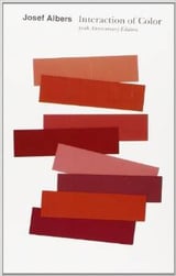
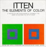
The 50th anniversary edition of Interaction An old copy of Elements

It bears repeating that you have to study the guys who devoted their lives to the subject. My personal favorite for it's brevity, practicality, and extraordinary effectiveness is Albers' Interaction of Color. That's not terribly long, so you should have time to soak up Itten's The Elements of Color as well.

Taking shortcuts

The reason you find yourself falling back on a trusted personal palette is because you have learned a practical (and most likely effective) shortcut to color theory. You are not alone. Again like typography, most of our industry has had neither the exposure nor the time to explore the art of it. So you've developed a safe and dependable alternative, but you haven't mastered color.

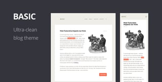
Templates are good shortcuts: Basic from Themeforest

Your practical system is bolstered by developing rules. You can survive by guidelines like 'text to ground contrast must be at least 40%'; or 'a background color should never be saturated past 36%'; or 'yellow makes me uncomfortable so don't even ask!' Formulas make things easy.

It takes commitment

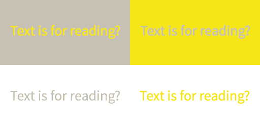
But when you truly master the relationship of colors, practical considerations will become obvious. Maybe bright yellow text didn't work on the last 100 projects, but this time you'll set it against a warm grey that perfectly tames it. Suddenly yellow text works for you. Maybe not but, your 'eye' will tell you. Your color instinct.

As with anything deserving of the label 'art', there's no shortcut to mastery. Albers observed that you have to train your eyes to truly see color. When you understand how to use colors to manipulate one another, your toolkit expands. When you understand the effect color has on your audience, your design becomes stronger.

Color tells a story

As you practice and begin to understand the interaction also think of color's narative. Set up tests for yourself to find the right color to represent some anthropomorphic trait, like you might do when selecting a typeface. Try to talk about individual hues in terms of personality. Then do it with whole palettes. How does each color contribute to the depth of that personality?

And just like real personalities, you'll know that a little bit of a given color will go a long way. Knowing what hue fits what element is part of constructing the story.

In the simple image below, there are only two colors (plus white). Perceptually, there are no less than four. And each quadrant conveys a different story. On press, over printing opens up a whole new world of opportunity for these two humble swatches.

There's only two colors here + white

Exactly what each hue and color interaction conveys is almost entirely cultural. As with most everything in design, know your audience. Even when you think you've used every swatch in just the right place, test it with a real target user and ask them what they see. The reactions can be enlightening.

There is no safe

When perceiving color interaction and personality becomes second nature, you'll find that your "safe" palette doesn't exist any more. All colors are safe and all colors are dangerous. It's just a matter of context.

0
6

Colour Psychology

Colours mean different things to different people. It's caused by the fact that we all live different lives, with different outlooks, and that we're all unique. Some say the beauty of humanity is in such differences.

Trying to perceive the differences through your own biases is an exercise in futility. You can try to be fair, but it's impossible to be truly objective. The best way to further your understanding, and your outlook in general, is through rationality.

By employing rationality in your thought process, you will naturally gravitate towards science and facts. I'm going to give a brief insight into the main topics and provide some references, and let you venture into the realm of colour psychology on your own whims.

You must also bear in mind that it's likely that a large portion of proprietary colour research is kept private for competitive advantage.

Science Says...

  • Age
  • Sex
  • Ethnicity
  • Geographical Positioning
  • Cultural Philosophies
  • Religious Philosophies

ALL affect a persons perception of colour. That's a lot to consider.

Colour Associations

Associating colours with ideas is a subconscious process. From the moment we're born we process and form colour associations that resonate throughout the rest of our lives.

Costly mistakes have been made in the past through the incorrect notion of "colour universality". A few colours may possess widely understood associations, but that does not mean that all of them do. In fact, depending on where you are in the world, some colour associations are inverted. For example, in the Netherlands, pink is considered a boys colour, while blue is considered a girls colour.

Instinctive Colour Associations

  • Hispanics are usually drawn to brighter, stronger, more intense colors.
  • African Americans prefer deeply saturated colors.
  • Blue is number one overall choice of color by ethnic groups, but the second most popular color varies among them.
  • African Americans and Hispanics lean proportionately more toward purple.
  • Asians lean proportionately more toward pink.
  • Asian Americans have a significantly lower preference for green than any other ethnic segment.
  • Caucasians lean proportionately more toward green.

Most Interestingly:

  • The closer to the equator a persons heritage is located, the greater the brightness, saturation, and contrast they'll prefer.

Learned Colour Associations

Research conducted on colours and their association with 13 words in four countries; Japan, China, South Korea and the U.S.

  • The results showed distinct similarities and dissimilarities across just these four cultures.
  • People in all four cultures associated blue with high quality, and black with power. But many colors had opposite meanings among the cultures.

Examples of disparate perception and response to color include:

  • White symbolizes mourning or death in East Asia, but happiness, purity and birth in Australia and New Zealand.
  • Blue is perceived as cold and evil in East Asia, cold in Sweden, but warmth in the Netherlands.
  • Green represents danger or disease in Malaysia, envy in Belgium, love in Japan and sincerity and dependability in China.
  • Red is unlucky in Nigeria, but lucky in China, Denmark and Argentina.
  • Yellow represent warmth in the U.S., but infidelity in France. It is associated with jealousy in Russia, but pleasant, happy, good taste, royalty in China.
  • Purple is the color of love in China and South Korea. Anger and envy in Mexico, sin and fear in Japan. Purple is considered expensive in China.
  • In the U.S. blue is associated with boys, and pink with girls. But in Belgium, the association of blue for a boy and pink for a girl is reversed

Main Source: Response to Color Literature Review with Cross Cultural Marketing Perspective (contains many, many useful references)

0
5

An interesting concept I first learned about on a male fashion advice page is to pick color combinations that occur in nature. For example, browns, light greens, and dark greens (forest); grays, light blues, and white (sky with clouds); etc. Obviously this isn't the be all and end all of color choice and combinations, but it might be a helpful thing to keep in mind from time to time.

0
5

I have struggled with this topic throughout my career. I really admire designers who are gifted when it comes to color. I have a dribbble bucket devoted just to color palettes that I admire.

Text Contast

I use the WCAG color contrast checker to check text and background color contrast. I will only use combos that pass Level AA; this will soon be required for 508-compliance on websites and applications. I'm not exactly sure how that formula translates for print design though.

Beyond graphic design

About ten years ago I decided to be bold and paint my bedroom an intense dark reddish, slightly berry-toned, terra cotta color. I posted to a decorating board asking for color suggestions for drapes and bedding. I said that all I could come up with was black toile bedding on a cream background and someone posted, "You can do better than that." That comment really stuck with me. I never bought the toile bedding. I bought pewter-colored silk curtains, navy blue sheets, and a beige sateen bedspread. I'm still struggling (10 yrs later) to expand that color palette more (especially the bedspread) and to bring in patterns.

Back to graphic design

I save colors I like to my swatch palette in Photoshop. I like the site colourlovers.com for finding colors and palettes.

When I'm feeling creative in my spare time, I tend to make color palettes in Photoshop without a project in mind. I take one dominant color (often used as a large background square) and try different combinations of colors to go with it (in smaller squares on top of the background square). I test different stroke colors for the smaller squares to see what's necessary to make the color work (e.g. do I need a white, cream, or grey border for these to work together or can they fit together without the border?) I'll duplicate a color square and try different stroke colors on it. The trick is to take a color that may be hard to work with (pink or orange for example), and see what compliments it. I save the color schemes for later when I need them. I have different palettes (files) that reflect different moods (e.g. bright & cheery, fresh & airy, bold & powerful, etc). I try to stick to generally accepted color associations, such as red to make people hungry or associate with food, orange to show price value, etc.

It's easier to use bright colors in small quantities, say in icons, than as backgrounds. But I love seeing a beautiful color background color, so I keep trying. I'm in the process of redesigning my website and I am not allowing myself to use white as a background color. It's my own personal design challenge that does not need client approval. :-)

3

Consider mixing colors like a painter would on a palette, this allows you to do different graduation and sometimes mixing colors gets you new hues you didn't think of. This is a alternate approach that combines to the way @Matt/@cockypup suggests.

The benefit of this approach is, that it is a bit more organic, thus allows for random surprises that can help you break a habit. It is also less strict than a even graduation that certainly works too.

quick idea

Image 1: A quickly made placeholder for the idea. Many ways to blend colors.

Another thing you could do is sample the colors form photographs with the color picker tool, this makes combinations more natural.

3

I would love to comment on here instead of answer, since I feel that my reply is more useful to anyone like me who is starting in the design field. However, I am new, so I don't have the ability to comment yet.

I'm sure that as a designer, you've heard of Color Theory, and have hopefully read Color Theory books like Itten's Elements of Color, or anything written by Itten. That being said, I'm slightly confused by some of your questions, since I feel that they can be answered by changing and visually observing effects in different color's hue, saturation, or value.

As for moodboards, mentioned by user568458, what they suggest would largely be what cockypup answered with. I would start by finding images that I thought best reflected those words. You can go out and take your own photographs, or just use the internet to find some. After that, I would do what cockypup has done and create a palette from those images, and use them as a reference to ask yourself "does this color really reflect this idea?"

0

Your Answer

By clicking “Post Your Answer”, you agree to our terms of service and acknowledge you have read our privacy policy.

Not the answer you're looking for? Browse other questions tagged or ask your own question.