15

Suppose I'm designing something for printing purposes. Then I need to stick with CMYK model. When ever I'm choosing color while designing, I'm setting color based on what my monitor shows me as CMYK. But Monitors don't work on CMYK. So, what my monitor showing is a conversion of that CMYK in RGB.

After reading little bit, now I understood that CMYK and RGB are not exactly convertible and there are always some differences. So, what I'm seeing is not the color I actually set. Right? If that is the case, because of deception by my monitor, am I setting the wrong colors? How are we supposed to design then?

This is based on a question regarding RGB to CMYK conversion.
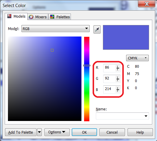
enter image description here

say, RGB (86,92,214) the color in my image. Then monitor uses same values for displaying (lightning LEDs, LCDs or CRTs). Right?

enter image description here

3 Answers 3

17

A monitor can't show true CMYK. CMYK is reflective light, or subtractive color. A computer display is projected light, or additive color. They take up different (albeit overlapping) color spaces.

Your software does its best to emulate the CMYK colors converting them to RGB but it simply can't replicate them exactly.

"When ever I'm choosing color while designing, I'm setting color based on what my monitor shows me as CMYK"

As you're probably found out, that's quite a crap shoot. You can calibrate your monitor, which will help, but it will never be the same.

Your best bet is to get color samples from your printer. Bigger printers will often print out color grids showing you different CMYK mixes on various paper stock. Barring that, you can invest in some Pantone CMYK books that do the same.

If you use a regular printer, and tend to run larger jobs that require cropping/trimming, you can make these yourself by placing CMYK color grids in the gutters of your press sheets. Ask the printer to keep those for you when they trim them all.

7
  • I don't have a printed catlog of colors. december.com/html/spec/colorcmyk.html shows conversion between RGB & CMYK for different colors. For example, The color I want in RGB (102,102,255) #6666FF is mapped to "cobalt(Safe Hex3) cmyk(60%, 60%, 0%, 0%)". So, can I blindly use these values of CMYK irrespective of how my monitor is displaying it?
    – claws
    Commented Feb 22, 2012 at 8:07
  • 3
    You should bold that "calibrate your monitor" :)
    – Scott
    Commented Feb 22, 2012 at 8:38
  • @claws without printed samples, it's all blind guessing.
    – DA01
    Commented Feb 22, 2012 at 8:45
  • @scott probably...though I've never had much faith in that...most of us use laptops in coffee shops these days so calibration only gets you so far. ;)
    – DA01
    Commented Feb 22, 2012 at 8:45
  • truth in that: I have an older lcd with some dirt ir grey streaks between the light back and the image plane, but it is the closest calibrated monitor and the only one I trust even a little, so it stays.
    – horatio
    Commented Feb 22, 2012 at 15:20
7

It's not so much "how does the monitor display color" as "how does the software think it's displaying this particular color on this particular monitor." As they say on Facebook, "It's complicated."

Color gets to your screen through layers of software called color profiles. A color profile takes the raw numbers and interprets them for display or for printing. (If you're thinking, "Hey, you mean changes them?" you're right.)

Your application software is applying a particular color profile to the numbers, then the OS and/or your graphics driver apply another profile to decide how bright to make all the screen's red, green and blue sub-pixels. When you calibrate your monitor, what actually happens is that you (or the software you're using to do the calibration) creates a custom profile that gets applied by the OS before the image hits your screen. If your monitor doesn't have its own color profile, which many monitors don't, or if you never installed it, then the profile being applied will be "Standard RGB." Which will, in most cases, be wrong.

Applications such as Photoshop, Illustrator and InDesign have additional proofing profiles that you can use to "soft proof" an image. These try to imitate what the piece will look like when printed, even to the point of trying to account for the fact that paper doesn't reflect 100% of the light that falls on it. Corel may have a similar feature, if you dig around.

1
1

You are correct a monitor can not display all print colorspace colors. In fact things are much worse than that, you can not even know how RGB colors display on other monitor. Calibration is the only way to go even if it does not solve the problem. High end monitors can display wider range of colors but currently not wide enough. The opposite is also true there are huge areas of colors that the monitor can show that the printer can not make.

What calibration does is it creates a map for the computer to a absolute colorspace, called a profile. Without this map your computer just does not know what your monitor shows. In laymans terms its a map to a central location from where other maps can contiue to the final destination.

Because the human senses are extremely complex, this calibration is affected by many factors, like ambient light conditions. So getting it right is extremely challenging.

The biggest problem is what to do with colors that can not be shown. So there is in fact 4 methods in the standards for dealing with this called intent. The four intents are named differently by different vendors. But they are for this discussion:

  • Relative colorimetric
  • Absolute colorimetric
  • Image
  • Display

Now these govern what happens when the color can not be displayed. The colorimetric intents try to preserve the color. The difference is that absolute just clips the exceeding color and relative finds a nearest color scaled by medium. Image works by scaling the entire image to fit into the showable colorspace (called gamut), this works well for images as the human visual system is only interested in relative colors. In natural images our color processing engine kicks in and corrects colors somewhat. The last option is when you need saturated colors but dont care of the exact color, like business graphics.

And thats the short details of how it works. But without calibration things are much worse.

Your Answer

By clicking “Post Your Answer”, you agree to our terms of service and acknowledge you have read our privacy policy.

Not the answer you're looking for? Browse other questions tagged or ask your own question.