1

I'm designing my app (targeting only iOS/iPhone devices).

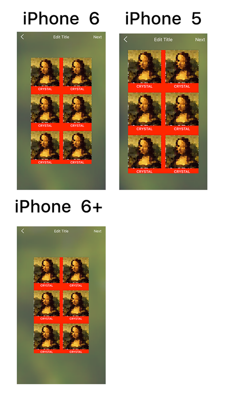
Currently, there couple components, which I'm designing to fit into iPhone 5 screen(smallest screen). On largers screens(iPhone 6, 6+), I'm centering the components and just give it more margin from the sides.

Note: In all of the images, the "red" area is at the same size(width and height), only the screen size changes


Should I or should I not increase the size proportionally? Is there are a known guidelines? Should I keep the font size and only increase the images?

Example:

enter image description here

1 Answer 1

2

You'll want to choose your font and image sizes to be comfortably usable on the smallest screen, which might result in short lines and little space for images. But that's a function of physics, for which you're not responsible (you are responsible for user comfort, of course, within reason).

Once I had those sizes selected, I wouldn't increase them with an increase in screen size, I'd allow more information to appear. It's not hard to see why: imagine translating an increase in size to a desktop screen. The same principle operates: bigger isn't necessarily better, if you've sized it correctly in the first place.

2
  • In case i don't have any more "data" to show. Should i still keep it they way i did?
    – Roi Mulia
    Commented Nov 15, 2016 at 17:49
  • I would. I'd make certain sure that my sizing is good for the smallest screen, and then use that as my standard across all applications and content areas over time. I'd probably also offer a zoom feature so that owners could have some control and visually fill up their extra screen area if they chose. That presumes a zoom would make sense. If it would only show them fat pixels then maybe not :-)
    – MMacD
    Commented Nov 15, 2016 at 19:44

Your Answer

By clicking “Post Your Answer”, you agree to our terms of service and acknowledge you have read our privacy policy.

Not the answer you're looking for? Browse other questions tagged or ask your own question.