0

I am laying out a web app and have decided to use a 12-column, 30px fixed-width gutter (existing constraints dictated our layout). However, how should I design the spacing units, margin, padding, etc. anything that doesn't directly align to the columns.

I have heard and seen many different approaches to defining the grid, which in turn often defines the base UI unit for spacing. Material design uses a 4pt grid which dictates the margins, spacing between containers, padding, vertical and horizontal alignment, and is sustainable for many different devices. A more web-friendly approach has been to define the body text (often 16pt) and use easy percentages of 16 (i.e. 150% 24) to create the baseline.

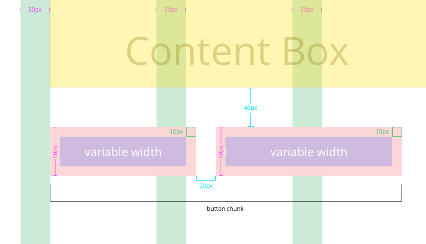
Our project has two defined units of size, a 16pt body text and 30px fixed-gutter. My first thought was to use multiples of 5 (derived from the split gutter width of 15, 33%). Example element could be a 50px tall button with 10px padding and 10px of margin. However this creates ill-defined text baselines for a 16pt body text (please correct me if my logic is wrong).

5pt Grid

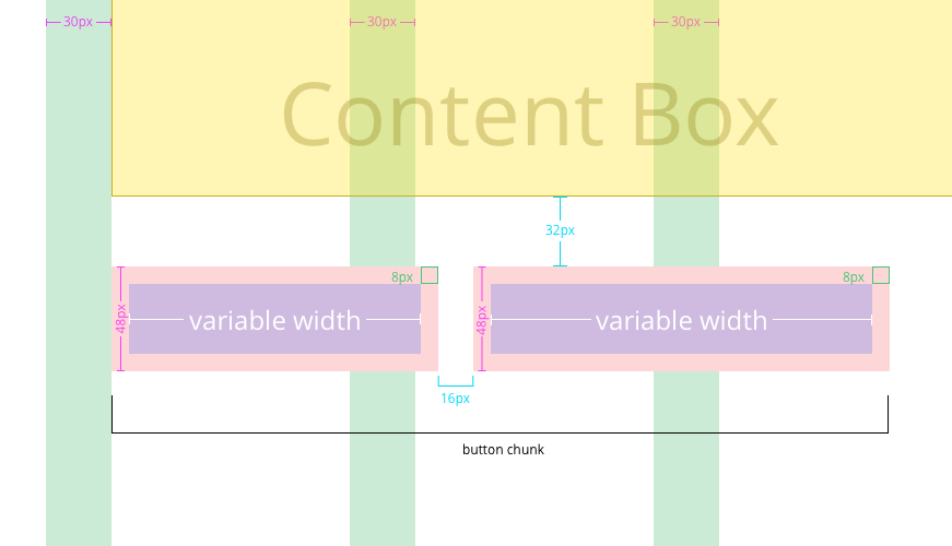
So then I figured let's use an 4pt grid so that my buttons are 48px tall with 8px of padding and margin. This also allows for my text baselines to be better aligned with the spacing of different elements.

4pt Grid

I use the 4pt grid a lot for app layouts and honestly don't know why I shouldn't use it. Except for the fact that the gutters don't align with a 4pt grid (not even sure if that matters).

I'd appreciate any similar experiences, best practices, or feedback.

1 Answer 1

1

Google doesn't know everything...

Material design uses a 4pt grid which dictates the margins, spacing between containers, padding, vertical and horizontal alignment, and is sustainable for many different devices.

...

I use the 4pt grid a lot for app layouts and honestly don't know why I shouldn't use it. Except for the fact that the gutters don't align with a 4pt grid...

Why should you use 4pt? Why not 3pt? or 6pt?

Material design works with a 4pt grid not because everything looks better spaced in multiples of 4pt, but because the aim of Material Design is to create a unified visual language, and for that they need consistency... You aren't doing that, so forget 4pt (maybe a 4pt grid works for you, and that's fine. 4 is an easy number to work with too; but don't use it just because Google does).

So, what should you use?

If you're going to work with a baseline grid in web design then working in easily calculable numbers and ratios can be helpful and multiples of your base font-size is a good and common tactic. I like to work with CSS rem units, which size relatively to the font size of the document's root; allowing you to work with ratios and scales and easily change the base size.

A quick example:

p {
  font-size: 1rem;
  line-height: 1.5rem;
  margin: 1.5rem;
  }

h1 {
  font-size: 3rem;
  line-height: 3rem;
  margin: 1.5rem;
  }

You can then responsively change the base size by changing the font size of the html element, proportionally scaling everything sized with rem units:

html {
  font-size: 16px;
  }

@media screen and (min-width: 900px) {
  html {
    font-size: 18px;
    }
  }

@media screen and (min-width: 1200px) {
  html {
    font-size: 20px;
    }
  }

As for specific numbers, rules and systems...

I love grids. They're a great tool for creating visual consistency. But systems like Material Design and web frameworks that people rely on (too much...) have (IMO) made people rely on grids in completely the wrong way. You shouldn't, in most cases, blindly pick a grid system and work to it; building your grid system (including margins, spacing, type scale etc.) should be an integral part of the design process. Experiment and see what works for your design, take in to account your audience and your output (devices, screen sizes, environment etc.) and test in those conditions.

What you come up with is often a compromise between what works visually and what numbers are convenient to work with. But, don't base your grid on any magic number or unrelated system (e.g. the latest framework); it should be specific to your design.

Your Answer

By clicking “Post Your Answer”, you agree to our terms of service and acknowledge you have read our privacy policy.

Not the answer you're looking for? Browse other questions tagged or ask your own question.