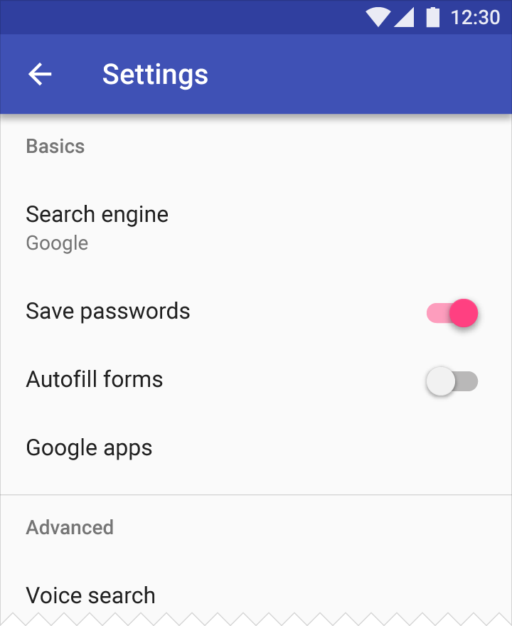
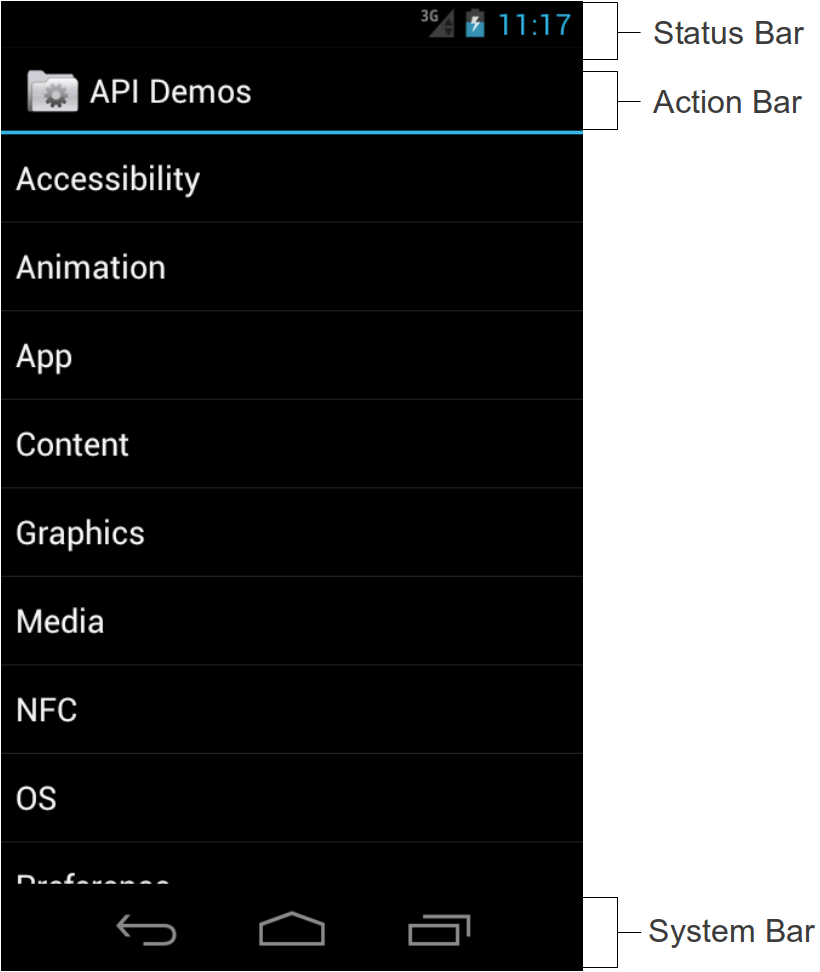
I don't think this is referenced directly, but if you look at at the color section there's this paragraph that mentions the status bar vs toolbar:
To create contrast between elements, you can use lighter or darker
tones of your primary color. The contrast between lighter and darker
tones helps show division between surfaces, such as between the status
bar and a toolbar.
Source
For example:

I'd say that it's a good general principle to divide/distinguish groups of elements that have different functionalities, by using different colors, saturations or shapes.
The advantage of material color guidelines is that they offer a nice selection of color in their palettes. A shade that is slightly lighter would separate the status bar, which I think is a great improvement over all black: The little Android bar is also a draggable element, it's useful to see where its edge is so you know where to pull. And since it has nothing to do with the app itself, there's another reason to keep them distinguishable from each other.
I'd recommend you take a look at the Principles of Grouping, the Proximity and Similarity parts will surely come in handy.
The Gestalt law of proximity states that "objects or shapes that are
close to one another appear to form groups".
and
The principle of similarity states that, all else being equal,
perception lends itself to seeing stimuli that physically resemble
each other as part of the same object, and stimuli that are different
as part of a different object.


