9

Does this logo convey a strong identity for a web developer/ designer?

enter image description here

I'm a web dev currently and am looking into branching out, as a start to this I'm working on a new portfolio site and branding for myself and thought a logo would be a good starting point.

My name is Callum Powell so I thought that going with my initials would be a good start

I also wanted to bring in a aspect of web code so ended up skewing my the 'CP' to resemble a end tag.

</>

EDIT* added some of the suggested changes below

enter image description here

5
  • 1
    I actually like it better without the gradient/drop shadow.
    – Welz
    Commented Apr 30, 2018 at 23:36
  • 1
    @WELZ, I thought it was a bit too flat ui-esk but i think it does work better than the shadows
    – crffty
    Commented Apr 30, 2018 at 23:41
  • 1
    Reminds me a lot of Chase logo.
    – Welz
    Commented Apr 30, 2018 at 23:58
  • 1
    My immediate thought was Arduino...
    – Laurel
    Commented May 1, 2018 at 1:12
  • 3
    It's very close to MS Visual Studio logos prior to 2010.
    – fjarri
    Commented May 1, 2018 at 2:03

2 Answers 2

8

I will start by saying that the </> in there wasn't immediately obvious to me, even after you pointed it out, it still is a bit hard to recognize.

My initial thought, was to just remove those lines:

enter image description here

The 'C' is still pretty legible (to me at least) but you can no longer identify the 'P', also because the line is connected, it seems a bit "off".

So I shifted over the slant (The 'P' is still very obvious) and then I adjusted the two "extra" lines to 25%:

enter image description here

Now, you can still tell that it's 'CP' and '' and it looks pretty stylish too.

2

I personally think that while it's unique, its not clear that it's 'CP'. On initially looking at it, I thought it was an infinity symbol. If I were you, I would also remove the drop shadow. It distracts from the shapes. Other than that, I like it!

If you make it a little more unique, it might be more memorable.

For example, look at American Airlines' old logo

enter image description here

It's a very simple design, like yours, but something unique about it makes it memorable.


The opening and closing HTML tag adds a cool double meaning to the logo, but it is not instantly recognizable. Then again, the arrow in FedEx's logo is not easily found if you aren't looking for it, and is still considered a genius design.

EDIT: If you want to include the < />, I might recommend that you have the pieces of your logo that represent the < /> a different color than the rest in order to highlight that hidden meaning a little more clearly.

EDIT 2: enter image description here
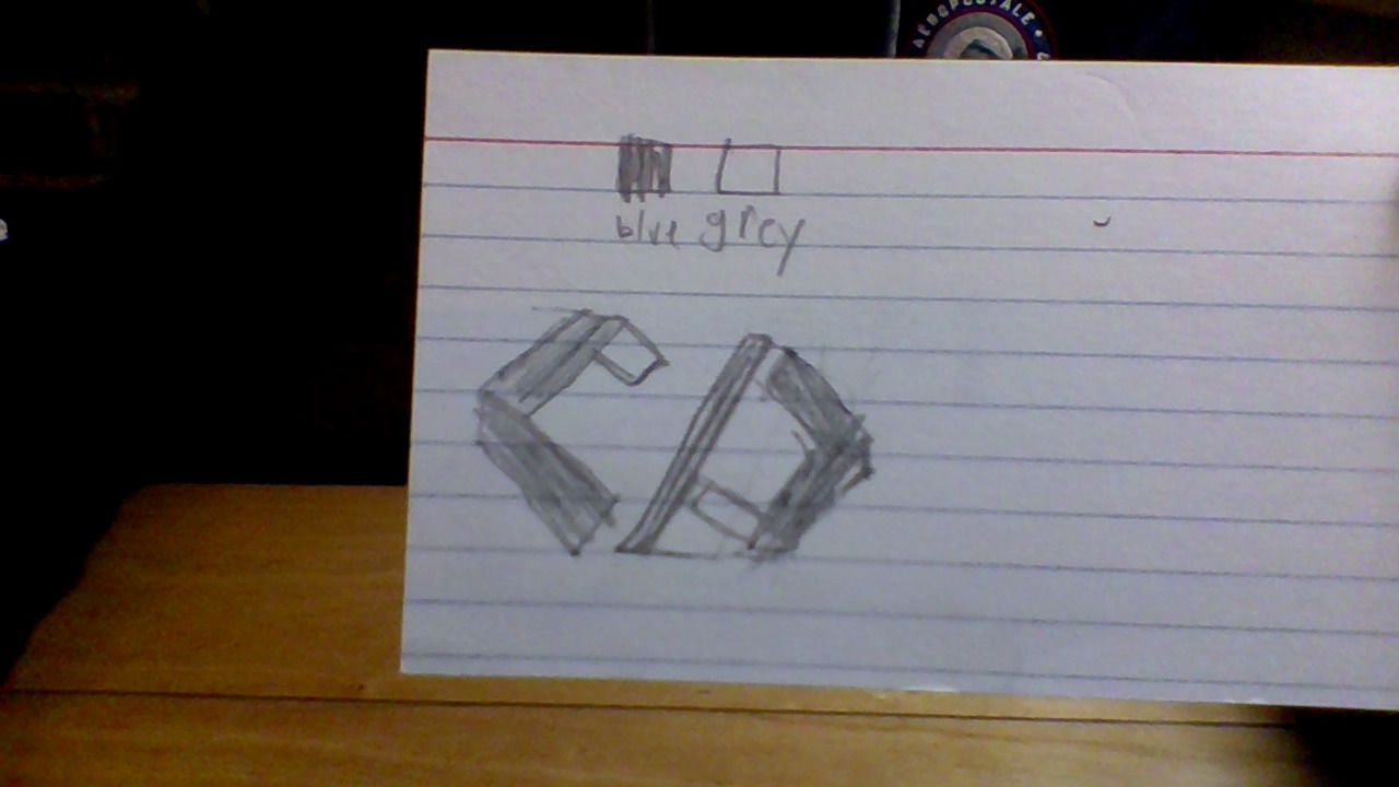
This is a really rough draft, but that is the main idea I have for this, You can tell it says CP, and if you use the shaded part with your cyan color, you can also see the < />.

also, I would separate the C and the P a bit more to distinguish that it is not an infinity symbol.

2
  • 1
    I actually also thought it was a broken lemniscate (∞), but after a second I realized the CP.
    – Welz
    Commented Apr 30, 2018 at 23:00
  • 1
    I created your 2nd edit [link], I hope I got it correctly, feel free to edit in.
    – Welz
    Commented Apr 30, 2018 at 23:52

Your Answer

By clicking “Post Your Answer”, you agree to our terms of service and acknowledge you have read our privacy policy.

Not the answer you're looking for? Browse other questions tagged or ask your own question.