0

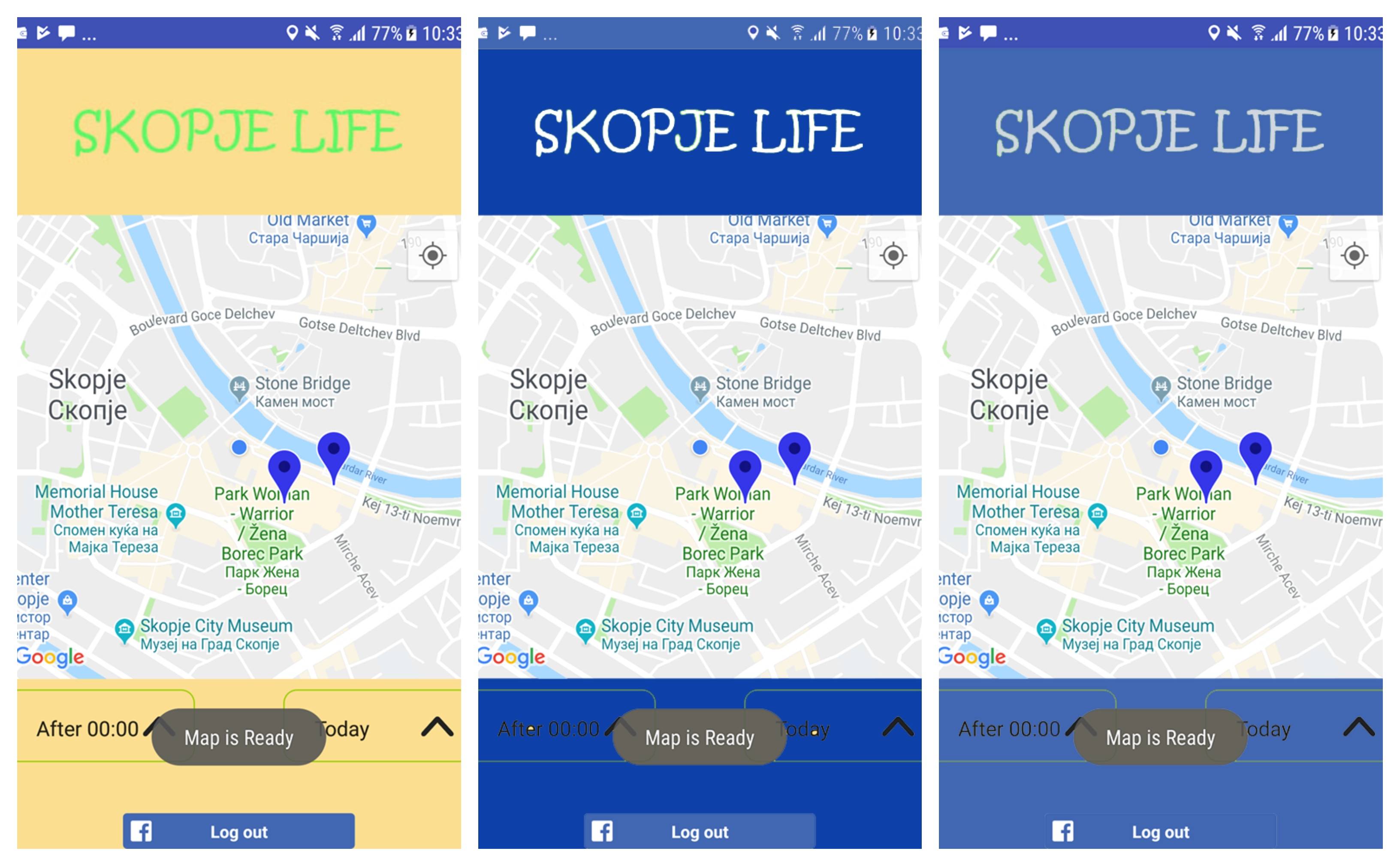
Need some help and advice, been working on an app, works good, time for the fun part, the design right. Turns out i really suck at that. So i made a few drafts, the green and yellow one was how i originally imagined it, but didn't quite turn out. Which one do you like best, which would should i change and how, do you have any other ideas, i would really appreciate them!

The logo that says Skopje Life will probably be drawn better by a pro and not me, and will be replaced. The facebook log in button at the bottom, i cant change its color. The markers on the map, wont always be blue. Anything else is changeable !

1
  • 1
    if anything, don't use a background color that matches the buttons... besides, that's quite a broad question to ask, and answers would be highly based on opinion and experience
    – Luciano
    Commented Jul 13, 2018 at 9:46

1 Answer 1

1

Well, since you are apparently hiring a professional for the logo, why not find one that can also design your app? Otherwise, have a look at some really good designs on Behance for inspiration.

If I were to suggest anything, I'll say use a white background (as most well-known apps are doing) with high contrast text, black or dark blue for instance.

Squeeze the logo area a bit and increase the map surface as this seems to be a map-oriented app. Give the buttons under the map a bit more whitespace.

Not the answer you're looking for? Browse other questions tagged or ask your own question.