1

Im a programmer and im finishing up my first app! So, i decided to have some fun and try to design my own logo(first time)enter image description here. The app is a app that maps events in the city of Skopje, Macedonia. Give me some critiques or advice ( except straightening the lines around the road and hill).
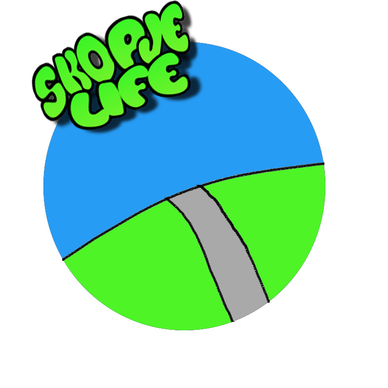
  1. 1.Is it too childish ?

    I feel like its a bit too childish and i am planning on adding some stuff in the blue area, just not sure what, advice? Keep in mind this is for an app. Its going to go on the logging screen.Thanks!

6
  • 1
    Hi Pasker, welcome to GD.SE and thanks for your question. I'm sorry to tell you that critique questions are a bit of a weird fit here, so we have some requirements for them that you can read about here. I'd like to ask you to edit your question to make it fit them. Otherwise, it might get put on hold. If you have any other questions about how this site works, have a look at the tour and the help center. Do hang around and keep on contributing!
    – Vincent
    Commented Jul 19, 2018 at 12:35
  • Oh i had no idea, il check it out. Thanks for being polite
    – Pasker
    Commented Jul 19, 2018 at 13:27
  • 1
    As an app icon, have you tested it out on small screens?
    – Luciano
    Commented Jul 19, 2018 at 13:45
  • My phone is pretty small and it looks good, i figured it look ok on even the smallest screens
    – Pasker
    Commented Jul 19, 2018 at 13:46
  • 1
    What kind of events does your app map? Private parties, cultural or public events? You're planning to add elements to the blue area, what for example? Who's this app for: teens, kids, older? Your question is still too broad to answer... perhaps you should really hire a designer to work with you in this app.
    – Luciano
    Commented Jul 19, 2018 at 16:06

2 Answers 2

1

Would you let a designer write your code?

I remember you were going to hire a professional for this logo a few days ago and think that was the better idea. What you have here can hardly be called a logo, a sketch - maybe, childish - definitely. I see you have a few bridges in Skopje, the stone one could be used in this logo, though i am sure it has been used before, its just one idea without researching too much into your local context. Then, that font is really really wrong, I've seen better fonts on Baby TV no offence. Look at some logos from this year, not from the 90's, just open Google Play and look at the first page logos.

0

Skopje probably has some landmark which is impossible to skip unnoticed if one has seen it. I know that things have changed during times, but if that landmark exists, try to include it inside the circle using your own style.

Another possiblity: Instead of the landmark insert something from the life sector that your site sees important. Good luck!

Your Answer

By clicking “Post Your Answer”, you agree to our terms of service and acknowledge you have read our privacy policy.

Not the answer you're looking for? Browse other questions tagged or ask your own question.