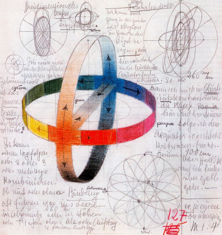
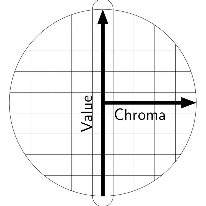
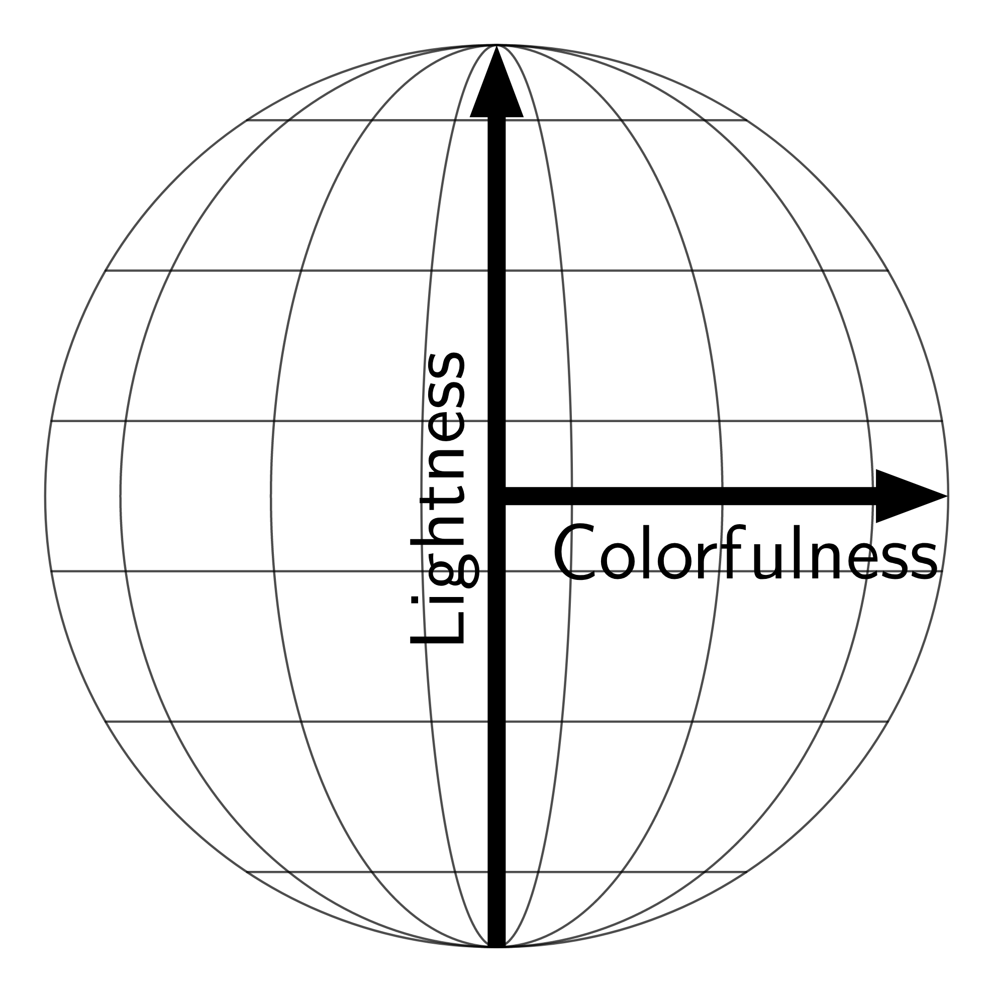
The reason why these guys that you ask about, dont describe the interiors all that well is that color does not actually work that way that they describe. Munsell did eventually realize this which is why the later iteration of munsell spaces aren't nice spheres.
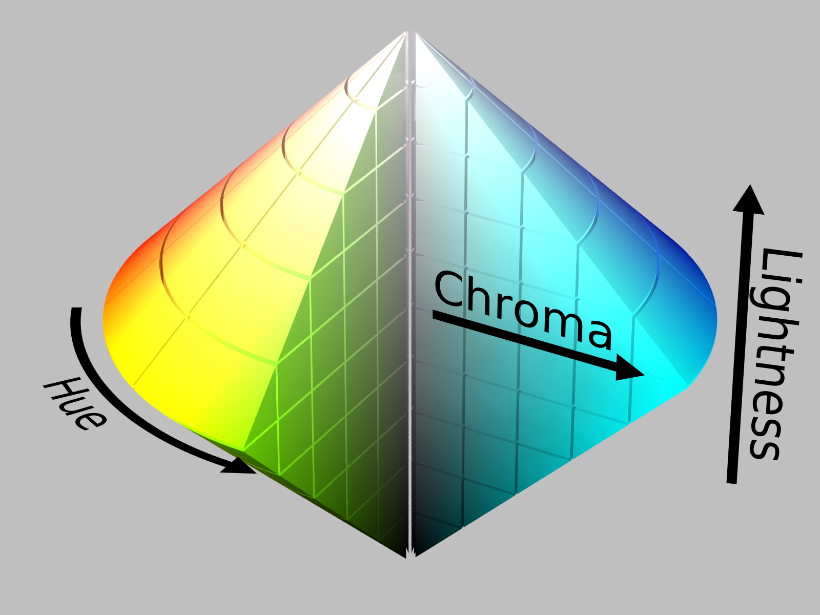
But Itten is basically describing is a derivate of a double conic HCL colorspace. While contemporary people tend to draw the space with linear sides. This is just because they are mapping some sort of visual linearness. If you'd draw real lightness the result would be more drop shaped than that.

Image 1: Contemporary drawing, wikimedia commons.
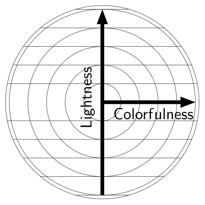
Now even very bright whites can be colorful so thinking the shells as colorfulness out of center is what would happen. So for example you often see cyan in the sky just because they are very very bright deep blues just becasue human senses will flood over. Off course this neglects the fact that cyan can also be cyan, but also dark bule.*
All this spaces even exception of the really hard to understand and interpret CIE spaces, that dont really tell anything meaningful of the colors. Don't actually reflect well how light and human sensing really work. But are artistically easier to work with and so they do have some merits.
* if you go into 3d graphics, then you will be confronted by this fact when you try to make reflections match reality

