7

I'm trying to lay out a block of several lines of all-caps copy. I want the lines to be evenly spaced. However when letters such as Ô and È are included in a line, they "collide" with the preceding row.

Here's a quick example:

ALL CAPS accents causing issues!

Are there any rules of thumb for handling this?

3 Answers 3

7

In some cases, for example, in publications headlines with a colored background close to the text limits, the height of the accented letter is reduced. As far as I know, it's the only one rule.

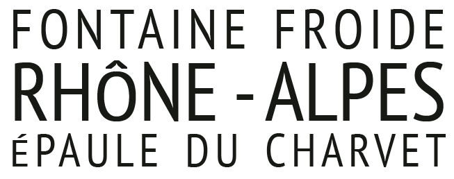
First

enter image description here

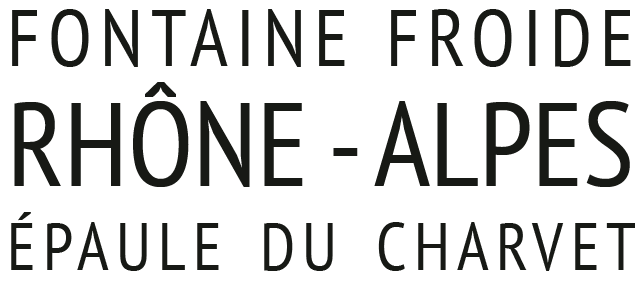
In highlighted texts such as the one in question, if the space between text lines has the same distance/height, what in different text sizes it is not the same leading; the equality between the separations creates a repetition pattern optically stronger than the proximity between accents and letters.
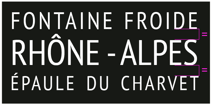
enter image description here

enter image description here

Try fixing your text with this optical adjustment, taking as a reference the largest line spacing.
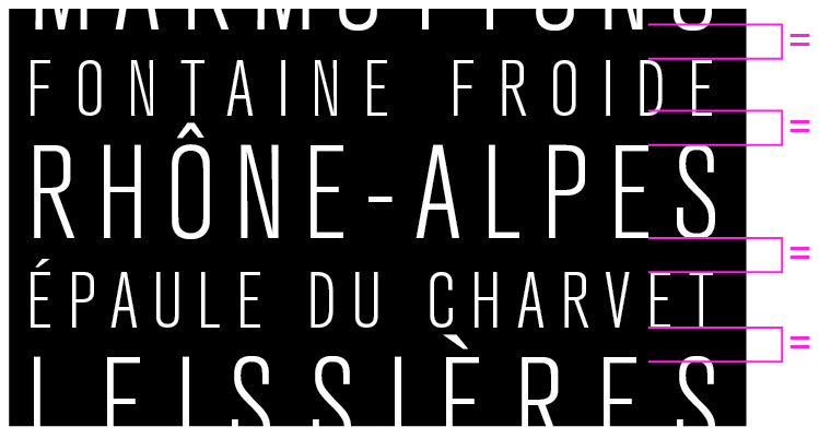
your text

3
  • 1
    Thank you very much for such a helpful answer. I originally tried reducing the size of the accented characters but it looked "odd" so thought I'd ask the question here. I'll certainly sort out the leading (interlinear spacing) per your suggestion...it's a mess as a result of quickly using the "distribute" alignment function :-)
    – James
    Commented Aug 31, 2018 at 11:14
  • 1
    Back in the 1980s, the PostScript standard included a means by which fonts could specify different renderings for accented characters in height-limited and non-height-limited contexts. I don't know if any newer font-rendering technologies have followed suit, but being able to have fonts define such renderings would seem better than ad hoc manual adjustment, since fonts could define things in such fashion as to maintain stroke weights.
    – supercat
    Commented Aug 31, 2018 at 15:38
  • @supercat therw lots of features in postscript that could be usefult today. Lots of things was lost only to be done again
    – joojaa
    Commented Aug 31, 2018 at 16:26
4

If you don't have a lot of text to deal with or if you can modify the font, you could also tweak the accents so they take up less vertical space. Just make sure that they can still be recognized for what they are.

Here are some examples in use 1, 2, 3

They'll still take up space in your leading but you'll get a consistent cap height and won't have them collide with the previous line.

1
  • Thanks for the ideas. I've worked it up with the standard accents but if they grate when I review it I'll bite the bullet and manually adjust them!
    – James
    Commented Aug 31, 2018 at 15:07
2

Really your only option here would seem to be to increase the leading. You can get titling fonts that have custom condensed accents. Fonts In Use shows some examples: e.g. see this modified umlaut in a German case, but I don't feel that fits with the design of your font. It's quite airy and spacious; my feeling is that this kind of modified accent tends to go best with bold geometric fonts, where people are willing to take a bit more abstraction from normal alphabetic forms.

Your Answer

By clicking “Post Your Answer”, you agree to our terms of service and acknowledge you have read our privacy policy.

Not the answer you're looking for? Browse other questions tagged or ask your own question.