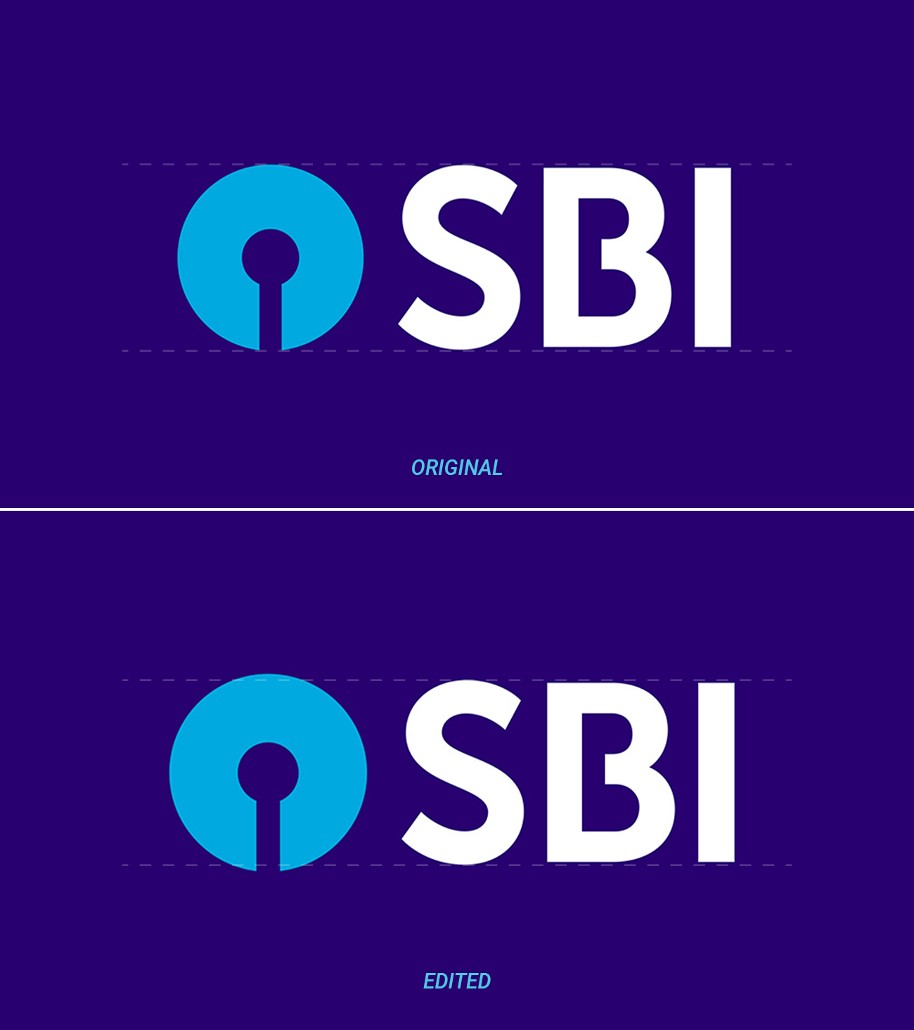
At first glance, this may look like a typographical overshoot, i.e., round bases and tops of letters extending a bit further up- or downwards than flat ones – which accounts for an optical illusion. However, if you look closely, you will note that the logo and the S already feature an overshoot in the original. Also, in the corrected version, the overshoot of the S is not increased, which would be the logical conclusion if you consider the original overshoot too small. Therefore, there must be more to it.
The reason why the logo needs even more overshoot is that it is darker than the text and on top has a hue similar to the background. This results in an optical illusion similar to the one requiring the typographical overshoot, which the additional overshoot compensates. See this question for a similar problem. For illustration, here is the original with a white logo, thus eliminating the need for this additional overshoot:


