19

I'm trying to come up with a logo for a web devlopment freelance company called Two-Bit Studios. The logo concept that I came up with involves a 1 and 0 combined to make a lowercase 'b'.

To me as a developer, this makes sense in many ways.

  1. "bits" are just binary digits with the only options of 1 or 0.
  2. The binary representation for two is '10'
  3. The 1 and 0 makes a lowercase 'b' which is the symbol for 'bit' (as well as the first letter, for extra clarity).

However, most of the people I'd be doing development work probably wouldn't know any of that, they'll probably just see a stylized 'b' which is a pretty insignificant part of "two-bit". Would this lead to a lot of misunderstanding or is the recognition of the logo more important.

(Note: I'm not a designer I'll be sending off my concept to someone more talented to greatly refine it, I'm just supplying the idea, this question is just about the concept of the logo).

enter image description here

12
  • 18
    Insert compulsory, "There are 10 types of people in the world…" joke here.
    – Tetsujin
    Commented Sep 24, 2019 at 15:13
  • 3
    This is a great, great question!
    – Rafael
    Commented Sep 24, 2019 at 16:12
  • 5
    I think the discussion is being led by the idea of bits a little too much here: "two-bit" has a very definite meaning in American English ("insignificant" or "cheap/poor quality"). Certainly used here as playful and ironic, but it should be considered as the primary meaning, regardless of the business domain.
    – Yorik
    Commented Sep 24, 2019 at 18:24
  • 6
    On first look, the logo seems more like "1 bit". Commented Sep 24, 2019 at 19:35
  • 1
    I was having this same exact question with this logo: uvreatio.sirv.com/Images/Shrynk.png . The bottom part should be about compression, the top part about predictions, and it shrinks from left to right. I think the people looking at it at won't get all of it most of the time, but I still think it is interesting to look at even for people who are clueless. I think yours ticks the box as well that it is actually a nicely stylized b at the very least, you'll score a lot of bonus points for those that will understand (like shrynk, it relies on hearing the name). Commented Sep 25, 2019 at 7:43

5 Answers 5

21

Your customers don't have to understand your name. Your customers don't have to understand your logo. Your customers do have to remember both. To make it easier to remember you'll typically make a logo that relates to the name.

The most important thing though is that its memorable. Any reasoning behind it quite honestly doesn't matter.

A mentor of mine many years ago named his company 540 Interactive. The 540 was the number of times a bird he owned flapped its wings in a minute. His logo was the text 540 Interactive with a little bird perched atop it. Did anyone ever get why the bird was related? Nope! Did it matter? Nope!

The fact is if the logo makes sense to you, don't worry about whether or not anyone else gets all of the nuance behind it. If someone asks you can explain it. Making it memorable and putting it in front of customers is far more important.

6
  • 7
    And I'd bet that people ALWAYS asked "Why the bird?" And once told, never forgot the logo. Commented Sep 24, 2019 at 19:38
  • 4
    +1 Many famous logo's meanings are not even a consideration for most customers, and some have even been lost to history. Shell is a great example of this; with their past in import/export of various antiques, oriental shells, and kerosene. Another one is the barber poles with their red, white and blue spirals, which represent the bloodletting procedures they were historically allowed to perform.
    – curious
    Commented Sep 25, 2019 at 4:51
  • It's hard to understand from your anecdote if you think 540 was cleverly chosen... it does not sound memorable to me at all (was it 530?) Commented Sep 25, 2019 at 7:40
  • 1
    That's a totally incorrect and bad example for the problem at hand, Ryan. Certainly, many companies have names/logos that are "whacky unrelated ideas". That issue is utterly unrelated in any way to "idea logos" where there is a "clever" symbolic link in the logo to a meaning related to the project.
    – Fattie
    Commented Sep 25, 2019 at 10:47
  • @Emilie While Shell is definitely an example of a weak link between the name of a company and what it does (now), the connection between the logo (a red and white seashell) and the name (Shell) seems pretty much on the nose to me. Though not explicitly stated, the question seems to be much more about the latter than the former.
    – Jasper
    Commented Sep 25, 2019 at 12:38
9

Do my potential customers need to understand the “meaning” of a logo?

If a 100% understanding is not achieved graphically, at least it should have a hint of the meaning.

Do my potential customers need to recognize my logo?

100% yes.

As in everything, I think it's about reaching a balance, if it turns in favor of one of the two options, much better for you, your company and your costumers.


Now:

I don't think it's very positive to disadvantage this balance towards a negative point. In the case of your logo, beyond formal errors, which has them, there's a quite important conceptual controversy that leads any potential customer not to immediately interpret its meaning.

The company is called “TWO-Bit Studios” and the main image perceived is a “1”.

Beyond the meanings, there is formally a two represented with a one.

A few years ago, quite a few, there was a stylistic tendency derived from deconstructivism that favored this type of interpretation to catch the public attention. There are examples in advertising, fashion, architecture and also in graphic design where for example a logo had some error in kerning, or alignment, or also some conceptual ambivalences. If in your case you talk about 2 and the image represents a 1 (and a 0), you are generating an ambiguity that can affect an effective result of your logo, which can be remembered for the “pseudo” error, but I don't think it will be interpreted.

Imagine your logo with the name below:
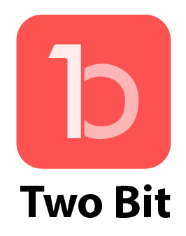
logo+name

There's a graphic representation of four elements: the two, the one, the 0 and the bit b:

  • 4210b

Maybe for a developer it might be something immediate, for a general public I don't think so.


I'm not a developer, but I know that among the main visual characteristics of the binary code are:

  • Items repetition
  • Equal distance between each component

enter image description here

Neither of these two features is represented to favor the shape of the letter b. Another point to increase the non-immediate interpretation.


Personally I think there are too many elements for something so simple. Perhaps a cleaning in the conceptual argument favors both points raised in the question:

  • Do my potential customers need to understand the “meaning” of a logo?
  • Do my potential customers need to recognize the logo?
1
  • 1
    Now I want that shirt! Commented Sep 25, 2019 at 13:43
4

Yes, customers need to understand a logo, especially with a new first-contact, never-seen-this-before logo. They will — in time — recognize it after seeing it repeatedly, but it still needs to make sense for anyone looking at it for the first time. Some possible reactions looking at your "idea":

  • is this really a "b"?
  • does it look like a "ten"?
  • where's the "2"?
  • why different shades of white?
  • why semi-transparent?
  • why red?

It just looks more complicated then it should be, but good to hear you're sending this off to a professional who may be able to give you a new perspective. As a designer, i think there's definitely a better way to look at this.

0
4

Okay I'll supply my short, image free, answer ... :)

No, it is not inherently bad if the underlying meaning of any logo is not picked up on in a conscious manner.

Logos don't have to consciously convey anything... it's all about subconscious interpretation. As long as the impression the logo makes is favorable, it makes absolutely no difference that viewers understand the representation of bits or that it's intended to convey some sort of "code" structure. None of that matters.


You can't tell me the meaning behind logo symbology such as Adidas, Pepsi, Motorola, Triple A, or even Adobe is readily apparent. It's not. People simply remember the mark and aren't typically concerned with why the mark is how it is.

3

You're making a common novice mistake. Trying to be clever and not having the execution skills to follow through. You also don't need a symbol for such a short name, and the 1 in the symbol for a company which actually has a 2 in the name is begging for confusion.

A word mark would be the best approach, so just spell out 2-bit in Helvetica XBold and be done with it.

As a professional agency designer for 15+ years, the approach i would take is: make the brand elements representative of bits and not binary numbers. They are effectively 'on' and 'off'... so you can get creative with that idea (filled/stroked. Square/circle. Red/blue etc etc). By displaying the name clearly you'd be facilitating the viewer to be able understand any subsequent bit/binary visual references. When designers say "keep it simple" we mean minimal, legible and to the point.

4
  • 1
    so very correct man, so many people over thinking, things just lose their sense
    – lmlmlm
    Commented Sep 25, 2019 at 10:27
  • This is (no offense to the other answers) the only valuable answer here. Well, I guess that is offensive to the other answers! :O
    – Fattie
    Commented Sep 25, 2019 at 10:49
  • 1
    Hi Paul, thanks for your answer. Calling someone an amateur and unskilled at the beginning of an answer is not very polite though, nor is it necessary for your answer. Could you edit your answer to change the tone a bit and make it more welcoming to the graphic design aficionado (amateur and professional alike)?
    – PieBie
    Commented Sep 25, 2019 at 11:51
  • 1
    How does this answer the question of whether or not a logo needs to be understood or just memorable?
    – Ryan
    Commented Sep 25, 2019 at 13:21

Your Answer

By clicking “Post Your Answer”, you agree to our terms of service and acknowledge you have read our privacy policy.

Not the answer you're looking for? Browse other questions tagged or ask your own question.