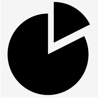
I created my first app in Android and I created a logo. The app is about tracking your football matches and then you can see statistics about them. I am not a very creative person, and I came up with this:
What do you think?
Thanks in advance.
I created my first app in Android and I created a logo. The app is about tracking your football matches and then you can see statistics about them. I am not a very creative person, and I came up with this:
What do you think?
Thanks in advance.
Without context, this layman suggests that it's a striking image, simple and bold. Technically it would be easy to reproduce with various devices such as a vinyl cutter or decal printer. Stencils would be straightforward as well. The flattened top and bottom should be corrected, but that's also just an opinion.
As an icon for an app, it will be easy to pick out of a cluttered screen.
This is honestly pretty solid. Great job on keeping the strokes consistent throughout. I personally wasn't aware that the blue/yellow was suppose to be inspired by a circle-graph at first, but I like the direction you're headed.
I'd love to see a "slice" pulled out a bit and portrayed similar to this: 
Although you assume you're not creative, this is a great first take on your app icon/logo and you should be proud.