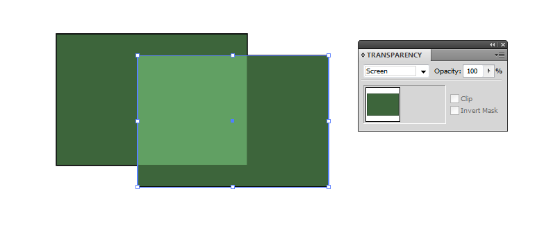
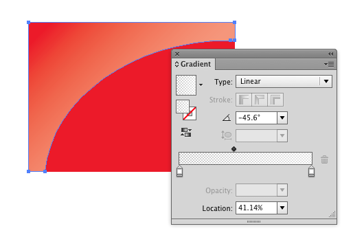
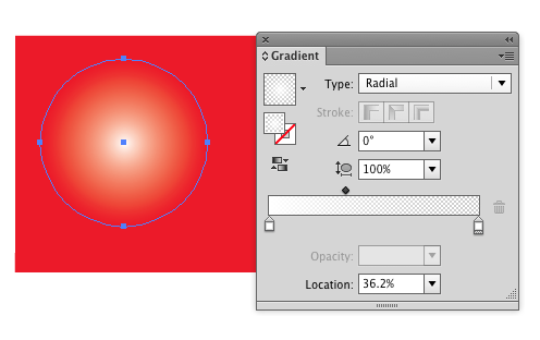
Blending mode Screen has at least the right direction:

Reduce the opacity to reduce the effect. Insert another identical shape to lighten more
The effect is now better than what's got by inserting only transparent white because this doesn't reduce the colorfulness as much as transparent white. Unfortunately the same highlighter shape cannot be used if there's also other colors below.
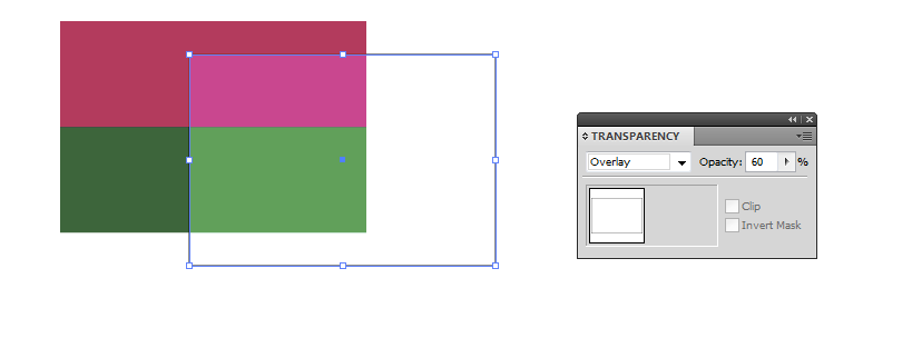
A method which allows several colors highlighted with the same shape is to insert a white shape with blending mode overlay:

On the top there's a white shape with reduced opacity and blending mode overlay.
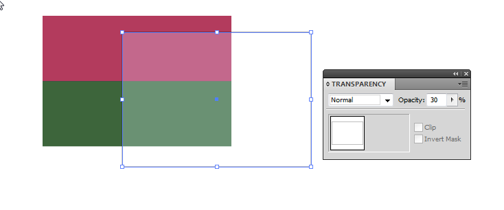
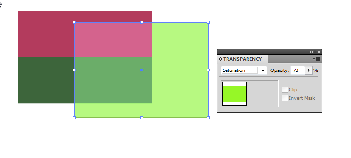
Another way with a little more control to highlight with the same shape more than one color below is to use 2 highlighter shapes with different blending modes:
At first insert a white shape which has reduced opacity, but blending mode = normal. It makes everything below lighter, but washes the colors out at the same time:

Then insert a copy of the same shape, but fill it with solid max bright and saturated green. Let it have blending mode Saturation. Reduce the opacity as needed:

None of these methods is perfect. I guess colorfulness reduction caused by only inserting transparent white for light (or transparent black to get a shadow) has started to look disturbing for you. If I guessed right you already have an idea that highlights and shadows need something more than inserting transparent black or white.
On matte surfaces the washed out highlight color is very much a lie which has pushed away the truth, because in RGB photos highlights often look washed. That happens because the RGB system cannot show the right color of the highlights if the darker areas are trimmed for good brightness, contrast and color saturation. The real highlight on a matte surface should be brighter, but as colorful (=same chroma) as the same material with less light.
Glosses reflect the environment which makes things soon complex - plausible glosses need some talent and experience if one doesn't make them with 3D model rendering. Photoshop's Bevel&Emboss effect is a special case of it.
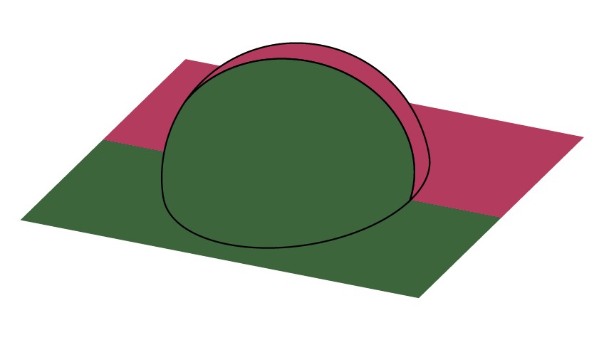
Finally let's try how to make a practical shading with the shown methods. We try only the overlay due its simplicity. We have a 2-color plane with a spherical bubble. Now the bubble is well visible because it has a thick black stroke. We want to get rid of strokes and make it visible with shading:

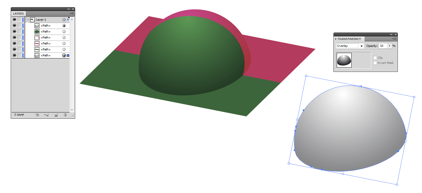
We insert an united copy of the bubble outline which has white to black gradient fill and blending mode overlay:

A copy of the inserted "shader" is shown in the right.
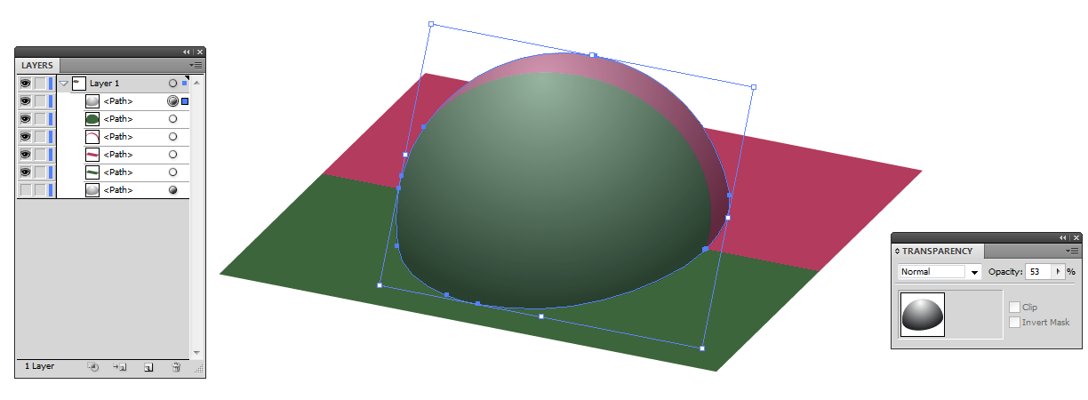
For comparison there's the same with blending mode normal. Note the heavy loss of chroma:

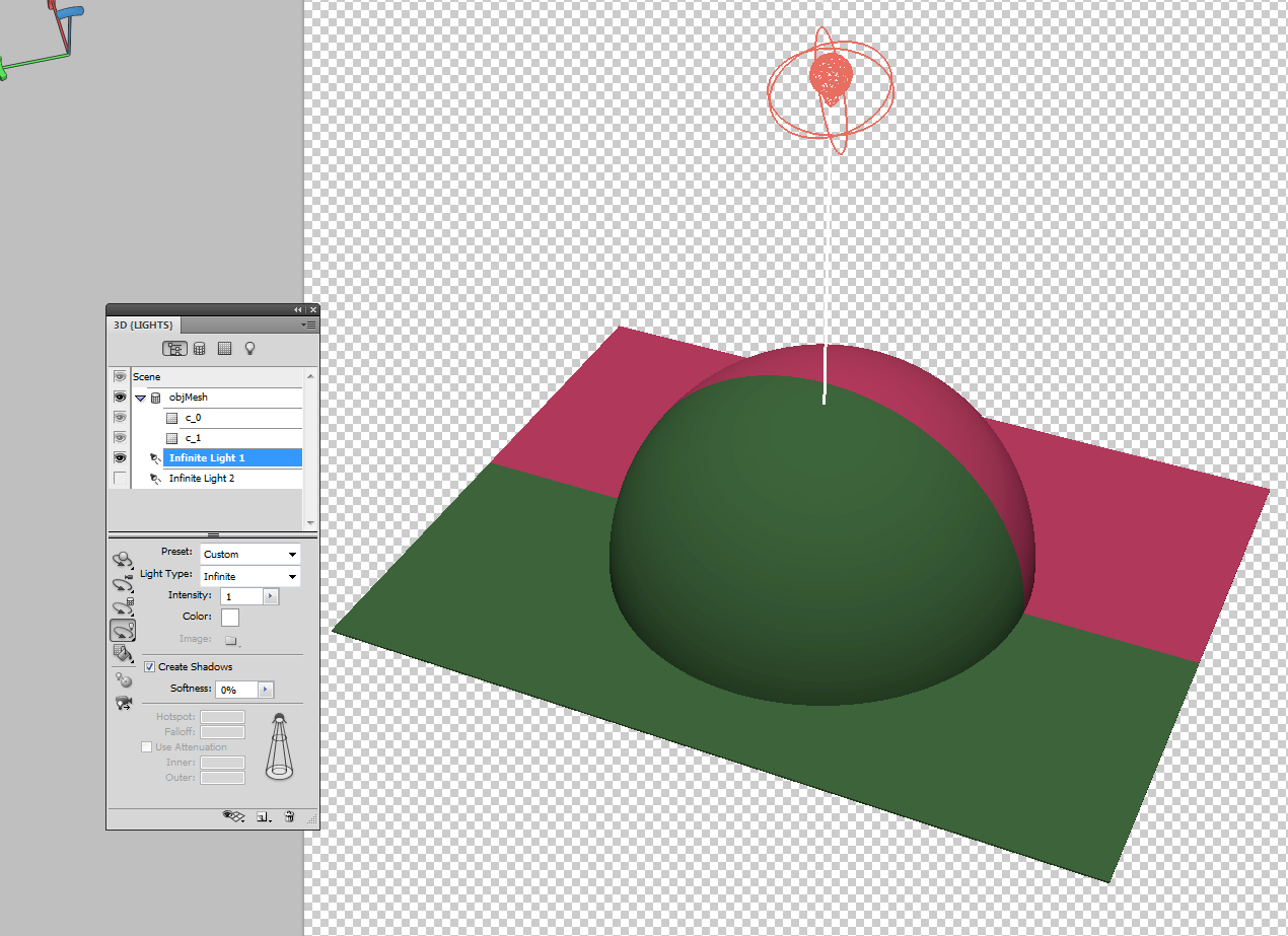
To see what a 3D program can make from the same subject and by assuming the light comes downwards I insert this rendered 3D model:

It's drawn in an entry level CAD program which unfortunately doesn't have controlled and realistic rendering capablity, so it's exported as OBJ file and opened in Photoshop:
It's not radically different than the BW gradient overlay version made in Illustrator except it has perspective and perfect division of the sphere.

