I'm really interested in learning how to create top notch UI for
websites, mobile apps, etc.
Okay, that's a broad topic. You want to create "beautiful", "top notch", professional looking" websites. So, you need to know what makes people perceive something as "beautiful", right? Luckily for you, beauty isn't really subjective.
One of the keys to a beautiful visual design is harmony.
The lack of harmony is what makes your designs look amateurish.
And, the best thing is that visual harmony comes down to maths. It's not about having a gut feeling.
Like others have pointed out, I'd recommend designing websites on your own. Try to apply the design principles you learn about instead of using a ready framework. It might be hard at the beginning, but it will help you become better.
How to embed harmony in a website design
Following is a practical example and a funny little exercise you can do now.
One way that I personally prefer is to use a modular scale to size the website elements in harmonious proportions. A website that can help you generate a modular scale is this one: modularscale.com
The benefit of using a modular scale is that it can make sizing decisions as easy as picking a number from the scale.
For example, let's size a website's headings (to communicate visual hierarchy).
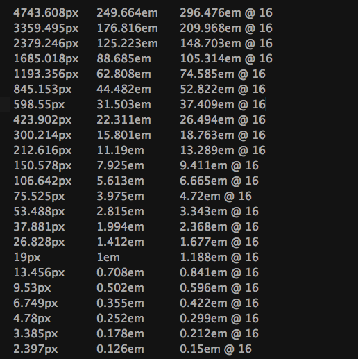
Let's say we have this modular scale based on the 19px body font size that I chose (19px because it looked best with the font I was using, but you can skip this step and go with the default 16px size) and the ratio 1.412 (No need to go into details why I chose this ratio. Just any ratio will do better than no ratio for your projects.):

Looking at it, I’d pick the H1 to be 2.815em, the H2 to be 1.994em and the H3 to be 1.412em. First 3 numbers bigger than the body font size. Easy-peasy, right?
The body text would be 1em (in my case 19px). Then, I’d size the H4-H6 at 1em and use contrast (different font weight or style) to differentiate them from the body text.
So, try this now:
- Generate your own modular scale
- Get a plain HTML document (real content, please no Lorem Ipsum)
- Use the scale to size the headings.
- Then try using the scale for other sizing decisions (margins, paddings, etc)
That's just a small step towards better designs, but I hope that it will help you.
If you found this helpful, you can read my other list of 7 tips for beginner web designers who know HTML and CSS
P.S.: You really have a lot of reading to do
Like others have said, read:
- The Elements of Graphic Design by Alexander White
- The Elements of Typographic Style by Robert Bringhurst
- Don't Make Me Think by Steve Krug
Also, here a huge list of online resources like blogs and communities to keep an eye on: enboard.co/webdesign/

