21

Background on color perception:

Due to the nature of the human eye and visual processing by the brain, there's an optical illusion that the same color will look different depending on the background.

It is known as the contrast effect, illustrated below — center rectangles are identical:

enter image description here Source: Wikimedia

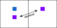
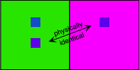
An illustration (and report) by NASA makes the effect of the background's color even more obvious:
enter image description here

enter image description here Source: NASA Color Usage Research Lab

(Note how the two upper-most colors in the second image appear the same, but are actually completely different.)


What about web design?

My question pertains to web design, specifically in this case, the color of link text on different backgrounds.

For a given color of text, how can one find the complementary color to make it appear the same on a certain background?


Let's take a look at an example for this question:

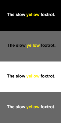
Consider my example below, with yellow text #FFF000 on the following backgrounds:

  • white #FFFFFF,
  • black #000000,
  • and grey #555555.


Compare colors on different backgrounds for web design text


As expected, doesn't look the same at all. (View and download .PSD file here.)

How can we make it look the same on all three? Clearly, the text on the white background needs to be a darker yellow, and the one on the grey needs hue/tone adjustments. (The surrounding text will also affect it — but that's likely harder to account for.)

Can this perfect color somehow be calculated, based on the Hex, RGB or another system? That's where the crux of this question lies, as it would be much more efficient than manually approximating.

8
  • You'll need to use yellows. Notice in your examples they used colors similar to the one they are trying to make look different.
    – Hanna
    Commented Jan 30, 2013 at 5:37
  • 2
    @Johannes, what do you mean?
    – Baumr
    Commented Jan 30, 2013 at 5:40
  • In your first example the colors used were all shades of gray. In your second example your purple was made to look more blue through the use of a very bright purple. Then in your yellow example you're butting yellow of whites, grays, and blacks. So what I'm saying is you need to use yellows instead to make your yellow appear the same on different backgrounds.
    – Hanna
    Commented Jan 30, 2013 at 5:47
  • 1
  • 1
    This behavior in video form Commented Dec 31, 2019 at 14:10

2 Answers 2

11

It seems like you're looking for the analogue of complementary colours, but in the lightness space rather than hue. As far I can tell, no such general mapping can exist.

Suppose you could compensate for the effect by assuming a linear correlation between the background and the foreground, so that as the background darkens the foreground text lightens by the same amount. I assume that hue remains fixed. There will always be a midpoint at which the background and the foreground share the same colour.

As an example, consider black on white. The converse lightness for the same hues is white on black, but if you tried to find a foreground for every intermediate background of the same hue, at the midway point you hit grey-on-grey and can't see anything at all.

For much the same reason, I can't see that any reasonably simple mapping — even a lossy one — can exist.

2
  • 1
    To solve this, I think we would need to build a model of the (average) human eye, and find the best fit using a genetic algorithm
    – Baumr
    Commented Mar 5, 2015 at 13:31
  • 1
    @Baumr: Could be a good PhD thesis :) Commented Mar 5, 2015 at 13:41
0

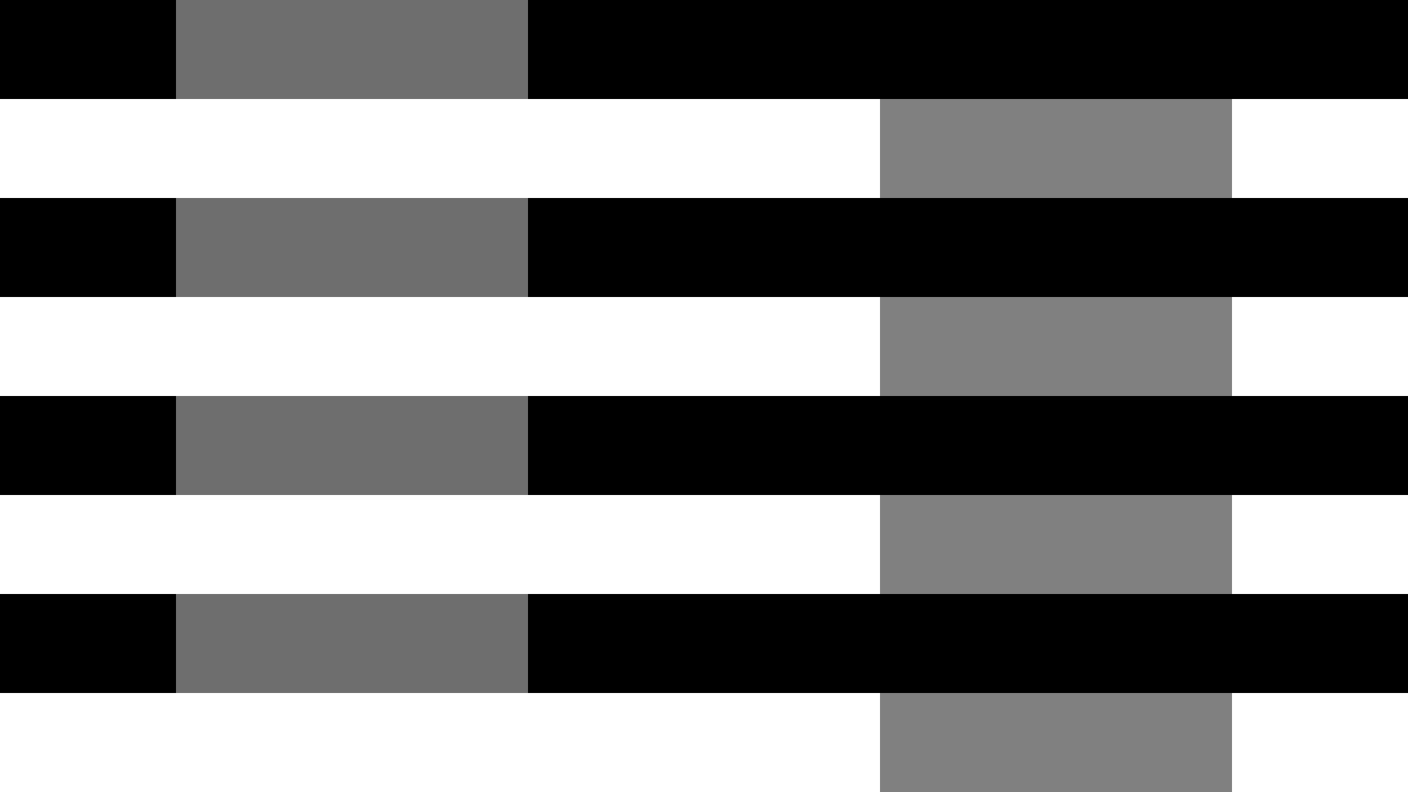
How about this: use different greys under different backgrounds, painted white and black, so that the former appear the same, but not when they're against a neutral one.

Let me know if these two sets of patches look the same on top of the black and white rows:

enter image description here

Because what these patches look like on top of a neutral grey is depicted in this picture:

enter image description here

I used GIMP's layer blending mode called Grain Extract/Merge, which allowed me to find the lightest grey by extracting a neutral patch from another, and then the darkest one by merging the two of them together. In other words: I found two greys whose additive-averaging is neutral.

With color against a black or white background, you can use Grain Merge to find the additive-averaged color, and with Grain Extract the complementary of the latter.

EDIT: check this out. You may find these yellows to appear the same.

enter image description here

Your Answer

By clicking “Post Your Answer”, you agree to our terms of service and acknowledge you have read our privacy policy.

Not the answer you're looking for? Browse other questions tagged or ask your own question.