11

My human brain has a certain sensation of how "bright" a color is. More formally there is Lightness:

Human vision has a nonlinear perceptual response to brightness: a source having a luminance only 18% of a reference luminance appears about half as bright. The perceptual response to luminance is called Lightness. It is denoted L* and is defined by the CIE as a modified cube root of luminance:

enter image description here

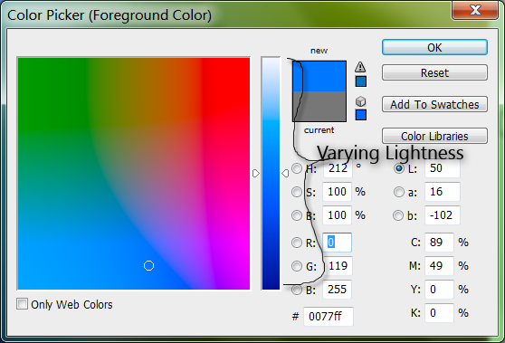
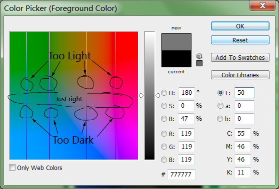
Lab is one color model where colors with the same Lightness should appear to have the same "bright-ish-ness". Except when i look at a color picker showing colors with the same L, they don't appear equally "bright" to me:
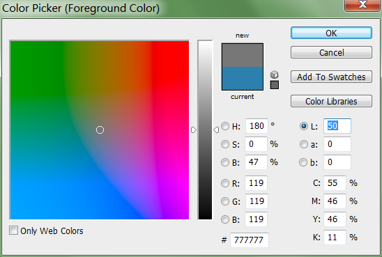
enter image description here

Maybe it's limited to my brain, and other's don't see it, but when i look at that color swatch some i see lines separating darker areas from lighter ones:
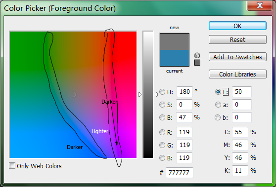
enter image description here

What accounts for this variation in Lightness?

  • is it just me?
  • is it because my monitor is not color calibrated with Photoshop's sRGB?
  • is it a limitation of a trisimululus color representation (i.e. red+green+blue) used by LCD monitors?
  • is it a limitation of the Lab color model?
  • is it a limitation of the XYZ color model?

Why is it that colors that should have the same Lightness have different apparent brightness?

4
  • 2
    Obligatory Animal Farm: All colors are equal lightness, but some are lighter than others.
    – Ian Boyd
    Commented Feb 29, 2012 at 16:53
  • Is this a color perception question or a design question? Commented Feb 29, 2012 at 16:59
  • perception for sure, consider that there can be sounds of equal loudness that are outside the range of human hearing. We might not be aware of their existence at all. Another example: infrared and UV have measurable brightness, but are outside our ability to perceive.
    – horatio
    Commented Feb 29, 2012 at 17:23
  • @lawndartcatcher: Yes. i have a designed application, that should honor a user's color preference. Then there's the algorithm to "colorize" existing elements. You want to keep the various lightnesses the same, but change the color. But changing the color changes the lightness - even colors that have the same lightness.
    – Ian Boyd
    Commented Feb 29, 2012 at 17:39

4 Answers 4

10

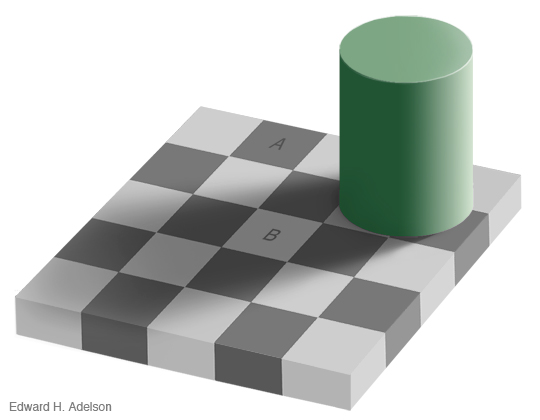
Goes back to this illusion.....

Checker shadow illusion

The squares marked A and B are the exact same shade of gray.

Surrounding values alter the human perception. One reason why a neutral grey desktop is very beneficial when doing color critical work.

I don't know all the science behind it. I expect it would take a medical degree to fully understand.

(photo from http://web.mit.edu/persci/people/adelson/checkershadow_illusion.html)

7
  • 1
    good gravy, they really are. I DLed it and eyedroppered both squares and they both came up 6b6b6b. Commented Feb 29, 2012 at 19:50
  • 1
    I HAD to do the same thing first time I saw it Lauren. I didn't believe it until I saw the numbers.
    – Scott
    Commented Feb 29, 2012 at 20:01
  • 1
    And despite the fact that you've both done it, I had to as well. It's amazing to me mostly because they aren't that far from each other (distance-wise). What an amazingly effective graphic.
    – Farray
    Commented Feb 29, 2012 at 21:43
  • 2
    That version of the image is somewhat spoiled by JPEG compression artefacts.
    – e100
    Commented Mar 1, 2012 at 10:39
  • 1
    @e100: I replaced it with a better one. Commented Mar 1, 2012 at 22:48
3

i decided to test Scott's theory, that it's an optical illusion.

Really the colors are all the same lightness, and if i compared them side-by-side i would see they're the same lightness.

Starting with the "darker" blue from my original question, you can see the vertical gradient provided by Photoshop. That gradient is:

  • that is the same "color"
  • but with different lightness:

enter image description here

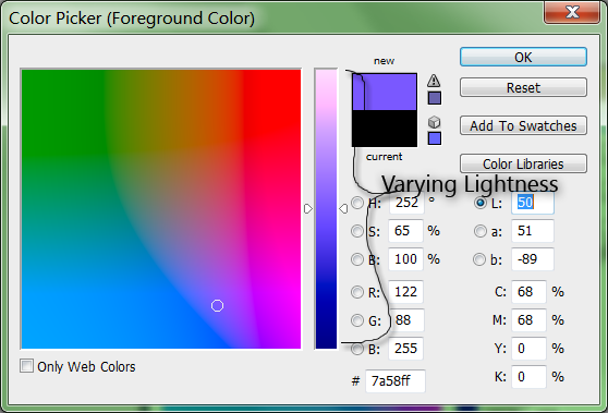
And the same with the "lighter" purple:

enter image description here

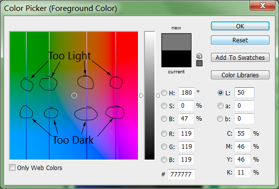
i take a single strip of that lightness scale from both colors, and overlay them on top of my original "50% lightness" gradient:

enter image description here

  • at the top, the bars are "too light" compared to the background
  • at the bottom, the bars too "too dark" compared to the background:

enter image description here

which means somewhere each line must have the same lightness as the background:

enter image description here

And in my opinion the blue is the same lightness at 50%, as the purple is at 50%, as the background is at 50%.

So they really are all the same lightness.

My brain is just dumb!

3

Because our color perception is subjective/psychological and doesn't correspond to any mathematical models. Also, the LAB colorspace can't be produced on RGB monitors. In fact, many LAB colors are purely imaginary.

Furthermore, CIELAB is considered the most basic of the CIE "color appearance" models, which have been gradually developed over the years to better model perceptual color. Newer color models include S-CIELAB and CIECAM02, both of which use human contrast sensitivity functions to better model human color perception. A more recent and even better perceptual color model is called HCLarchive:

A New Perceptually Uniform Color Space with Associated Color Similarity Measure for Content-Based Image and Video Retrieval

It was developed outside of CIE by Canadian researchers in 2005 and improves on existing models using a new similarity metric called DHCL.

See the wikipedia articles on color, color theory, and color vision for more details. This short document also describes the strengths and weaknesses of CIELAB.

2
  • 404 on the "short document"?
    – Ian Boyd
    Commented Feb 29, 2012 at 20:51
  • Sorry, Google's SERP makes it hard to copy the actual URL. It should be fixed now. Commented Feb 29, 2012 at 21:02
2

No, your brain does not have the dumb.

enter image description here

The eye responds better to certain colors than others, so some colors will always appear darker than others at the same relative (to 100%) brightness. This is something graphic designers, set designers, movie makers and lighting directors have to work with constantly.

Desaturating/grayscaling an image is a quick way to pull color out of the equation so you can look at the relative contrast in a layout. This is not the same as a Black and White conversion, which applies offsets to different colors to mimic film or various filters.

A design can sometimes fail because it lacks grayscale contrast, even though the colors are contrasting. When a layout will be seen from a distance or in small scale, tonal range (which is what "grayscale contrast" is) becomes very important to legibility because our eyes respond first to lightness (relative to 100% for a given color) and secondarily to color.

If something looks too bland in grayscale, color is not likely to salvage it.

Your Answer

By clicking “Post Your Answer”, you agree to our terms of service and acknowledge you have read our privacy policy.

Not the answer you're looking for? Browse other questions tagged or ask your own question.