1

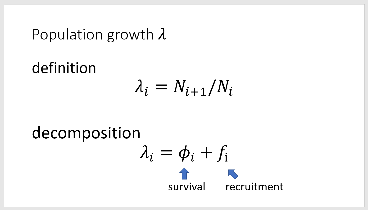
I am using MS PowerPoint 2019 with the default settings and with these, my slide looks like this:

enter image description here

It by default uses Calibri Light 44 for the slide caption, and Calibri for the rest of the text (except math formulas). But it looks ridiculous to me - why should the slide caption look "less bold" and be from a thinner font than the rest of the slide? Shouldn't it be the other way around?

Is it some modern graphical design that I just don't see, or is it just a bad default?

5
  • You say Calibri Light, but you didn't mention italic… Calibri Light's Phi is slightly reminiscent of yours [though, of course, not italicised], but Calibri Italic is totally different. I'd guess you have some font substitution going on there.
    – Tetsujin
    Commented Aug 23, 2022 at 13:52
  • @Tetsujin don't focus on the math formulas, I'm not asking about these (they have different font). Important is the rest - the caption and the other text.
    – Tomas
    Commented Aug 23, 2022 at 14:03
  • Ah, OK, misread - so you're wondering why Calibri Light looks lighter than Calibri, or why someone chose those defaults? We can't answer why any company chose to do things a certain way.
    – Tetsujin
    Commented Aug 23, 2022 at 14:24
  • Yeah, why those defaults - the question is, whether these defaults make graphical sense, so I should keep them, or not.
    – Tomas
    Commented Aug 23, 2022 at 14:28
  • Don't know if it's possible to answer the why question. Perhaps somebody just messed up. Yes it looks bad, it's unbalanced. You should probably change it.
    – Billy Kerr
    Commented Aug 24, 2022 at 23:00

1 Answer 1

1

It looks a bit dumb.

One of the goals graphic designers often have is to use lighter and lighter font weights as the size increases. That means the width of the strokes is roughly the same at different sizes, almost to create the illusion that all the letters in the layout were drawn with the same pen. That means a light font weight at large sizes, a bolder font weight at smaller sizes. You can see a guide to that here. This was one of the best things about classic metal type serif fonts like Bembo, the designers carefully designed every size right for the size it would be printed at to make the design feel comfortable at any size.

It feels here like someone tried that but it hasn't worked out, the body text is too large and the heading is too small. Needs better balance of size. This is one of the things variable fonts can help pro designers with.

Your Answer

By clicking “Post Your Answer”, you agree to our terms of service and acknowledge you have read our privacy policy.

Not the answer you're looking for? Browse other questions tagged or ask your own question.