1

I have a project in inDesign that was only budgeted for 2 colors, Pantone Orange and Black. I've read that to print photos with only 2 spot colors, you'd need to have the photo set to a grayscale color mode and then in indesign, set the fill of the bounding box with the photo to your spot color. This works, but there are no highlights.

I was wondering if I create a second image in a greyscale color mode, with only white and alpha values, and then place that over my spot colored orange and black image, will it print just fine?

Here is the grayscale image:

black and white photo

Here is what it looks like using two spot colors in design: black and orange photo

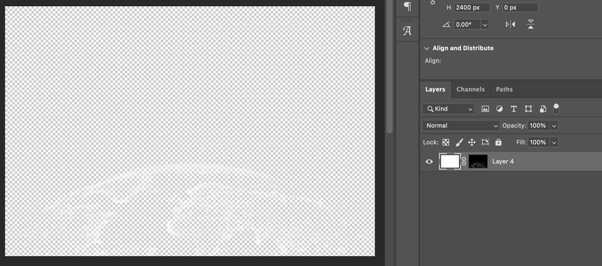
Here is an all-white fill with an alpha mask of only the highlights of the original image (photoshop screenshot for clarity): white fill with alpha mask
Here is what it looks like in indesign with the white image over the black and orange image: white alpha image over black and orange image

I guess I'm just asking for assurance, but will this work? Or would it be better to just image-trace the white image be a vector? And that way it's guaranteed to work.

2
  • It depends entirely on how the "spot colored orange and black" image is constructed... which you don't go into detail about. In theory, yes, placing a white image on top of a spot color in Indesign will effectively "knock out" the spot color.
    – Scott
    Commented Jul 7, 2023 at 20:00
  • The greyscale image has whites... rather than a flood fill of a spot color, you could construct an actual duotone image and have control over the white's showing without any need for a secondary image.
    – Scott
    Commented Jul 7, 2023 at 21:04

1 Answer 1

1

For the highlights to work, you need to poke a hole in the orange, (Although it could work, I would not overlay another layer as in your example)

A duotone is normally the same image with some modification on the curves to emphasize different zones.

Here is a modification I made on your same image for the orange channel.

The curve has 3 zones:

  1. I am crushing all the dark gray tones to have a flat orange

  2. To keep them smooth I made the middle section as a curve.

  3. I crushed the very light tones flattening the last portion of the curve, so I have clean whites.

The right image is a simulation combining orange and black ink.

enter image description here

It still could have a bit of tweaking; I would like pure white on both, black and orange channels.

As the black ink is a big grayish on the highlights It also needs some white crushing. But also I Lighten up the overall image so more orange shows in the image making it "glow". Here is the black ink modified.

enter image description here

If you have the original RGB image, try using different channels for different inks. Here is a full explanation: Preparing design for duotone printing?

Your Answer

By clicking “Post Your Answer”, you agree to our terms of service and acknowledge you have read our privacy policy.

Not the answer you're looking for? Browse other questions tagged or ask your own question.