1

I'm making a custom GUI on a custom device (7 inch 800x600). It supports .otf and .ttf fonts.

The customer supplied us with a custom font in otf format.The font is not monospaced, which is fine. It is based on the font "Letters from Sweden".

But the digits are not monospaced so text on the display is dancing when digit values change. This is the issue. I'm hoping making at least the digits the same width would resolve this.

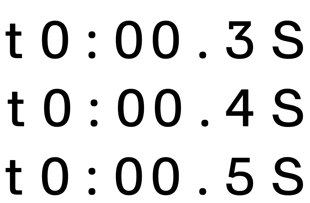
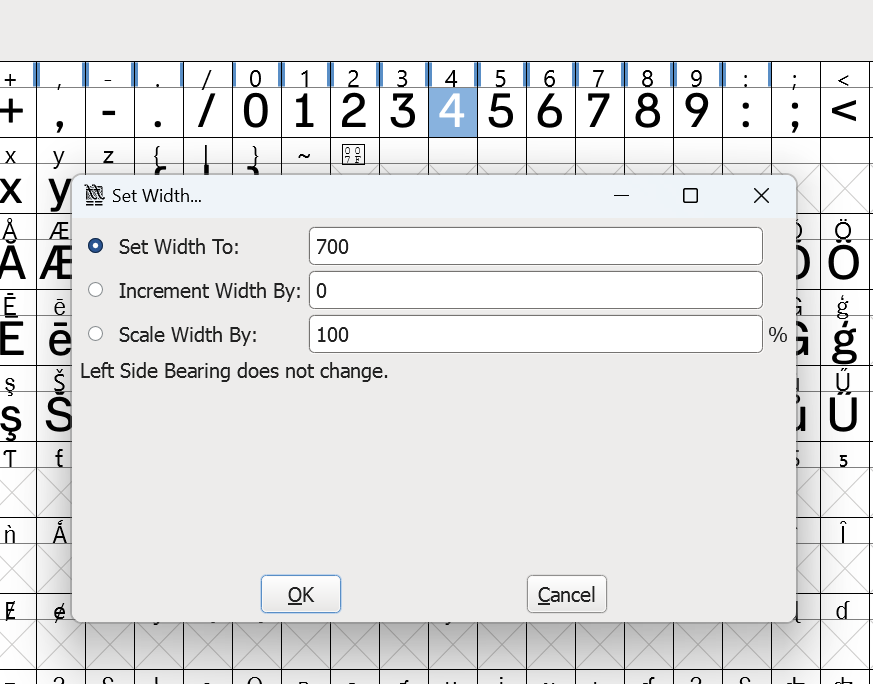
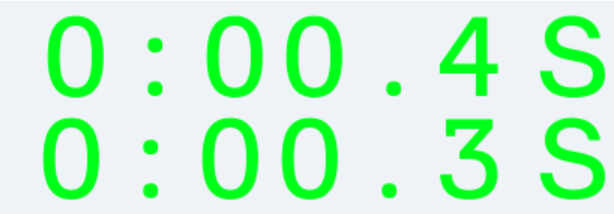
I used fontforge to set the width of the digits to the same width and save it as tff. This appeared to work. But I noticed that the digit 4 is slightly less wide. Digits dance when when a digit changes to or from '4'. I set it to an extreme width, but that didn't help. In MS word and custom hardware I see that 4 is indeed slightly less wide. Both with right align and left align. But the effect is more noticeable on the custom hardware.

digits on custom hardware (simulator):

digits on custom hardware

digits in MS Word (notice the position of the period):

digits in MS Word

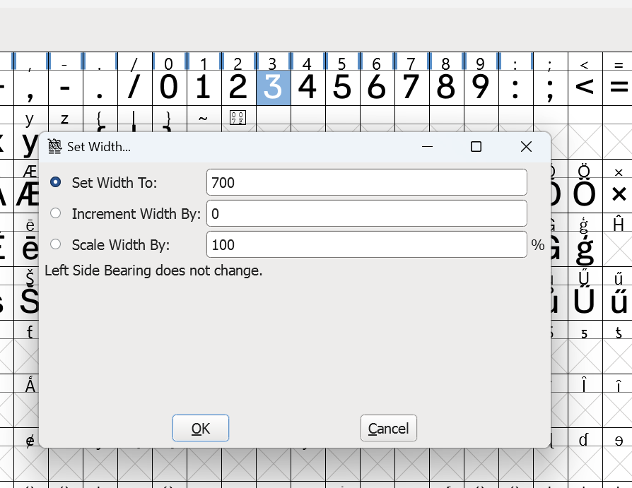
digit 3 in fontforge

digit 4 in fontforge

I'm a lay person in terms of font design. Could the error in width be due to rounding numbers? Are kerning-pairs related to this?

But my main question is how to prevent dancing text?

There are no copyright issues in making the modification as the fnt files themselves would not be accessible/published, but converted /compiled to bitmap on an embedded device. So the font itself will not be modified, just the rendering will be tweaked.

3
  • 1
    Letters from Sweden is a company that sells commercial fonts. Is this font one of theirs? You'd be best off asking them to make the required modifications for you. Also, normally you don't have the right to modify commercial fonts yourself, the font maker retains that.
    – Copilot
    Commented Aug 24 at 17:57
  • 3
    The simplest answer here would be to use an actual monospace font. The problem with modifying a commercial font is that under most circumstances, you will find that it's not legal to do so. Check the font licence, or check with the font creator to see if this is allowed.
    – Billy Kerr
    Commented Aug 25 at 9:21
  • The customer has licensed this font to us and we can modify it for rendering purposes. The font is converted/compiled into a bitmap or vector format by the GUI tool we use (TouchGFX). It's only used on a embedded system so modification of the font only results in different rendering on the screen of the product. The font files will not be accessible by others. Using a monospaced font would be the best option. But then I would have to use different fonts in different places. I rather just modify the digits.
    – elechris
    Commented Aug 25 at 20:18

1 Answer 1

1

I figured it out. The issue was kerning. Many digits had non-zero kerning-pairs. The variable kerning and the variable width of the digits cancelled each other out in many combinations so I didn't notice it. The digit 4 just happened to have worse kerning values leading to digits dancing. A period followed by a 4 was off by 3 pixels compared to digit 3, for instance.

I made the font's digits "monospaced" in fontforge the following way:

In FontForge I selected all the digits using shift. Then I used set width to give them all the same width using Metrics -> Set Width. Then I centered them all using Metrics -> Center in Width

To remove kerning for digits: Element -> Font Info -> Lookups -> GPOS

Then I selected the table 'kern' Horizontal Kerning in Latin lookup 0 subtable Then Edit Data. Then I deleted all digits from the kerning table.

For good measure I added the unicode character "Figure space" (0x2007) so numbers padded with spaces all have the same width when replacing the leading spaces with "Figure space". I simply used set width to set the width of this missing character to the same value as digits.

Your Answer

By clicking “Post Your Answer”, you agree to our terms of service and acknowledge you have read our privacy policy.

Not the answer you're looking for? Browse other questions tagged or ask your own question.