7

We are about to create a new luxury fashion brand. We researched many trademark logos, and saw they use different font types. We cannot decide between the two different fonts below. We target people who using luxury leather goods (handbags, belts, wallets), similar to Michael Kors, Furla, Balenciaga or Prada.
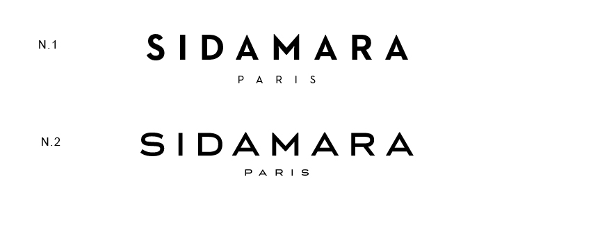
enter image description here

Which one looks cool, good and suitable for a fashion brand? Would appreciate the input from you knowledgeable graphic artist.

2
  • 2
    Both are valid. This will mostly come down to preference. I'd suggest n2 for 'Sidamara' and use n1 for 'Paris' to give a bit of contrast between the two.
    – DA01
    Commented Mar 29, 2014 at 3:00
  • I don't know if these are finals but kerning looks off to me on the 1st option in the IDA part.
    – curious
    Commented Mar 30, 2014 at 2:29

5 Answers 5

12

A typeface tells a story.

Whether or not you're consciously aware of it, it has history, character, emotion. Of course, most people don't realize this. It's subconscious but that makes it all the more powerful as a psychological tool.

If your mark is going to be primarily typographic, the message of the typeface becomes a much bigger piece of the authenticity of your branding. It needs to align with your story and aspirations.

In your example, #1 has a sort of early 20th century New York architectural feel. It's stylish but approachable. It's solid and just a little quirky. #2 is much more serious, somewhat European, and possibly snobbish.

We could all tell you what we like but that's not very relevant to your brand.

1
  • Thanks for your valued comment. Yes we want typographic brand logo. Just some like Louis Vuitton, Prada, Gucci, Fendi, Armani. I know this is very hard procces to create unique type of font. But we hope we'll find best font type for our brand.
    – murat
    Commented Mar 30, 2014 at 12:54
8

This is wildly opinion-based, but I would go for number two; hands down. The proportions are better, the sharpness of the M an As less spiky. Besides.. the top one reminds me a little too much of Futura, and though it is a good font, it is a little dated. At least to me.

0
4

I would say the first font is better for a fashion brand because it is thinner and more angular. These things give it a great feminine distinction and make it more appealing to that audience. It also has the advantage of being bolder and will stand out better when inverted to white against color and will stand off print material well when black.

0
2

Although I understand everyone's thoughts of going with the second version, I would not. Engravers Gothic is too widely used in luxury brand identities (Marc Jacobs, Acqua de Parma – to name a few)…thereby making it less unique. If you would like your brand to stand out among the rest, I would go with number 1.

1

I like the first one, it has more of a classic feel and the "PARIS" just looks like luxury.

The second ones horizontal scale seems too wide, especially in the A and S.

0

Not the answer you're looking for? Browse other questions tagged or ask your own question.