6

Was doing some reading and came across this which I found very insightful:

Weight

This is the difference between bold typefaces or versions of a typeface, and regular typefaces or versions of a typeface, as shown here by the difference between Arial Black and Arial.

As with many of the features to be discussed below, this is not a binary but a gradual contrast -- there is, at least in principle, a continuum of boldness, even if technologies like the word processor reduce it to a binary choice.

-Theo van Leeuwen

It is true that computers reduce it to a binary choice. So is there a way to expand the number of iterations any given font has within those binary choices? I'm imagining selecting my text and then using my scroll-wheel not for font size but for font thickness, being able to stop not on 2 or 3 or 9 thicknesses but limitless thicknesses for a given font.

Does anyone know of any studies or conceptual graphic design projects that have looked at this?

3
  • 1
    A font designer has to design each 'weight' of a font, so the closest way to do what you're asking would be to style a font with a stroke on it. Then up the stroke weight. - but different 'weights' of a font are actually different fonts, with different letter spacing.
    – Rsiel
    Commented May 9, 2014 at 18:30
  • @Rsiel that's why I'm asking if anyone is aware of any conceptual graphic design projects looking at this not practical in use projects.
    – Ryan
    Commented May 9, 2014 at 18:35
  • gotcha. Don't know of anything, but it's generally a TON of work creating a quality font, which is why the font sets that have many weights cost so much.
    – Rsiel
    Commented May 9, 2014 at 18:37

5 Answers 5

5

You want to look up the Multiple Masters Fonts --- these were created w/ the idea of interpolating between different styles for a font and weight was frequently one of the axes.

Many type designers will use MM technology for their underlying font designs, so a given set of outlines will be compatible --- just set the same text in the two different weights, convert each to paths, then select a matching node between the two and blend the paths for some reasonable number of iterations, one of which is to be where the instance you want will appear.

2
  • good to know. I was always under the impression that Multiple Master tech had more to do with handling increases, or deceases in font size, not styling. - Thanks ;)
    – Rsiel
    Commented May 9, 2014 at 19:07
  • Just a note. Multiple Master fonts may not function and may cause system issues with any Mac OSX version from the past several years. They were great in their day.. but often a problem any more.
    – Scott
    Commented May 10, 2014 at 0:42
3

The binary choice part would be 'fake bolding'. Something you might see in your common word processor.

When you select 'bold' most modern word processors:

  • first check to see if there is a bold version of the particular font installed and, if not
  • 'fake it' by fattening up what's already there.

Same goes for italics.

But in terms of the typeface itself, no, it's not binary at all. A typeface can have as many weights as desired and created by the designer.

Some typefaces may have several weights such as Helvetica Neue, which has ultralight, light, book, medium, bold, extrabold, and black.

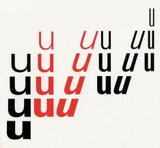
Another example is Univers, which was a typeface designed to have both a spectrum of weights and a spectrum of widths:

enter image description here

And WillAdams points out Multiple Masters which was a technology within a typeface to allow users to generate any weights they desired in whatever spectrum the typeface designer allowed.

To answer your specific question:

Is there a way to create gradations between two given weights of a particular font?

As a user of standard word processing software and the like, no. You are at the mercy of what the type designer designed.

However, if you have access to multiple master fonts, or font editing software, you could manually create a version of a typeface that fits your particular needs. This is no simple task, however.

3

Probably the most extensive implementation of this idea is Metafont. Metafont is a system, designed to work with TeX, for designing parameterized fonts. It's a combination of a programming language, an equation solver, and a font rasterizer. Unfortunately, the output is device-specific bitmap fonts instead of the outline font formats that are popular today.

Basically, a font designer using Metafont would write a program (in Metafont's special language) to generate the letter shapes he wanted, using variables for all the dimensions, including stroke weight. Then he can use different values for these variables to generate various styles of the font.

Knuth's Computer Modern font family has an extensive range of styles, but it seems to only have regular and bold weights—although anyone could add a new weight by changing the dimensions that affect stroke width.

3
  • Have any favorite links on the topic you could add in to your answer? I found a few but yours might be more up to date and higher quality. The French site I found hasn't been updated since 2004 so maybe its not the right page for the project any longer?
    – Ryan
    Commented May 10, 2014 at 3:28
  • I don't really have any favorite links. The TeX Users Group (tug.org) is the home for the TeX and Metafont project, so maybe you should look there. But Metafont hasn't changed significantly in the past 20 years, so a 10-year-old site is actually fairly up-to-date. Commented May 10, 2014 at 17:43
  • METATYPE1 is the hot new, updated version of METAFONT --- it uses METAPOST so as to be able to make outlines which will be compatible w/ making a font. Article here: tug.org/TUGboat/tb24-3/jackowski.pdf
    – WillAdams
    Commented May 12, 2014 at 12:00
3

There have been various failed (all of them) attempts to automate the generation of different font weights. They failed because they are pretty simple algorithms, and while they theoretically do the job, they range, aesthetically, from poor to awful in their output. A font has to be drawn at the weight and for

Back in the long ago (I know you know this, but others may not), a "font" was a complete set of characters of a particular typeface in a specific size. Each character for each size was created individually to look right on a page. Letterpress characters took into account the fact that they would be impressed into the surface of the paper. They were three-dimensional.

When offset lithography came along, quickly followed by photo-typesetting, there were two big changes: type was two-dimensional, so that characters now had to be redrawn for the new medium; and photo-typesetting made characters scalable.

The problem with scaling is that a font is drawn to look optimum at a specific size. Enlarge it or reduce it too much, and you generally end up with a degraded appearance that won't work in professional design. Photo-typesetting addressed with with different sets of film for use in certain ranges of final output size.

The same principle applies to bolding, extending or condensing a font. You can't just "Offset Path" and end up with a pleasing variant. There's an ocean of garbage fonts out there from the 1990s era when people went nuts with Fontographer and similar programs, churning out "type families" that consisted of nothing but machine-modified versions of a basic font. They come bundled with consumer-grade layout programs like Print Shop.

A bold font has to be drawn as a bold font, and its kerning has to be adjusted differently than a light, medium, or heavy version.

The same is true of size. Great display faces are drawn with much finer detail than text faces, and can't be used at text sizes. Great text faces look clunky at display sizes when compared with the same font at text sizes. All professional fonts are drawn to be used within a particular, fairly narrow range of sizes. They are definitely not drawn to be arbitrarily "emboldened."

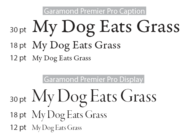
To make the point really obvious that it's not just a matter of adroit mechanical scaling, here are samples of Garamond Premier Pro in normal-weight Caption and Display fonts at 30 pt (headline), 18 pt (subhead) and 12 pt (text).
enter image description here

Having harrumphed all that, there are (rare!) occasions when you have no choice but to fake it, when the weight you need is semi-semibold and you only have regular and semibold to choose from. Provided you tell no-one, you can fake it by adding a very fine stroke to the outside of the characters and adjusting the tracking and kerning manually. This can be useful when you have white text reversed out from a black background, for example, and you need to enfatten it a tad.

1
  • Yes because the font is used so many times the cost of manual work is a no issue. Anyway kerning scales pretty well. The change in outline shape needed by the increased resolution not so much. Anyway there's no reason why the interpolation has to be one axis. After all the same technology is used for human facial animation too and its far more complicated and has less room for errors. But yes it would be a lot of work to do it properly and there's really no need to have all those intermediate forms so its not done.
    – joojaa
    Commented May 11, 2014 at 15:48
1

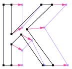
Technically it is possible to interpolate an existing font.

Interpolated letter K

Image 1: Interpolation of letter K of Arial regular to 2.2 times Arial black.

Quite many fonts lend to simple interpolation Arial was chosen for simplicity, and clarity of explaining the interpolation. In this case the vertex numberings were a bit out of sync so i had to identify the first corner again. What I basically did is the same thing as MM font does.

Explanation of how it works:

This is how it works. For each vertex and Bezier tangent handle point. Identify counterpart in different weight, find the vector between the point.

Vectors between points

Image 1: Vectors between corresponding points.

You can then add the original point vector plus offset vector times a number between 0-100% to get something between these font weights. It is also possible to go further than the target giving you over interpolation. Animators call the same technology morphs or blend shapes. Not all fonts lend themselves to be worked with to this technology.

One can also be more complex you can make things out of interpolated pieces and then do other constraint based tools such as rounds after merge etc. So if one does this you can make fonts that are interpolated but once flattened nobody else can interpolate them. Same happens if you do manual teaks by inserting points etc.

Current generation of fonts are actually very poor at doing this. Old postscript user fonts could have done nearly any kind of custom building conceivable so fonts were in this regard better years ago. One reason to use EPS files for custom font programs that can then be converted to conventional fonts.

Your Answer

By clicking “Post Your Answer”, you agree to our terms of service and acknowledge you have read our privacy policy.

Not the answer you're looking for? Browse other questions tagged or ask your own question.