2

I have a compact left navigation menu that I've developed but I can't seem to get the coloring/depth just right with the different levels it has.

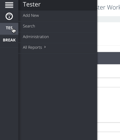
At the basic level it looks like:
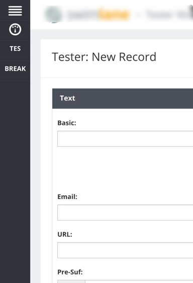
enter image description here

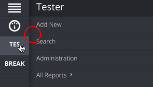
When you expand the second level:

enter image description here

The last menu expand ( typically not used ):
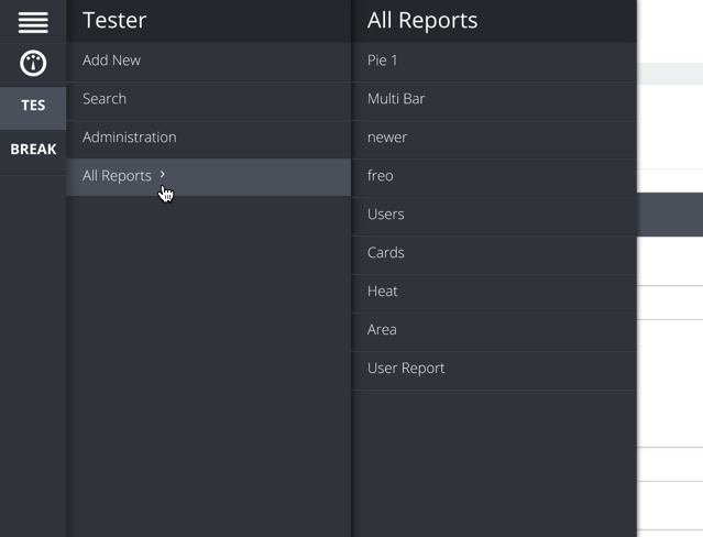
enter image description here

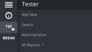
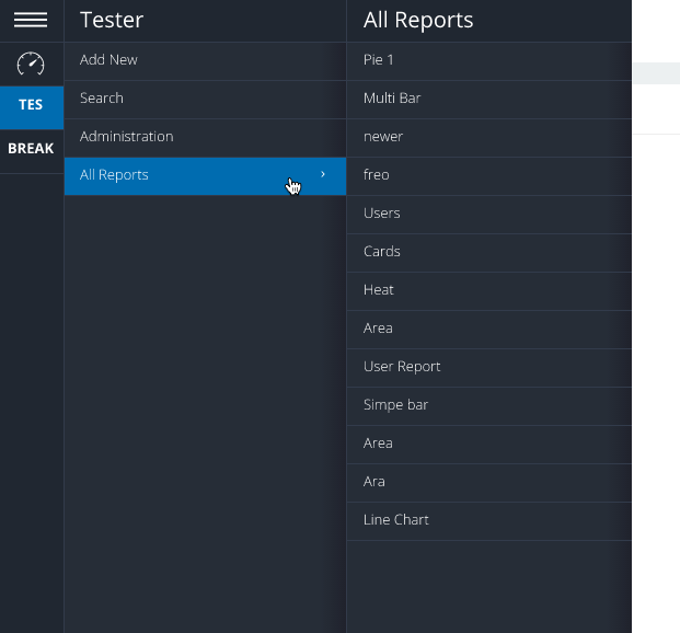
I want to illustrate a clean menu, I've played around with removing the shading and going all flat with a pop of blue like:
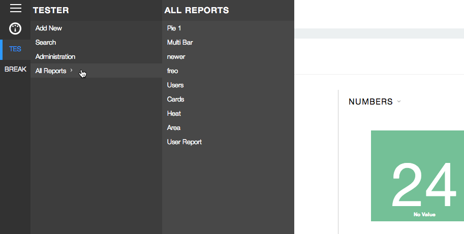
enter image description here

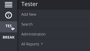
but wasn't happy with the last menu subset. I'm shooting for a blue/dark grey color scheme like:
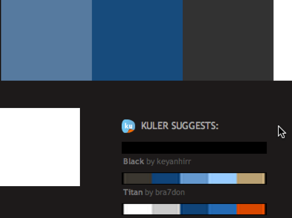
enter image description here

Any suggestions on how to accomplish the shading on the nested menus?

3
  • Hi, probably it is my display, buy your grays looks (or percepts) a bit reddish. I would suggest to add a bit cold cyan to them.
    – Vnovak
    Commented May 29, 2014 at 12:37
  • 1
    I thought they looked a bit blue ( maybe Im color blind ha ). Got any specific colors you think would look good?
    – amcdnl
    Commented May 29, 2014 at 12:40
  • Have checked :) plain grey.. I think it worth to try to add a little bit of blue tint
    – Vnovak
    Commented May 29, 2014 at 12:52

4 Answers 4

4

The main 'issue' (not really an issue though) that I have with the depth is due to the divider lines in your submenues:

enter image description here

The drop shadow is underneath the lines, when it should be on top (with some transparency applied to it), which causes the lighter line to appear even lighter.

I'd try that first, moving the shadow to the top. However, something else that might help is to get rid of some of the lines complexity. When you remove them entirely, the depth looks much more realistic, because there are less levels to it:

enter image description here

So instead of lines with a shadow, you could have plain solid ones:

enter image description here

1

Use very slight gradients, from left to right, in each column of your views. This will give you the delineation you're seeking.

0

Honestly, I like the first ones (the blueish ones) as-is. The only suggestion that I have is to make both drop shadows match. Right now, the right one is smaller and darker.

2
  • So you like the shadows vs the color difference?
    – amcdnl
    Commented May 29, 2014 at 15:24
  • Yea, I like the shadows. I like the shadow on the left more than the one of the right though.
    – Manly
    Commented Jun 2, 2014 at 15:41
0

Ended up using some gradients to create the effect and adding a bit of pop with the highlight effect, thoughts?

enter image description here

2
  • The gradients on the right-hand side look ‘wrong’ to me if the submenus are meant to slide out (or seem as if they do). They make it look like the lower-level menu is on top of the higher-level menu, rather than below it, which makes my brain go a bit 3D-haywire. Commented Jun 3, 2014 at 14:37
  • hmmm ... maybe flip them? i started with that but then the difference between the 2nd and 3rd menu didn't stand out enough.
    – amcdnl
    Commented Jun 3, 2014 at 14:42

Your Answer

By clicking “Post Your Answer”, you agree to our terms of service and acknowledge you have read our privacy policy.

Not the answer you're looking for? Browse other questions tagged or ask your own question.